- Power BI forums
- Updates
- News & Announcements
- Get Help with Power BI
- Desktop
- Service
- Report Server
- Power Query
- Mobile Apps
- Developer
- DAX Commands and Tips
- Custom Visuals Development Discussion
- Health and Life Sciences
- Power BI Spanish forums
- Translated Spanish Desktop
- Power Platform Integration - Better Together!
- Power Platform Integrations (Read-only)
- Power Platform and Dynamics 365 Integrations (Read-only)
- Training and Consulting
- Instructor Led Training
- Dashboard in a Day for Women, by Women
- Galleries
- Community Connections & How-To Videos
- COVID-19 Data Stories Gallery
- Themes Gallery
- Data Stories Gallery
- R Script Showcase
- Webinars and Video Gallery
- Quick Measures Gallery
- 2021 MSBizAppsSummit Gallery
- 2020 MSBizAppsSummit Gallery
- 2019 MSBizAppsSummit Gallery
- Events
- Ideas
- Custom Visuals Ideas
- Issues
- Issues
- Events
- Upcoming Events
- Community Blog
- Power BI Community Blog
- Custom Visuals Community Blog
- Community Support
- Community Accounts & Registration
- Using the Community
- Community Feedback
Register now to learn Fabric in free live sessions led by the best Microsoft experts. From Apr 16 to May 9, in English and Spanish.
- Power BI forums
- Forums
- Get Help with Power BI
- Desktop
- Re: How can I toggle line/columns on line charts?
- Subscribe to RSS Feed
- Mark Topic as New
- Mark Topic as Read
- Float this Topic for Current User
- Bookmark
- Subscribe
- Printer Friendly Page
- Mark as New
- Bookmark
- Subscribe
- Mute
- Subscribe to RSS Feed
- Permalink
- Report Inappropriate Content
How can I toggle line/columns on line charts?
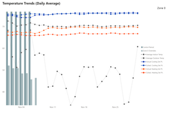
I have the following line and column chart and the user is requesting the ability to toggle columns/lines on and off. How do I do that? The columns on all on the same table. I made a disconnected table of the column names but I'm not sure where to go from here.
Solved! Go to Solution.
- Mark as New
- Bookmark
- Subscribe
- Mute
- Subscribe to RSS Feed
- Permalink
- Report Inappropriate Content
Hey @ashamsuzzoha ,
you can achieve this, by creating a table that represents the measure name, this table fills the slicer that allows users to select what they want to see on the visual. but is otherwise unrelated to your data model.
All the measures have to be assigned to the visual in advance 🙂 as it's still valid what I said above, that you can't programmatically assign a measure / column to a visual.
Assuming that there is a measure called Measure 1, you have to do 4 things
- add the value "Measure A" to the visual
- add a row to the unrelated table that is populating the "Measure slicer"
- create a slicer based on the unrelated table
- adjust your measure in a way that it reflects the selection inside the slicer (see the DAX below)
As the measures might be used outside of the context of the visual we are currently talking about, the DAX statement that toggles the "visibility" has to be a little more generic.
If I implement something like this, I consider it useful to remember that the selection of all items from a slicer means basically the same as no item is selected in regards to the rows that will be filtered, but can mean a great difference to use this information for toggling the visibility of a measure.
Another aspect to keep in mind, is the fact that visibilty of a measure means leveraging the fact that visuals (most of them) honor the value BLANK() in one way or the other.
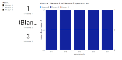
In the sample report (see link below), the measure name will always appear in the legend of the line and stacked column chart no matter if a measure returns a value.
Here is the DAX statement for one measure:
Measure 1 =
var measureTableIsFiltered = ISFILTERED( 'unrelated table' )
var filteredMeasure = VALUES( 'unrelated table'[Measure] )
return
IF( NOT( measureTableIsFiltered ) || "Measure 1" in filteredMeasure
    ,
    // the below DAX computes the actual measure - here a simple constant value
    1
    // the above DAX computes the actual measure - here a simple constant value
    , BLANK()
)
Here you will find a sample pbix file
A screenshot of what's inside the pbix (the card visuals are just used for decoration and testing):
Hopefully, this provides what you are looking for, if not create a pbix that contains sample data but still reflects your data model. Upload the pbix to onedrive or dropbox and share the link. If you are using Excel to create the sample data share the xlsx as well.
Regards,
Tom
Did I answer your question? Mark my post as a solution, this will help others!
Proud to be a Super User!
I accept Kudos 😉
Hamburg, Germany
- Mark as New
- Bookmark
- Subscribe
- Mute
- Subscribe to RSS Feed
- Permalink
- Report Inappropriate Content
@ashamsuzzoha
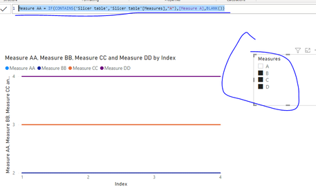
You can achieve this only for measures, you may create a disconnected slicer table including measure using IF(Contains()....). See attached example pbix.
Paul Zheng _ Community Support Team
If this post helps, please Accept it as the solution to help the other members find it more quickly.
- Mark as New
- Bookmark
- Subscribe
- Mute
- Subscribe to RSS Feed
- Permalink
- Report Inappropriate Content
Hey @ashamsuzzoha ,
you can achieve what you want by using bookmarks, but you have to create 2 versions of the visual and use a button to toggle between theses versions. Here you will find an articel that explains bookmarks: Overview of bookmarks in Power BI service reports - Power BI | Microsoft Docs
This is necessary as there is no feature that allows to programmatically change the content of a visual.
Hopefully, this provides some ideas on how to tackle your challenge.
Regards,
Tom
Did I answer your question? Mark my post as a solution, this will help others!
Proud to be a Super User!
I accept Kudos 😉
Hamburg, Germany
- Mark as New
- Bookmark
- Subscribe
- Mute
- Subscribe to RSS Feed
- Permalink
- Report Inappropriate Content
Extremely frustrating answer, I would need a chart for every permutation of the line and chart. So 7! (=5040) charts??
- Mark as New
- Bookmark
- Subscribe
- Mute
- Subscribe to RSS Feed
- Permalink
- Report Inappropriate Content
@TomMartens wrote:This is necessary as there is no feature that allows to programmatically change the content of a visual.
Thanks Microsoft.
- Mark as New
- Bookmark
- Subscribe
- Mute
- Subscribe to RSS Feed
- Permalink
- Report Inappropriate Content
Hi @ashamsuzzoha ,
Do you require something like - Toggle between 2 charts: 1 column chart and 2nd Line chart representing same information?
If yes then you can use bookmarks to do create these toggles in power BI.
I wrote a blog sometime back on how you can toggle between 2 charts using bookmarks:
https://community.powerbi.com/t5/Community-Blog/Toggle-Between-Charts-in-Power-BI/ba-p/1345014
The only different thing you need to do is create one column chart and one Line chart using your information and then follow the above blog to toggle between them using buttons/bookmarks.
Let me know if this helps.
Thanks,
Pragati
- Mark as New
- Bookmark
- Subscribe
- Mute
- Subscribe to RSS Feed
- Permalink
- Report Inappropriate Content
No, user wants to ability to select any number of the columns/series with a check box.
- Mark as New
- Bookmark
- Subscribe
- Mute
- Subscribe to RSS Feed
- Permalink
- Report Inappropriate Content
HI @ashamsuzzoha ,
Please detail your requirement with some sample data and screenshots.
https://community.powerbi.com/t5/Desktop/How-to-Get-Your-Question-Answered-Quickly/m-p/1447523
Thanks,
Pragati
- Mark as New
- Bookmark
- Subscribe
- Mute
- Subscribe to RSS Feed
- Permalink
- Report Inappropriate Content
Something like this but for table columns, and being to select more than one table column at a time.
Change the Column or Measure Value in a Power BI Visual by Selection of the Slicer: Parameter Table ...
- Mark as New
- Bookmark
- Subscribe
- Mute
- Subscribe to RSS Feed
- Permalink
- Report Inappropriate Content
Hey @ashamsuzzoha ,
you can achieve this, by creating a table that represents the measure name, this table fills the slicer that allows users to select what they want to see on the visual. but is otherwise unrelated to your data model.
All the measures have to be assigned to the visual in advance 🙂 as it's still valid what I said above, that you can't programmatically assign a measure / column to a visual.
Assuming that there is a measure called Measure 1, you have to do 4 things
- add the value "Measure A" to the visual
- add a row to the unrelated table that is populating the "Measure slicer"
- create a slicer based on the unrelated table
- adjust your measure in a way that it reflects the selection inside the slicer (see the DAX below)
As the measures might be used outside of the context of the visual we are currently talking about, the DAX statement that toggles the "visibility" has to be a little more generic.
If I implement something like this, I consider it useful to remember that the selection of all items from a slicer means basically the same as no item is selected in regards to the rows that will be filtered, but can mean a great difference to use this information for toggling the visibility of a measure.
Another aspect to keep in mind, is the fact that visibilty of a measure means leveraging the fact that visuals (most of them) honor the value BLANK() in one way or the other.
In the sample report (see link below), the measure name will always appear in the legend of the line and stacked column chart no matter if a measure returns a value.
Here is the DAX statement for one measure:
Measure 1 =
var measureTableIsFiltered = ISFILTERED( 'unrelated table' )
var filteredMeasure = VALUES( 'unrelated table'[Measure] )
return
IF( NOT( measureTableIsFiltered ) || "Measure 1" in filteredMeasure
    ,
    // the below DAX computes the actual measure - here a simple constant value
    1
    // the above DAX computes the actual measure - here a simple constant value
    , BLANK()
)
Here you will find a sample pbix file
A screenshot of what's inside the pbix (the card visuals are just used for decoration and testing):
Hopefully, this provides what you are looking for, if not create a pbix that contains sample data but still reflects your data model. Upload the pbix to onedrive or dropbox and share the link. If you are using Excel to create the sample data share the xlsx as well.
Regards,
Tom
Did I answer your question? Mark my post as a solution, this will help others!
Proud to be a Super User!
I accept Kudos 😉
Hamburg, Germany
Helpful resources

Microsoft Fabric Learn Together
Covering the world! 9:00-10:30 AM Sydney, 4:00-5:30 PM CET (Paris/Berlin), 7:00-8:30 PM Mexico City

Power BI Monthly Update - April 2024
Check out the April 2024 Power BI update to learn about new features.

| User | Count |
|---|---|
| 112 | |
| 100 | |
| 80 | |
| 64 | |
| 57 |
| User | Count |
|---|---|
| 146 | |
| 110 | |
| 93 | |
| 84 | |
| 67 |


