- Power BI forums
- Updates
- News & Announcements
- Get Help with Power BI
- Desktop
- Service
- Report Server
- Power Query
- Mobile Apps
- Developer
- DAX Commands and Tips
- Custom Visuals Development Discussion
- Health and Life Sciences
- Power BI Spanish forums
- Translated Spanish Desktop
- Power Platform Integration - Better Together!
- Power Platform Integrations (Read-only)
- Power Platform and Dynamics 365 Integrations (Read-only)
- Training and Consulting
- Instructor Led Training
- Dashboard in a Day for Women, by Women
- Galleries
- Community Connections & How-To Videos
- COVID-19 Data Stories Gallery
- Themes Gallery
- Data Stories Gallery
- R Script Showcase
- Webinars and Video Gallery
- Quick Measures Gallery
- 2021 MSBizAppsSummit Gallery
- 2020 MSBizAppsSummit Gallery
- 2019 MSBizAppsSummit Gallery
- Events
- Ideas
- Custom Visuals Ideas
- Issues
- Issues
- Events
- Upcoming Events
- Community Blog
- Power BI Community Blog
- Custom Visuals Community Blog
- Community Support
- Community Accounts & Registration
- Using the Community
- Community Feedback
Register now to learn Fabric in free live sessions led by the best Microsoft experts. From Apr 16 to May 9, in English and Spanish.
- Power BI forums
- Forums
- Get Help with Power BI
- Desktop
- How can I display values in Power BI 100% Stacked ...
- Subscribe to RSS Feed
- Mark Topic as New
- Mark Topic as Read
- Float this Topic for Current User
- Bookmark
- Subscribe
- Printer Friendly Page
- Mark as New
- Bookmark
- Subscribe
- Mute
- Subscribe to RSS Feed
- Permalink
- Report Inappropriate Content
How can I display values in Power BI 100% Stacked Bar?
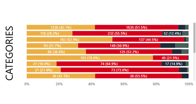
I've got a 100% stacked bar chart that displays the percent of 100% for each stacked bar.
I can hover over each bar to show the value for that bar (for example 69.10% is 966 and 30.90% is 432). Is there a way to display the value along with or instead of the percent? So it would be something like "966 (69.10%)" and "432 (30.90%)", or just the value would be fine.
In case it matters, data is coming from a SQL Server view.
Thanks!
Solved! Go to Solution.
- Mark as New
- Bookmark
- Subscribe
- Mute
- Subscribe to RSS Feed
- Permalink
- Report Inappropriate Content
Hi @Richtpt ,
The data labels option only shows the percentage and I didn't find any options to show both numbers and percentage.
I'd like to suggest you to submit an idea.
Best Regards,
Jay
Community Support Team _ Jay Wang
If this post helps, then please consider Accept it as the solution to help the other members find it more quickly.
If this post helps, then please consider Accept it as the solution to help the other members find it.
- Mark as New
- Bookmark
- Subscribe
- Mute
- Subscribe to RSS Feed
- Permalink
- Report Inappropriate Content
I think I found the solution to this:
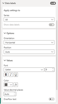
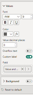
Under the "Format Visual" button, turn on data labels. Under data labels, go to values, and add a custom label (turn it on). For the field select your measure. This worked for me.
So, for my own use case I came up with the following measure:
Value and Percent =
CONCATENATE(COUNT(Table1[ID])," ("&FORMAT('New Measures'[% of Total],"0.0%")&")")
- Mark as New
- Bookmark
- Subscribe
- Mute
- Subscribe to RSS Feed
- Permalink
- Report Inappropriate Content
can you please elaborate 'New Measures'[% of Total] from? thank you
- Mark as New
- Bookmark
- Subscribe
- Mute
- Subscribe to RSS Feed
- Permalink
- Report Inappropriate Content
Sure thing! It is a standalone measure that i have that calculates the % of my metric. Effectively:
'New Measures'[% of Total] =
FORMAT([MeasureA]/[MeasureB],"%")
- Mark as New
- Bookmark
- Subscribe
- Mute
- Subscribe to RSS Feed
- Permalink
- Report Inappropriate Content
I do not have an option to add custom labels to the stacked bar or 100% stacked bar visual. I do not see it as a preview feature either.
- Mark as New
- Bookmark
- Subscribe
- Mute
- Subscribe to RSS Feed
- Permalink
- Report Inappropriate Content
It should be right under the overflow text option 🙂
- Mark as New
- Bookmark
- Subscribe
- Mute
- Subscribe to RSS Feed
- Permalink
- Report Inappropriate Content
how come such simple features to be added require such complex work-arounds? power bi lets users down so much...
- Mark as New
- Bookmark
- Subscribe
- Mute
- Subscribe to RSS Feed
- Permalink
- Report Inappropriate Content
How is this not a feature yet??? Tableau has been allowing multiple values as display text for years. Come on.
- Mark as New
- Bookmark
- Subscribe
- Mute
- Subscribe to RSS Feed
- Permalink
- Report Inappropriate Content
Hi Richtpt,
I know this is late, but I do this by doing the following:
1) Create a calculated field that adds up all of the fields you are including in your chart. Something like this:
X_Axis_Total = [FIELD 1] + [FIELD 2] + .... [FIELD N]
2) Make a regular Stacked Bar Chart and put all your fields in the Values section.
3) Turn on your data labels.
4) Temporarily turn on your X-Axis and modify the Start and End to be Start = 0 and for End click fx then select your new measure X_Axis_Total from the list.
This should make your X-Axis go all the way across as if it was a 100% stacked chart, but it will use the actual values for the display and the chart colors.
Hope this helps!
- Mark as New
- Bookmark
- Subscribe
- Mute
- Subscribe to RSS Feed
- Permalink
- Report Inappropriate Content
I think its possible.
1. Create a visual in a seperate page and set the page as tooltip instead of the default one for your graph
2. Create a measure which concatenates the value and percent to total and use the measure in that visual created in step 1.
Let us know how it works.
If this helps, mark it as a solution
Kudos are nice too
- Mark as New
- Bookmark
- Subscribe
- Mute
- Subscribe to RSS Feed
- Permalink
- Report Inappropriate Content
I'm not sure I'm understanding what you are saying.
I created a new page and turned on the page tooltip. Not sure what that accomplishes.
My 100% stacked bar chart is setup with FolderName in the Axis, Last Run Group in the Legend (which is Has Run Date and No Run Date), then TotalRecords in the value. I created a measure that concatenates the values together but I can't use that measure in the Value.
When I turn on data labels it will display the percent. I want to display either the percent and value or just the value. Thanks!
- Mark as New
- Bookmark
- Subscribe
- Mute
- Subscribe to RSS Feed
- Permalink
- Report Inappropriate Content
Go through the documentation on how to use a page as tooltip to another visual and try what I recomended.
https://docs.microsoft.com/en-us/power-bi/desktop-tooltips
- Mark as New
- Bookmark
- Subscribe
- Mute
- Subscribe to RSS Feed
- Permalink
- Report Inappropriate Content
AH, I see what you are saying. That's cool, but not quite what I want. I don't want to have to hover over a bar to view the amount, that's already there. I want to just look at the chart and see the values and/or percent, not just the percent. Something like the first bar.
- Mark as New
- Bookmark
- Subscribe
- Mute
- Subscribe to RSS Feed
- Permalink
- Report Inappropriate Content
Hi @Richtpt ,
The data labels option only shows the percentage and I didn't find any options to show both numbers and percentage.
I'd like to suggest you to submit an idea.
Best Regards,
Jay
Community Support Team _ Jay Wang
If this post helps, then please consider Accept it as the solution to help the other members find it more quickly.
If this post helps, then please consider Accept it as the solution to help the other members find it.
- Mark as New
- Bookmark
- Subscribe
- Mute
- Subscribe to RSS Feed
- Permalink
- Report Inappropriate Content
- Mark as New
- Bookmark
- Subscribe
- Mute
- Subscribe to RSS Feed
- Permalink
- Report Inappropriate Content
Hi there,
Would you be able to advice if there is any update with regards to this request? Has a real solution being found/developed? Many thanks.
Best regards,
Awie
- Mark as New
- Bookmark
- Subscribe
- Mute
- Subscribe to RSS Feed
- Permalink
- Report Inappropriate Content
Refer
https://community.powerbi.com/t5/Desktop/100-Stacked-bar-chart-display/m-p/853213
https://community.powerbi.com/t5/Desktop/100-Stacked-bar-chart/m-p/905132
Appreciate your Kudos. In case, this is the solution you are looking for, mark it as the Solution. In case it does not help, please provide additional information and mark me with @
Thanks. My Recent Blog -
Winner-Topper-on-Map-How-to-Color-States-on-a-Map-with-Winners , HR-Analytics-Active-Employee-Hire-and-Termination-trend
Power-BI-Working-with-Non-Standard-Time-Periods And Comparing-Data-Across-Date-Ranges
Connect on Linkedin
Microsoft Power BI Learning Resources, 2023 !!
Learn Power BI - Full Course with Dec-2022, with Window, Index, Offset, 100+ Topics !!
Did I answer your question? Mark my post as a solution! Appreciate your Kudos !! Proud to be a Super User! !!
- Mark as New
- Bookmark
- Subscribe
- Mute
- Subscribe to RSS Feed
- Permalink
- Report Inappropriate Content
Neither of these address the question I asked. A 100% stacked bar chart shows the percent values for each bar when you turn data labels on. I want to display either the percent and value or just the value.
- Mark as New
- Bookmark
- Subscribe
- Mute
- Subscribe to RSS Feed
- Permalink
- Report Inappropriate Content
Hi @Richtpt did you find answer to your question? If yes - Please let me know. I have the same issue.
- Mark as New
- Bookmark
- Subscribe
- Mute
- Subscribe to RSS Feed
- Permalink
- Report Inappropriate Content
Sorry, no, never found a solution for this. I did submit a feature request, though don't know if they ever did it.
Helpful resources

Microsoft Fabric Learn Together
Covering the world! 9:00-10:30 AM Sydney, 4:00-5:30 PM CET (Paris/Berlin), 7:00-8:30 PM Mexico City

Power BI Monthly Update - April 2024
Check out the April 2024 Power BI update to learn about new features.

| User | Count |
|---|---|
| 118 | |
| 107 | |
| 70 | |
| 70 | |
| 43 |
| User | Count |
|---|---|
| 148 | |
| 105 | |
| 104 | |
| 89 | |
| 65 |


