- Power BI forums
- Updates
- News & Announcements
- Get Help with Power BI
- Desktop
- Service
- Report Server
- Power Query
- Mobile Apps
- Developer
- DAX Commands and Tips
- Custom Visuals Development Discussion
- Health and Life Sciences
- Power BI Spanish forums
- Translated Spanish Desktop
- Power Platform Integration - Better Together!
- Power Platform Integrations (Read-only)
- Power Platform and Dynamics 365 Integrations (Read-only)
- Training and Consulting
- Instructor Led Training
- Dashboard in a Day for Women, by Women
- Galleries
- Community Connections & How-To Videos
- COVID-19 Data Stories Gallery
- Themes Gallery
- Data Stories Gallery
- R Script Showcase
- Webinars and Video Gallery
- Quick Measures Gallery
- 2021 MSBizAppsSummit Gallery
- 2020 MSBizAppsSummit Gallery
- 2019 MSBizAppsSummit Gallery
- Events
- Ideas
- Custom Visuals Ideas
- Issues
- Issues
- Events
- Upcoming Events
- Community Blog
- Power BI Community Blog
- Custom Visuals Community Blog
- Community Support
- Community Accounts & Registration
- Using the Community
- Community Feedback
Register now to learn Fabric in free live sessions led by the best Microsoft experts. From Apr 16 to May 9, in English and Spanish.
- Power BI forums
- Forums
- Get Help with Power BI
- Desktop
- Re: How can I create a interactive venn diagram
- Subscribe to RSS Feed
- Mark Topic as New
- Mark Topic as Read
- Float this Topic for Current User
- Bookmark
- Subscribe
- Printer Friendly Page
- Mark as New
- Bookmark
- Subscribe
- Mute
- Subscribe to RSS Feed
- Permalink
- Report Inappropriate Content
How can I create a interactive venn diagram
Hi
I am trying to create an interactive ven diagram the outline draft of how I would like it to look is below:
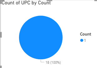
Everything is perfect the only trouble I am having is the venn diagram itself. I have tried to use a pie charts example below to create the ven diagram so i was going to have 6 of these based on the slicers, and when the user selects the chart the table I would want it to filter out the list of products within that pie chart but it isnt working. When I select the pie chart the table isnt cross filtering. Please could you advise on what to do?
Solved! Go to Solution.
- Mark as New
- Bookmark
- Subscribe
- Mute
- Subscribe to RSS Feed
- Permalink
- Report Inappropriate Content
Hi @Powerbing1,
If both common visuals and custom visuals not suitable for your requirement, you can also try to use script-based visuals (r, python) if you are familiar with these scripts.
Venn Diagram with R or RStudio: A Million Ways - Datanovia
How to Create and Customize Venn Diagrams in Python | by Julia Kho | Towards Data Science
Notice: script-based visuals can respond with other visuals' interactions but they cannot directly affect other visuals.
Regards,
Xiaoxin Sheng
If this post helps, please consider accept as solution to help other members find it more quickly.
- Mark as New
- Bookmark
- Subscribe
- Mute
- Subscribe to RSS Feed
- Permalink
- Report Inappropriate Content
Hey @Powerbing1 ,
I think the Venn Diagram by MAQ could be an option for you:
Venn Diagram by MAQ Software (microsoft.com)
Here a video and description of the custom visual:
Power BI Custom Visuals - Venn Diagram by MAQ Software (pragmaticworks.com)
- Mark as New
- Bookmark
- Subscribe
- Mute
- Subscribe to RSS Feed
- Permalink
- Report Inappropriate Content
Hi Denis,
Thank you, however I already tried using this visual but it is not interactive. I would want the user to select each set and have the table filtered out. For example if I select 1 of the sets in the ven diagram which shows 5 i would want 5 of the products to show up in the table.
Are you able to help me with this?
THank you,
- Mark as New
- Bookmark
- Subscribe
- Mute
- Subscribe to RSS Feed
- Permalink
- Report Inappropriate Content
Hi @Powerbing1,
If both common visuals and custom visuals not suitable for your requirement, you can also try to use script-based visuals (r, python) if you are familiar with these scripts.
Venn Diagram with R or RStudio: A Million Ways - Datanovia
How to Create and Customize Venn Diagrams in Python | by Julia Kho | Towards Data Science
Notice: script-based visuals can respond with other visuals' interactions but they cannot directly affect other visuals.
Regards,
Xiaoxin Sheng
If this post helps, please consider accept as solution to help other members find it more quickly.
Helpful resources

Microsoft Fabric Learn Together
Covering the world! 9:00-10:30 AM Sydney, 4:00-5:30 PM CET (Paris/Berlin), 7:00-8:30 PM Mexico City

Power BI Monthly Update - April 2024
Check out the April 2024 Power BI update to learn about new features.

| User | Count |
|---|---|
| 114 | |
| 100 | |
| 88 | |
| 70 | |
| 61 |
| User | Count |
|---|---|
| 151 | |
| 120 | |
| 103 | |
| 87 | |
| 68 |


