- Power BI forums
- Updates
- News & Announcements
- Get Help with Power BI
- Desktop
- Service
- Report Server
- Power Query
- Mobile Apps
- Developer
- DAX Commands and Tips
- Custom Visuals Development Discussion
- Health and Life Sciences
- Power BI Spanish forums
- Translated Spanish Desktop
- Power Platform Integration - Better Together!
- Power Platform Integrations (Read-only)
- Power Platform and Dynamics 365 Integrations (Read-only)
- Training and Consulting
- Instructor Led Training
- Dashboard in a Day for Women, by Women
- Galleries
- Community Connections & How-To Videos
- COVID-19 Data Stories Gallery
- Themes Gallery
- Data Stories Gallery
- R Script Showcase
- Webinars and Video Gallery
- Quick Measures Gallery
- 2021 MSBizAppsSummit Gallery
- 2020 MSBizAppsSummit Gallery
- 2019 MSBizAppsSummit Gallery
- Events
- Ideas
- Custom Visuals Ideas
- Issues
- Issues
- Events
- Upcoming Events
- Community Blog
- Power BI Community Blog
- Custom Visuals Community Blog
- Community Support
- Community Accounts & Registration
- Using the Community
- Community Feedback
Register now to learn Fabric in free live sessions led by the best Microsoft experts. From Apr 16 to May 9, in English and Spanish.
- Power BI forums
- Forums
- Get Help with Power BI
- Desktop
- How can I create a 100% stacked chart out of a mat...
- Subscribe to RSS Feed
- Mark Topic as New
- Mark Topic as Read
- Float this Topic for Current User
- Bookmark
- Subscribe
- Printer Friendly Page
- Mark as New
- Bookmark
- Subscribe
- Mute
- Subscribe to RSS Feed
- Permalink
- Report Inappropriate Content
How can I create a 100% stacked chart out of a matrix table with likert values?
Hi, I have a question but I can't find the right answer, maybe I'm not using the correct terms to look for it.
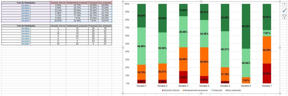
I have a set of 7 items from a survey that correspond to a construct, each item can get a score from 1 to 4 (Needs to prepare to Fully prepared) on a Likert scale that 64 students self-assessed themselves. I know how to do this on Excel, is very easy, but I can't figure it out to do it on Power BI, as far as I can get is a graph for each item, but I need all 7 in one graph, does someone knows how to do it? Been looking on the forums, someone one said about unpivoting values, but if I do this the columns merge into one and can’t analyze them separately if needed, also the number of rows increases and gives me errors on total sums. I include the screenshot of the 100% stacked chart I can do on Excel, but not on Power BI.
Also if I have the same scenario, but with a likert scale of 1 to 10 whole numbers I can't create a single graph containing multiple items like this another screenshot.
Thanks.
Julián
- Mark as New
- Bookmark
- Subscribe
- Mute
- Subscribe to RSS Feed
- Permalink
- Report Inappropriate Content
The best approach is to unpivot your data. You can then easily pivot it back out in your visual. You can put the new Attribute column (question/variable) on the x axis, use the response as the legend and create a pct of total responses for that question/variable as your measure (or just let it count and then display as % of total).
Pat
Did I answer your question? Mark my post as a solution! Kudos are also appreciated!
To learn more about Power BI, follow me on Twitter or subscribe on YouTube.
@mahoneypa HoosierBI on YouTube
- Mark as New
- Bookmark
- Subscribe
- Mute
- Subscribe to RSS Feed
- Permalink
- Report Inappropriate Content
I'll post the same message for the third time, hoping it doesn't dissapear...
Hi Pat, thanks for your answer, sorry that I didn’t test it before, had to finish the report for my boss before doing any testing.
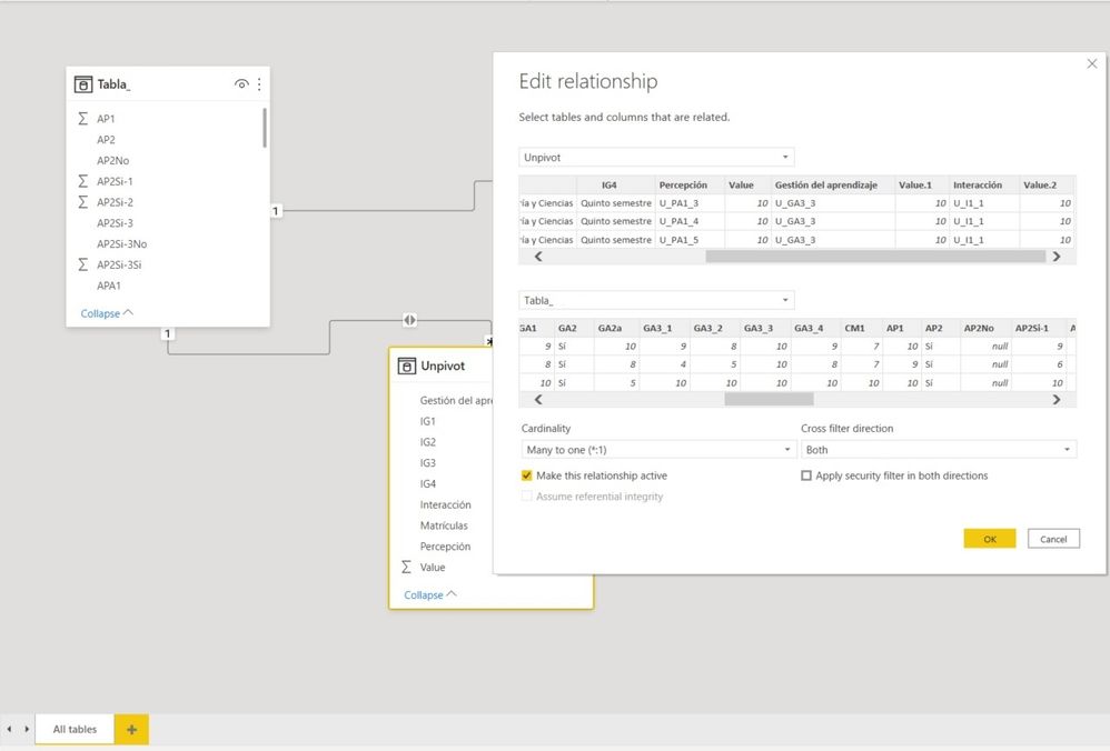
I did what you suggested, but I ran into some problems. Unpivoting data messes the total rows (increasing the count values) corresponding to different surveys, also if I pivot it back again the graph gets broken, so what I did was to unpivot these specific columns in a separate excel and use a relationship (many to one) and a cross filter direction in both ways.
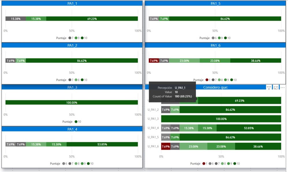
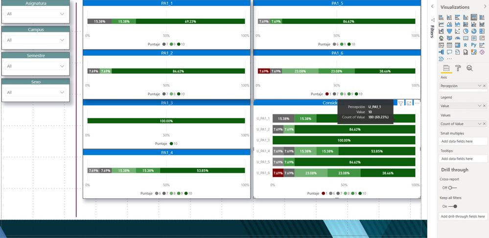
You can see 6 different graphs that all of them are inside the last one (the one you helped me). The problem that I have is that the counter is way off, for example, in the image you can see a count of values of 180 while it should be 9 (only 9 people assigned a value of 10 on the Likert scale). Also, I got the items all scattered so I choose to sort them ascending and the % got messed up, undo the data, and sorted again and now is ordered as you see in the picture. How can I get the correct count values?
Can you help me pointing me out what I'm doing wrong? Also if you know how to setup info from surveys in a Dashboard since most of the info I find is related to KPIs or Sales but I work on a University and just started with Power BI, did some courses that I bought from Packt, but are mainly related to sales management and most of the info only covers the basics.
Thanks again Pat.
Julián
- Mark as New
- Bookmark
- Subscribe
- Mute
- Subscribe to RSS Feed
- Permalink
- Report Inappropriate Content
Once you unpivot, you would need to change the way you count. Instead of a simple count, you would do a DISTINCTCOUNT of the respondantID or something like that. You shouldn't need to make a second table (but I haven't seen your data, of course).
Pat
Did I answer your question? Mark my post as a solution! Kudos are also appreciated!
To learn more about Power BI, follow me on Twitter or subscribe on YouTube.
@mahoneypa HoosierBI on YouTube
- Mark as New
- Bookmark
- Subscribe
- Mute
- Subscribe to RSS Feed
- Permalink
- Report Inappropriate Content
Hi Pat.
A little background, we had a survey in which the students rated on a 10 scale their answers and the screenshot I’m showing is related to self-perception.
Here are the screenshots:
On the first one we can see that I got a relationship between tables, I made one just for unpivoting the questions regarding to a same topic, since I also need to analyze them individually.
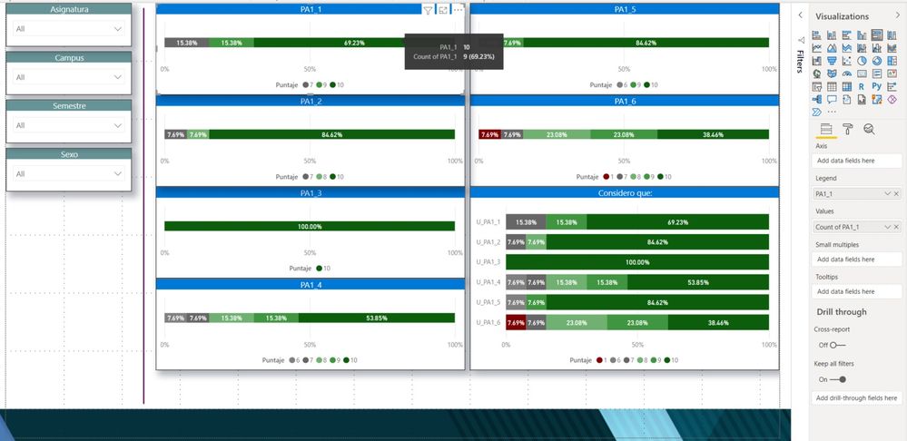
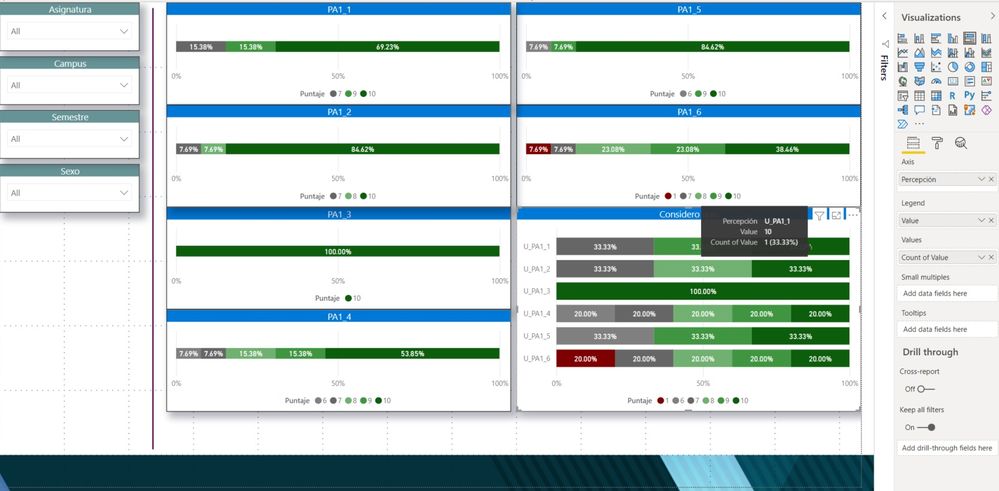
On the second picture we can see that PA1_1 counts 9 students gave a 10 to that question (on a 10 scale).
On the third picture we see that all these questions have been unpivoted to one graph following your help. They match the percentage, but you can see that instead of counting 9 students that gave the 10-scale number for U_PA1_1 it reads 180, that’s 20 times its count value (I put a U in front of PA1_1 to know that it comes from the unpivot table).
On the fourth picture you can see that I changed COUNT to DISTINCTCOUNT but the percentage gets messed up and you can see that only counts the 7, 9 and 10 values given on the scale.
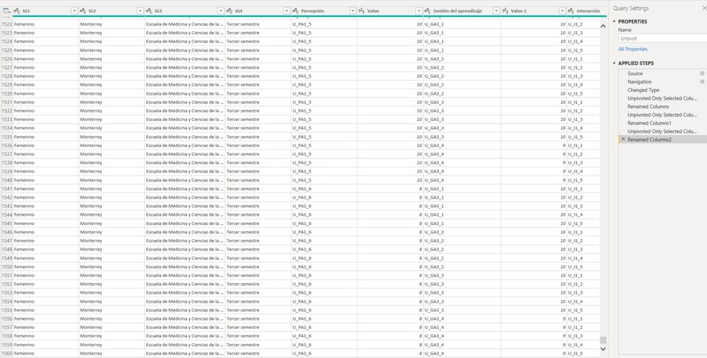
On the fifth picture you can see that the row is no longer made of 13 students, but go up to 1560, that is 120 times each student.
I can calculate averages Unpivoting data, but I can’t count correctly the values. There are only 13 students, for the PA1_1 question 2 gave a 7 on the scale, 2 gave 9 and 9 students gave a 10 scale to that question.
I hope this further info helps to know more about it and know what I'm doing wrong.
Thanks for help.
Julián
- Mark as New
- Bookmark
- Subscribe
- Mute
- Subscribe to RSS Feed
- Permalink
- Report Inappropriate Content
Hi Pat, thanks for your answer. I think that I even tried the distinctcount and got the same result, maybe I did something wrong. Tomorrow morning I'll post some more Images of what I was doing to get a better picture.
Thanks again.
Julián
- Mark as New
- Bookmark
- Subscribe
- Mute
- Subscribe to RSS Feed
- Permalink
- Report Inappropriate Content
Hi @Collenzi,
I think you can try to duplicate the raw query table and apply 'unpivot columns' on the copied table, then you can build a relationship between the transform table and the raw tale based on the category keys. They should not affect you to analyze records and design unpivoted graphs as excel charts.
Regards,
Xiaoxin Sheng
If this post helps, please consider accept as solution to help other members find it more quickly.
- Mark as New
- Bookmark
- Subscribe
- Mute
- Subscribe to RSS Feed
- Permalink
- Report Inappropriate Content
Thanks for the help, but I already did that, I created a second table only to unpivot, that works well following Pat's help and then I establish a relationship from one to many in both directions. I can create the graphs (as shown on my reply) but the counter is off, multiplies the values by 20.
Julián
- Mark as New
- Bookmark
- Subscribe
- Mute
- Subscribe to RSS Feed
- Permalink
- Report Inappropriate Content
Does anyone else knows how to solve this? I feel like my question was left in the blue because the given answer lead me to some more unanswered questions.
Thanks.
Julián
Helpful resources

Microsoft Fabric Learn Together
Covering the world! 9:00-10:30 AM Sydney, 4:00-5:30 PM CET (Paris/Berlin), 7:00-8:30 PM Mexico City

Power BI Monthly Update - April 2024
Check out the April 2024 Power BI update to learn about new features.

| User | Count |
|---|---|
| 117 | |
| 107 | |
| 69 | |
| 68 | |
| 43 |
| User | Count |
|---|---|
| 148 | |
| 103 | |
| 103 | |
| 88 | |
| 66 |
