- Power BI forums
- Updates
- News & Announcements
- Get Help with Power BI
- Desktop
- Service
- Report Server
- Power Query
- Mobile Apps
- Developer
- DAX Commands and Tips
- Custom Visuals Development Discussion
- Health and Life Sciences
- Power BI Spanish forums
- Translated Spanish Desktop
- Power Platform Integration - Better Together!
- Power Platform Integrations (Read-only)
- Power Platform and Dynamics 365 Integrations (Read-only)
- Training and Consulting
- Instructor Led Training
- Dashboard in a Day for Women, by Women
- Galleries
- Community Connections & How-To Videos
- COVID-19 Data Stories Gallery
- Themes Gallery
- Data Stories Gallery
- R Script Showcase
- Webinars and Video Gallery
- Quick Measures Gallery
- 2021 MSBizAppsSummit Gallery
- 2020 MSBizAppsSummit Gallery
- 2019 MSBizAppsSummit Gallery
- Events
- Ideas
- Custom Visuals Ideas
- Issues
- Issues
- Events
- Upcoming Events
- Community Blog
- Power BI Community Blog
- Custom Visuals Community Blog
- Community Support
- Community Accounts & Registration
- Using the Community
- Community Feedback
Register now to learn Fabric in free live sessions led by the best Microsoft experts. From Apr 16 to May 9, in English and Spanish.
- Power BI forums
- Forums
- Get Help with Power BI
- Desktop
- How can I change color for different bar where the...
- Subscribe to RSS Feed
- Mark Topic as New
- Mark Topic as Read
- Float this Topic for Current User
- Bookmark
- Subscribe
- Printer Friendly Page
- Mark as New
- Bookmark
- Subscribe
- Mute
- Subscribe to RSS Feed
- Permalink
- Report Inappropriate Content
How can I change color for different bar where the legend is on the same bar
Hi everyone, after searching for days in this forum I haven't find the answer to my problem. I have two measures and the total, divided for companies and for years. I want a multiple bar chart where are shown both measures on the same column (with different color) for each company grouped by year.
This are the kind of data.
| Company | year | value | measure |
| A | 2020 | 5 | big |
| A | 2019 | 6 | big |
| A | 2018 | 7 | big |
| B | 2020 | 5 | big |
| B | 2019 | 6 | big |
| B | 2018 | 7 | big |
| C | 2020 | 5 | big |
| C | 2019 | 6 | big |
| C | 2018 | 7 | big |
| A | 2020 | -1 | little |
| A | 2019 | -0.5 | little |
| A | 2018 | 0.2 | little |
| B | 2020 | -1 | little |
| B | 2019 | -0.5 | little |
| B | 2018 | 0.2 | little |
| C | 2020 | -1 | little |
| C | 2019 | -0.5 | little |
| C | 2018 | 0.2 | little |
I want the year on the X axis, grouped by company ( as legend do) and I want to have the total breakdown (with different color) for big and little measures. So I want to use 6 colors. To do something acceptable I make three bar chart for the years and then I use the company as X axis with the legend made by the variable "measure". For me it is ok even to make three graphics, but I want to use different color for each company (for example the companies red, green and blue, but with that color light for big and dark for little).
I know is something strange, I hope you can help me.
- Mark as New
- Bookmark
- Subscribe
- Mute
- Subscribe to RSS Feed
- Permalink
- Report Inappropriate Content
Hi @mumbea ,
You can't have two legend fields in a stacked column chart. Maybe you should consider to use custom visuals.
Best Regards,
Jay
If this post helps, then please consider Accept it as the solution to help the other members find it.
- Mark as New
- Bookmark
- Subscribe
- Mute
- Subscribe to RSS Feed
- Permalink
- Report Inappropriate Content
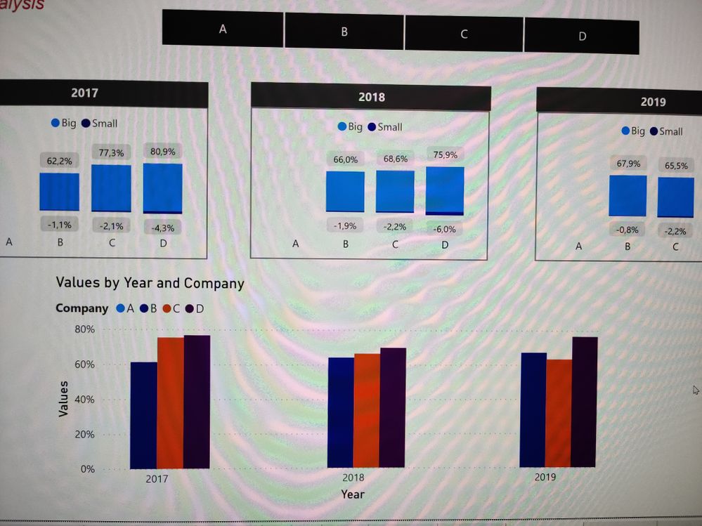
Thank you @amitchandak and @amitchandak for the answers, this is what I've done and what I want. I want the separation of the two component and each bar with a couple of color. Up in the picture I divide by year and I use the measure to separate on the same column, down there is my dream, but I can't underline the two part of the sum. The solution made by Pragati11 is good, but I can't see well how much 'small' is big related to 'big'
Thank you in advance
- Mark as New
- Bookmark
- Subscribe
- Mute
- Subscribe to RSS Feed
- Permalink
- Report Inappropriate Content
Hi @mumbea ,
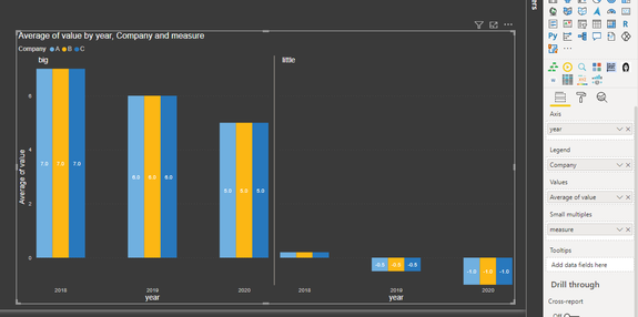
You can use a BAR CHART visual with Small Multiples in it. Somehting like below:
You can format the chart for colours, labelling etc. as per your need.
Thanks,
Pragati
- Mark as New
- Bookmark
- Subscribe
- Mute
- Subscribe to RSS Feed
- Permalink
- Report Inappropriate Content
@mumbea , the Expected output is not clear. But conditional formatting does work with legend and more than one measure.
You can have a measure and both columns on-axis and try conditional formatting. Refer to the power bi part in this video - https://www.youtube.com/watch?v=2P5BBRN853c
Microsoft Power BI Learning Resources, 2023 !!
Learn Power BI - Full Course with Dec-2022, with Window, Index, Offset, 100+ Topics !!
Did I answer your question? Mark my post as a solution! Appreciate your Kudos !! Proud to be a Super User! !!
Helpful resources

Microsoft Fabric Learn Together
Covering the world! 9:00-10:30 AM Sydney, 4:00-5:30 PM CET (Paris/Berlin), 7:00-8:30 PM Mexico City

Power BI Monthly Update - April 2024
Check out the April 2024 Power BI update to learn about new features.

| User | Count |
|---|---|
| 114 | |
| 99 | |
| 82 | |
| 70 | |
| 60 |
| User | Count |
|---|---|
| 149 | |
| 114 | |
| 107 | |
| 89 | |
| 67 |


