- Power BI forums
- Updates
- News & Announcements
- Get Help with Power BI
- Desktop
- Service
- Report Server
- Power Query
- Mobile Apps
- Developer
- DAX Commands and Tips
- Custom Visuals Development Discussion
- Health and Life Sciences
- Power BI Spanish forums
- Translated Spanish Desktop
- Power Platform Integration - Better Together!
- Power Platform Integrations (Read-only)
- Power Platform and Dynamics 365 Integrations (Read-only)
- Training and Consulting
- Instructor Led Training
- Dashboard in a Day for Women, by Women
- Galleries
- Community Connections & How-To Videos
- COVID-19 Data Stories Gallery
- Themes Gallery
- Data Stories Gallery
- R Script Showcase
- Webinars and Video Gallery
- Quick Measures Gallery
- 2021 MSBizAppsSummit Gallery
- 2020 MSBizAppsSummit Gallery
- 2019 MSBizAppsSummit Gallery
- Events
- Ideas
- Custom Visuals Ideas
- Issues
- Issues
- Events
- Upcoming Events
- Community Blog
- Power BI Community Blog
- Custom Visuals Community Blog
- Community Support
- Community Accounts & Registration
- Using the Community
- Community Feedback
Register now to learn Fabric in free live sessions led by the best Microsoft experts. From Apr 16 to May 9, in English and Spanish.
- Power BI forums
- Forums
- Get Help with Power BI
- Desktop
- How can I add a YTD Avg data point to a line chart...
- Subscribe to RSS Feed
- Mark Topic as New
- Mark Topic as Read
- Float this Topic for Current User
- Bookmark
- Subscribe
- Printer Friendly Page
- Mark as New
- Bookmark
- Subscribe
- Mute
- Subscribe to RSS Feed
- Permalink
- Report Inappropriate Content
How can I add a YTD Avg data point to a line chart?
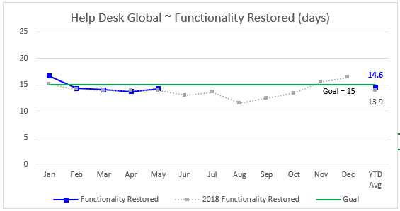
I am totally new to Power BI. I am trying to move/replicate charts that are used for a dashboard, that are currently produced in Excel. In Excel I can have the monthly data laid out in columns titled Jan - Dec with a 13th column named Avg and have this contain a YTD average which is then displayed to the right of the monthly section on the chart. Here is the Excel chart:
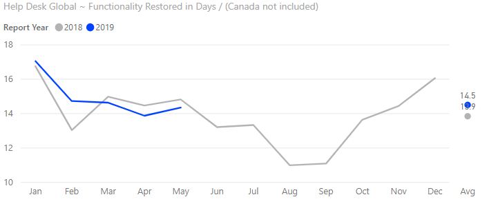
I'd like to do the same in Power BI but can't figure out how to get the data into the same chart in its own space to the right. I did create two charts in Power BI I placed them side-by-side, I would like a single chart with the monthly data and the YTD avg displayed. Here are how the two charts look in Power BI:
Again, these are two separate charts, with data for both current and previous year, and I need to put them into one chart. I need to recreate this for about 40 different data sets/charts to go into a final dashboard.
Thank you in advance for any suggestions!
- Mark as New
- Bookmark
- Subscribe
- Mute
- Subscribe to RSS Feed
- Permalink
- Report Inappropriate Content
Hi @DSKinCO
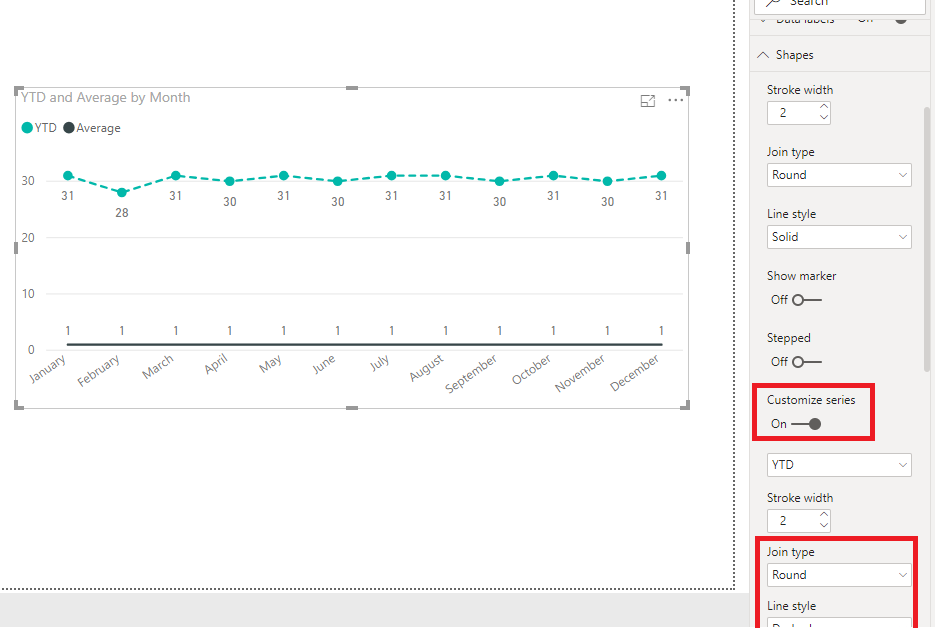
It seems you may create two measures and drag them to values of line chart.Then modify the 'shapes' as below.Attached a simplified sample file.
YTD = TOTALYTD(SUM('Table'[Value]),'Table'[Date])
Regards,
If this post helps, then please consider Accept it as the solution to help the other members find it more quickly.
- Mark as New
- Bookmark
- Subscribe
- Mute
- Subscribe to RSS Feed
- Permalink
- Report Inappropriate Content
Thank for responding but sorry, this is not what I am looking to do. I am not looking to have a point on the main part of the chart for YTD for each month. If you look at the Excel chart I included, you will see a single pair of plotted points off to the far right of the chart. This is the YTD averages for the two years plotted, and where I want them. The Chart shown form Power BI is actually two charts one for the main data and one for the YTD Averages for the two years. I'd like to know how I can combined these into one chart instead of overlaying two charts in Power BI.
- Mark as New
- Bookmark
- Subscribe
- Mute
- Subscribe to RSS Feed
- Permalink
- Report Inappropriate Content
Hi @DSKinCO
Here are a couple of decent articles on forecasting models in Power BI.
https://powerbi.microsoft.com/en-us/blog/describing-the-forecasting-models-in-power-view/
Regards,
If this post helps, then please consider Accept it as the solution to help the other members find it more quickly.
Helpful resources

Microsoft Fabric Learn Together
Covering the world! 9:00-10:30 AM Sydney, 4:00-5:30 PM CET (Paris/Berlin), 7:00-8:30 PM Mexico City

Power BI Monthly Update - April 2024
Check out the April 2024 Power BI update to learn about new features.

| User | Count |
|---|---|
| 113 | |
| 99 | |
| 80 | |
| 70 | |
| 59 |
| User | Count |
|---|---|
| 149 | |
| 114 | |
| 107 | |
| 89 | |
| 67 |


