- Power BI forums
- Updates
- News & Announcements
- Get Help with Power BI
- Desktop
- Service
- Report Server
- Power Query
- Mobile Apps
- Developer
- DAX Commands and Tips
- Custom Visuals Development Discussion
- Health and Life Sciences
- Power BI Spanish forums
- Translated Spanish Desktop
- Power Platform Integration - Better Together!
- Power Platform Integrations (Read-only)
- Power Platform and Dynamics 365 Integrations (Read-only)
- Training and Consulting
- Instructor Led Training
- Dashboard in a Day for Women, by Women
- Galleries
- Community Connections & How-To Videos
- COVID-19 Data Stories Gallery
- Themes Gallery
- Data Stories Gallery
- R Script Showcase
- Webinars and Video Gallery
- Quick Measures Gallery
- 2021 MSBizAppsSummit Gallery
- 2020 MSBizAppsSummit Gallery
- 2019 MSBizAppsSummit Gallery
- Events
- Ideas
- Custom Visuals Ideas
- Issues
- Issues
- Events
- Upcoming Events
- Community Blog
- Power BI Community Blog
- Custom Visuals Community Blog
- Community Support
- Community Accounts & Registration
- Using the Community
- Community Feedback
Register now to learn Fabric in free live sessions led by the best Microsoft experts. From Apr 16 to May 9, in English and Spanish.
- Power BI forums
- Forums
- Get Help with Power BI
- Desktop
- Re: Histogram with Dynamic Bins
- Subscribe to RSS Feed
- Mark Topic as New
- Mark Topic as Read
- Float this Topic for Current User
- Bookmark
- Subscribe
- Printer Friendly Page
- Mark as New
- Bookmark
- Subscribe
- Mute
- Subscribe to RSS Feed
- Permalink
- Report Inappropriate Content
Histogram with Dynamic Bins
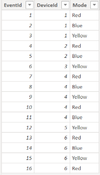
I have a table with a granularity of one row per event. It looks something like this:
I would like to create a histogram where the x-axis is number of events and the y-axis is the number of devices that experienced that number of events. For example, let's say the table in my screenshot is unfiltered. DeviceId 4 had the highest number of events at 5, and DeviceIds 3 and 5 had the lowest number of events at 1. Thus the x-axis would run from 1-5. Let's also say the bin size/width is 1. 1 device had 5 events, so the height of bin5 would be 1. 2 devices had 1 event, so the height of bin 1 would be 2.
Where I'm stuck: I'd like to include a slicer for the Mode column.
If it weren't for this requirement, I would create a calculated table with a row for each DeviceId and a column for NumberOfEvents. Then I could make NumberOfEvents (or possibly a group/bin field based on NumberOfEvents) the x-axis for my histogram and the y-axis the count of DeviceId in my calculated table. However, calculated tables don't respond to slicers.
I have thought about making a calculated table for each mode. That would require many tables and I'm not sure how to make my histogram interact with the correct table depending on the slicer selection.
Solved! Go to Solution.
- Mark as New
- Bookmark
- Subscribe
- Mute
- Subscribe to RSS Feed
- Permalink
- Report Inappropriate Content
Hi , @tonysantangelo
According to your description, On your X axis, you want to put the minimum to maximum number of events where the deviceid exists, and then display the number of devices corresponding to the corresponding number on the Y axis.
Here are the steps you can refer to :
(1)My test data is the same as yours.
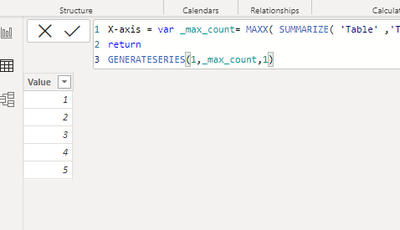
(2)We can click "New Table " to create a table as x-axis value:
X-axis = var _max_count= MAXX( SUMMARIZE( 'Table' ,'Table'[DeviceId] , "count" , COUNT('Table'[EventId])) , [count])
return
GENERATESERIES(1,_max_count,1)
(3)Then we can create a measure :
Measure = var _t = SUMMARIZE( 'Table' ,'Table'[DeviceId] , "count" , COUNT('Table'[EventId]))
var _max_value = MAXX(_t,[count])
var _min_value =  MINX(_t , [count])
var _count = MAX('X-axis'[Value])
var _value = COUNTROWS( FILTER(_t, [count]=_count))
return
IF(_count>=_min_value && _count<= _max_value ,_value+0, BLANK() )
(4)Then we can put the fields we need on the visual and we can meet your need:
If this method does not meet your needs, you can provide us with your special sample data and the desired output sample data in the form of tables, so that we can better help you solve the problem.
Thank you for your time and sharing, and thank you for your support and understanding of PowerBI!
Best Regards,
Aniya Zhang
If this post helps, then please consider Accept it as the solution to help the other members find it more quickly
- Mark as New
- Bookmark
- Subscribe
- Mute
- Subscribe to RSS Feed
- Permalink
- Report Inappropriate Content
Awesome work! I think I need to get better at using SUMMARIZE in the future. I made some tiny tweaks for my final measure. When I sliced by Mode my histogram didn't include number of devices with 0 events, which there are no such devices until I slice. I changed the X-axis table definition to start at 0 instead of 1. Then I noticed that the y-axis measure didn't respond to me binning the X-axis values. I followed this article to tweak the y-axis measure accordingly. https://radacad.com/dynamic-banding-or-grouping-in-power-bi-using-dax-measures-choose-the-count-of-b...
- Mark as New
- Bookmark
- Subscribe
- Mute
- Subscribe to RSS Feed
- Permalink
- Report Inappropriate Content
Replying to myself to add an additional requirement: My table also has a column for EventDate, and I need my histogram to respond to an EventDate slicer. Why is that relevant? I figured out that a solution to my original post would be to create a calculated table with a row per device and columns for number of events with each mode. Then I could use a field parameter for the user to switch between modes. However, this idea does not work with the additional date slicer because I can't feasibly create a column for each combination of mode + date range.
Helpful resources

Microsoft Fabric Learn Together
Covering the world! 9:00-10:30 AM Sydney, 4:00-5:30 PM CET (Paris/Berlin), 7:00-8:30 PM Mexico City

Power BI Monthly Update - April 2024
Check out the April 2024 Power BI update to learn about new features.

| User | Count |
|---|---|
| 108 | |
| 98 | |
| 79 | |
| 66 | |
| 60 |
| User | Count |
|---|---|
| 148 | |
| 113 | |
| 97 | |
| 84 | |
| 67 |


