- Power BI forums
- Updates
- News & Announcements
- Get Help with Power BI
- Desktop
- Service
- Report Server
- Power Query
- Mobile Apps
- Developer
- DAX Commands and Tips
- Custom Visuals Development Discussion
- Health and Life Sciences
- Power BI Spanish forums
- Translated Spanish Desktop
- Power Platform Integration - Better Together!
- Power Platform Integrations (Read-only)
- Power Platform and Dynamics 365 Integrations (Read-only)
- Training and Consulting
- Instructor Led Training
- Dashboard in a Day for Women, by Women
- Galleries
- Community Connections & How-To Videos
- COVID-19 Data Stories Gallery
- Themes Gallery
- Data Stories Gallery
- R Script Showcase
- Webinars and Video Gallery
- Quick Measures Gallery
- 2021 MSBizAppsSummit Gallery
- 2020 MSBizAppsSummit Gallery
- 2019 MSBizAppsSummit Gallery
- Events
- Ideas
- Custom Visuals Ideas
- Issues
- Issues
- Events
- Upcoming Events
- Community Blog
- Power BI Community Blog
- Custom Visuals Community Blog
- Community Support
- Community Accounts & Registration
- Using the Community
- Community Feedback
Register now to learn Fabric in free live sessions led by the best Microsoft experts. From Apr 16 to May 9, in English and Spanish.
- Power BI forums
- Forums
- Get Help with Power BI
- Desktop
- Re: Highlighting red for oversubscribed and green ...
- Subscribe to RSS Feed
- Mark Topic as New
- Mark Topic as Read
- Float this Topic for Current User
- Bookmark
- Subscribe
- Printer Friendly Page
- Mark as New
- Bookmark
- Subscribe
- Mute
- Subscribe to RSS Feed
- Permalink
- Report Inappropriate Content
Highlighting red for oversubscribed and green for under subscribed
Hi everyone,
I've created a Matrix that shows a Resource(employees name), the date and how much work an employee has been allocated.
However, the Matrix also needs to be colour coded to show when a Resource has been allocated more than their availability (part-time, full-time, etc) and when an employee has not been allocated enough work. (Red for overworked and green for underworked).
I'm struggling to do this since a person can be working on more than one project at a time and projects have different start and end dates.
Below is some sample data that I've been using. Please note in the real model the table below was created using a CrossJoin.
Below is the desired output but also needs to include the colour green.
Hope the above all made sense 🙂
Below is a link to the Power BI report
https://1drv.ms/u/s!ApYdg6ECJ7QzbnpwM20cR6nuGqE
Looking forward to any advice.
Regards,
PeteGen
- Mark as New
- Bookmark
- Subscribe
- Mute
- Subscribe to RSS Feed
- Permalink
- Report Inappropriate Content
Hi @PeteGen
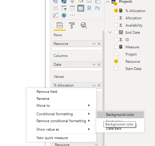
Create a measure
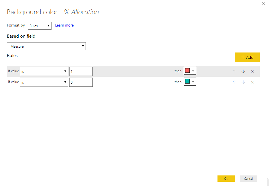
Measure = IF(MAX(Projects[Allocation])>MAX(Projects[Availability ]),1,IF(MAX(Projects[Allocation])<MAX(Projects[Availability ]),0))
Remove all conditional formatting,
then add new conditional formatting.
Best Regards
Maggie
Community Support Team _ Maggie Li
If this post helps, then please consider Accept it as the solution to help the other members find it more quickly.
- Mark as New
- Bookmark
- Subscribe
- Mute
- Subscribe to RSS Feed
- Permalink
- Report Inappropriate Content
Hi @v-juanli-msft thanks for your reply. I tried out your solution and had moderate success. The problem I’m facing is that someone maybe working fulltime, partime, etc with the Availability of 1, 0.8, etc but may have been allocated portions of different projects which is greater than their availability.
For example, Nick has the availability of 0.8
And has been allocated 0.3 to a MultiMedia Project which starts on 17/03/2019 and ends on the 25/06/2019.
Nick has also been allocated 0.5 to a WoodWork project which starts on 19/05/2019 and ends on the 14/07/2019.
Nick has also been allocated 0.4 to a MetalWork project which starts on 2/06/2019 and ends on the 26/09/2019.
So, Nick has a total of 1.2 allocated to him which is above his 0.8 availability. As his WoodWork project starts before the MultiMedia project has finished, same with the MetalWork project starting before the WoodWork project has finished. Even when one project finishes Nick’s allocation is either equal to his availability or just over.
When I tried your solution Nick would come up is under allocated since it was only looking at one date. Ideally the dates of the matrix should be the first of each month instead of each day.
I've created a new Power BI report with data which is very similar to what I'm using at work. As I feel that the previous Power BI report I posted lacked detail.
The Power BI link is below:
https://1drv.ms/u/s!ApYdg6ECJ7QzcEQ0mQPtd1pIdXw
I’m looking forward to hearing from you 🙂
Helpful resources

Microsoft Fabric Learn Together
Covering the world! 9:00-10:30 AM Sydney, 4:00-5:30 PM CET (Paris/Berlin), 7:00-8:30 PM Mexico City

Power BI Monthly Update - April 2024
Check out the April 2024 Power BI update to learn about new features.

| User | Count |
|---|---|
| 109 | |
| 98 | |
| 80 | |
| 64 | |
| 57 |
| User | Count |
|---|---|
| 145 | |
| 111 | |
| 92 | |
| 84 | |
| 66 |


