- Power BI forums
- Updates
- News & Announcements
- Get Help with Power BI
- Desktop
- Service
- Report Server
- Power Query
- Mobile Apps
- Developer
- DAX Commands and Tips
- Custom Visuals Development Discussion
- Health and Life Sciences
- Power BI Spanish forums
- Translated Spanish Desktop
- Power Platform Integration - Better Together!
- Power Platform Integrations (Read-only)
- Power Platform and Dynamics 365 Integrations (Read-only)
- Training and Consulting
- Instructor Led Training
- Dashboard in a Day for Women, by Women
- Galleries
- Community Connections & How-To Videos
- COVID-19 Data Stories Gallery
- Themes Gallery
- Data Stories Gallery
- R Script Showcase
- Webinars and Video Gallery
- Quick Measures Gallery
- 2021 MSBizAppsSummit Gallery
- 2020 MSBizAppsSummit Gallery
- 2019 MSBizAppsSummit Gallery
- Events
- Ideas
- Custom Visuals Ideas
- Issues
- Issues
- Events
- Upcoming Events
- Community Blog
- Power BI Community Blog
- Custom Visuals Community Blog
- Community Support
- Community Accounts & Registration
- Using the Community
- Community Feedback
Register now to learn Fabric in free live sessions led by the best Microsoft experts. From Apr 16 to May 9, in English and Spanish.
- Power BI forums
- Forums
- Get Help with Power BI
- Desktop
- Re: Highlight selected bar in a column chart
- Subscribe to RSS Feed
- Mark Topic as New
- Mark Topic as Read
- Float this Topic for Current User
- Bookmark
- Subscribe
- Printer Friendly Page
- Mark as New
- Bookmark
- Subscribe
- Mute
- Subscribe to RSS Feed
- Permalink
- Report Inappropriate Content
Highlight selected bar in a column chart
Hi All,
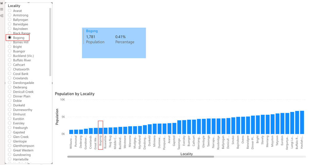
I have got a column chart with 79 geographies and a slicer with the 79 geographies. The column chart is not dependent on the slicer however there are other visualisations in the page that are dependent on the slicer.
What I would to achieve is when I select a specific geography in the slicer the bar that corresponds to that selected geography should be highlighted (i.e. a different colour fill). Can someone please let me know if it is possible to achieve.
Please see below the screenshot and also link to the .pbix file for your reference.
https://1drv.ms/u/s!AubIV2PXG9p4gqhykbbmeMfFYlChCw?e=w6UABf
Thank you.
Solved! Go to Solution.
- Mark as New
- Bookmark
- Subscribe
- Mute
- Subscribe to RSS Feed
- Permalink
- Report Inappropriate Content
@PVS07 , not sure what is wrong. I tried the same stuff on a new page it is working. Check page 2
Microsoft Power BI Learning Resources, 2023 !!
Learn Power BI - Full Course with Dec-2022, with Window, Index, Offset, 100+ Topics !!
Did I answer your question? Mark my post as a solution! Appreciate your Kudos !! Proud to be a Super User! !!
- Mark as New
- Bookmark
- Subscribe
- Mute
- Subscribe to RSS Feed
- Permalink
- Report Inappropriate Content
hi @PVS07 we have created a solution to this using dax .
Please check our latest blog on this :
https://www.beinex.com/blog/dynamic-highlight-bar-chart-with-slicer/
- Mark as New
- Bookmark
- Subscribe
- Mute
- Subscribe to RSS Feed
- Permalink
- Report Inappropriate Content
I have found this great solution posted on YouTube today (8 Oct 2020) by Patrick from "Guy in a Cube" channel that shows how to conditionally highlight a bar in a Power BI Report. Check it at https://www.youtube.com/watch?v=L2GnAfpsO2k
- Mark as New
- Bookmark
- Subscribe
- Mute
- Subscribe to RSS Feed
- Permalink
- Report Inappropriate Content
@PVS07 , in case you are not using legend and only using one measure you will be able to see conditional formatting.
You have created an independent slicer. Not coming from the table or joined to the table
create a color meausre like given below and use that in conditional formatting with "Field value" option
if(FIRSTNONBLANK(Table[locality],"true")= selectedvalue(locality[locality],"green","blue")
https://radacad.com/dax-and-conditional-formatting-better-together-find-the-biggest-and-smallest-num...
https://docs.microsoft.com/en-us/power-bi/desktop-conditional-table-formatting#color-by-color-values
Microsoft Power BI Learning Resources, 2023 !!
Learn Power BI - Full Course with Dec-2022, with Window, Index, Offset, 100+ Topics !!
Did I answer your question? Mark my post as a solution! Appreciate your Kudos !! Proud to be a Super User! !!
- Mark as New
- Bookmark
- Subscribe
- Mute
- Subscribe to RSS Feed
- Permalink
- Report Inappropriate Content
Hi @amitchandak,
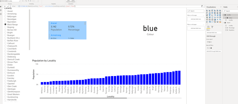
I have followed your instructions and created a new table with only the locality column. I have used this column for the slicer. However after I created a new measure using your formula it did not work. Can you please let me know what am I doing wrong? Thanks a ton for your assistance.
My formula -
Here is the link for the updated .pbix file - https://1drv.ms/u/s!AubIV2PXG9p4gqhykbbmeMfFYlChCw?e=w6UABf
- Mark as New
- Bookmark
- Subscribe
- Mute
- Subscribe to RSS Feed
- Permalink
- Report Inappropriate Content
@PVS07 , not sure what is wrong. I tried the same stuff on a new page it is working. Check page 2
Microsoft Power BI Learning Resources, 2023 !!
Learn Power BI - Full Course with Dec-2022, with Window, Index, Offset, 100+ Topics !!
Did I answer your question? Mark my post as a solution! Appreciate your Kudos !! Proud to be a Super User! !!
- Mark as New
- Bookmark
- Subscribe
- Mute
- Subscribe to RSS Feed
- Permalink
- Report Inappropriate Content
Hello
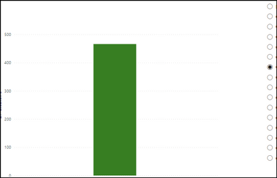
I followed what you did. When I select a modality at the filter level, only one bar is displayed. how to solve this ? Thanks
- Mark as New
- Bookmark
- Subscribe
- Mute
- Subscribe to RSS Feed
- Permalink
- Report Inappropriate Content
Hi @amitchandak,
Thanks a lot for the quick response and solution. Greatly appreciated.
I checked your version on Page 2 and my version with the solution that you provided initially, they both were same but for some reason it wasn't working. I removed the chart and slicer and redid it, Voilà it worked.
You are a champ. Thank you.
- Mark as New
- Bookmark
- Subscribe
- Mute
- Subscribe to RSS Feed
- Permalink
- Report Inappropriate Content
@PVS07 - Not if it is the same column in the slicer and the column chart. You would need a disconnected table for your slicer. The reason is that if you turned off interactions, the visual has lost all reference to what is selected in the slicer, you basically can't figure it out. With a separate table you can. Now, this would like mean vast changes for your other visuals obviously.
But, if you had this disconnected table, you could theoretically do it by using the default color "fx" to determine the color of the column by comparing if the column matched the slicer value.
@ me in replies or I'll lose your thread!!!
Instead of a Kudo, please vote for this idea
Become an expert!: Enterprise DNA
External Tools: MSHGQM
YouTube Channel!: Microsoft Hates Greg
Latest book!: The Definitive Guide to Power Query (M)
DAX is easy, CALCULATE makes DAX hard...
Helpful resources

Microsoft Fabric Learn Together
Covering the world! 9:00-10:30 AM Sydney, 4:00-5:30 PM CET (Paris/Berlin), 7:00-8:30 PM Mexico City

Power BI Monthly Update - April 2024
Check out the April 2024 Power BI update to learn about new features.

| User | Count |
|---|---|
| 113 | |
| 99 | |
| 75 | |
| 73 | |
| 49 |
| User | Count |
|---|---|
| 146 | |
| 108 | |
| 106 | |
| 90 | |
| 62 |


