- Power BI forums
- Updates
- News & Announcements
- Get Help with Power BI
- Desktop
- Service
- Report Server
- Power Query
- Mobile Apps
- Developer
- DAX Commands and Tips
- Custom Visuals Development Discussion
- Health and Life Sciences
- Power BI Spanish forums
- Translated Spanish Desktop
- Power Platform Integration - Better Together!
- Power Platform Integrations (Read-only)
- Power Platform and Dynamics 365 Integrations (Read-only)
- Training and Consulting
- Instructor Led Training
- Dashboard in a Day for Women, by Women
- Galleries
- Community Connections & How-To Videos
- COVID-19 Data Stories Gallery
- Themes Gallery
- Data Stories Gallery
- R Script Showcase
- Webinars and Video Gallery
- Quick Measures Gallery
- 2021 MSBizAppsSummit Gallery
- 2020 MSBizAppsSummit Gallery
- 2019 MSBizAppsSummit Gallery
- Events
- Ideas
- Custom Visuals Ideas
- Issues
- Issues
- Events
- Upcoming Events
- Community Blog
- Power BI Community Blog
- Custom Visuals Community Blog
- Community Support
- Community Accounts & Registration
- Using the Community
- Community Feedback
Register now to learn Fabric in free live sessions led by the best Microsoft experts. From Apr 16 to May 9, in English and Spanish.
- Power BI forums
- Forums
- Get Help with Power BI
- Desktop
- Re: Highlight percentage if it exceeds target in l...
- Subscribe to RSS Feed
- Mark Topic as New
- Mark Topic as Read
- Float this Topic for Current User
- Bookmark
- Subscribe
- Printer Friendly Page
- Mark as New
- Bookmark
- Subscribe
- Mute
- Subscribe to RSS Feed
- Permalink
- Report Inappropriate Content
Highlight percentage if it exceeds target in line charts
Hi Masters ,
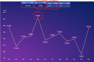
I am working on some line chart graphs and it needs some business requirement like if percentage value exceeds the target then that specific marker point needs to be highlighted .
Here in the graph we can see the target is 20% , but May month exceeds the limit , so here we have to give some benchmark as the target exceeds this place .
It may differ from year slicers , so whenever it exceeds then we have to highlight it in someway .
Please help me to sort this point ..
TIA
Dinesh
- Mark as New
- Bookmark
- Subscribe
- Mute
- Subscribe to RSS Feed
- Permalink
- Report Inappropriate Content
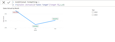
create a measure for conditional formatting indicator and use them in conditional formatting of values formatting option to set the colors,
Thanks,
Arul
- Mark as New
- Bookmark
- Subscribe
- Mute
- Subscribe to RSS Feed
- Permalink
- Report Inappropriate Content
Hi @Arul
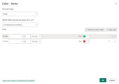
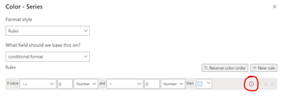
Thanks for your reply , i tried the same but in conditional formatting on my side having 2 conditions like greater than and less than , so in that case it is not exactly a good result coming . from your screen it shows only one condition to select numbers .. below attached the scene ..
Red circle has some errors like logic issue ..
Please hlep on this ..
TIA
Dinesh
- Mark as New
- Bookmark
- Subscribe
- Mute
- Subscribe to RSS Feed
- Permalink
- Report Inappropriate Content
Please share your conditions I will try.
Thanks,
Arul
- Mark as New
- Bookmark
- Subscribe
- Mute
- Subscribe to RSS Feed
- Permalink
- Report Inappropriate Content
@Arul Target is 20% , so if the line chart exceeds 20% target then the values should be highlighted . so we tried conditional formatting measure and trying to set the rule in data lables color . but it is not working properly .
Measure used --> conditional format = IF([Overdue %]>[KPI Target],1,0) and applied this in rules but not reflecting the result in line chart .
As of now i have used gridlines options instead of rules . but gridlines will not fix this issue as it will highlight whatever the lowest and highest value only not specifically 20% .
Is there anything needs to be changed in datatypes ?
- Mark as New
- Bookmark
- Subscribe
- Mute
- Subscribe to RSS Feed
- Permalink
- Report Inappropriate Content
Hi @dinesharivalaga ,
Have you tried conditional formatting on data labels? Here's a sample:
https://powerbidocs.com/2022/09/10/conditional-formatting-for-data-labels-in-power-bi/
Did I answer your question? Mark my post as a solution!
Proud to be a Super User!
"Tell me and I’ll forget; show me and I may remember; involve me and I’ll understand."
Need Power BI consultation, get in touch with me on LinkedIn or hire me on UpWork.
Learn with me on YouTube @DAXJutsu or follow my page on Facebook @DAXJutsuPBI.
Helpful resources

Microsoft Fabric Learn Together
Covering the world! 9:00-10:30 AM Sydney, 4:00-5:30 PM CET (Paris/Berlin), 7:00-8:30 PM Mexico City

Power BI Monthly Update - April 2024
Check out the April 2024 Power BI update to learn about new features.

| User | Count |
|---|---|
| 109 | |
| 96 | |
| 77 | |
| 66 | |
| 54 |
| User | Count |
|---|---|
| 144 | |
| 104 | |
| 102 | |
| 88 | |
| 63 |


