- Power BI forums
- Updates
- News & Announcements
- Get Help with Power BI
- Desktop
- Service
- Report Server
- Power Query
- Mobile Apps
- Developer
- DAX Commands and Tips
- Custom Visuals Development Discussion
- Health and Life Sciences
- Power BI Spanish forums
- Translated Spanish Desktop
- Power Platform Integration - Better Together!
- Power Platform Integrations (Read-only)
- Power Platform and Dynamics 365 Integrations (Read-only)
- Training and Consulting
- Instructor Led Training
- Dashboard in a Day for Women, by Women
- Galleries
- Community Connections & How-To Videos
- COVID-19 Data Stories Gallery
- Themes Gallery
- Data Stories Gallery
- R Script Showcase
- Webinars and Video Gallery
- Quick Measures Gallery
- 2021 MSBizAppsSummit Gallery
- 2020 MSBizAppsSummit Gallery
- 2019 MSBizAppsSummit Gallery
- Events
- Ideas
- Custom Visuals Ideas
- Issues
- Issues
- Events
- Upcoming Events
- Community Blog
- Power BI Community Blog
- Custom Visuals Community Blog
- Community Support
- Community Accounts & Registration
- Using the Community
- Community Feedback
Register now to learn Fabric in free live sessions led by the best Microsoft experts. From Apr 16 to May 9, in English and Spanish.
- Power BI forums
- Forums
- Get Help with Power BI
- Desktop
- Re: Highlight bar chart in tooltip page
- Subscribe to RSS Feed
- Mark Topic as New
- Mark Topic as Read
- Float this Topic for Current User
- Bookmark
- Subscribe
- Printer Friendly Page
- Mark as New
- Bookmark
- Subscribe
- Mute
- Subscribe to RSS Feed
- Permalink
- Report Inappropriate Content
Highlight bar chart in tooltip page
Hello
Currently I have a filled map, the filled areas are city's neighborhoods. When I hover over the neighborhood, I want to see its population bar highlighted among other neighborhood population bars in a bar chart.
The table I have has the following columns:
ZIP code || Neighborhood name || Population
However as I hover over the map, it only shows the filtered bar chart instead of highlight chart. I tried to "Edit Interactions" there is only "Filter" option, not "Highlight" option.
Thank you beforehand!
- Mark as New
- Bookmark
- Subscribe
- Mute
- Subscribe to RSS Feed
- Permalink
- Report Inappropriate Content
Thank you for your reply
I have looked at the guide and follow but it still does not work
- Mark as New
- Bookmark
- Subscribe
- Mute
- Subscribe to RSS Feed
- Permalink
- Report Inappropriate Content
Hi @Anonymous,
Please refer to the official documentation to ensure that my descriptions are not misleading.
Could you provide the output of your issue?
Could you see the 'highlight' option?
If possible, please provide pbix file after removing sensitive information and i will check in my environment.
Looking forward your reply. 😉
Best Regards,
Link
If this post helps then please consider Accept it as the solution to help the other members find it more quickly.
- Mark as New
- Bookmark
- Subscribe
- Mute
- Subscribe to RSS Feed
- Permalink
- Report Inappropriate Content
Hello,
Thank you for your help.
I have used "Highlight" option as connection from pie chart to bar chart.

When I click on the bar chart I choose "None" as connection from the bar chart with every other charts in the page. I have tried to change the "None" to "Filter" and "Highlight" mode as connection from bar chart to pie chart but it has not highlighted anything.
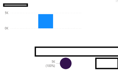
This is how it looks like when I hover my mouse over one neighborhood:
SInstead of the pie chart I have also tried with many different charts but still it doesn't change.
Best,
P-
- Mark as New
- Bookmark
- Subscribe
- Mute
- Subscribe to RSS Feed
- Permalink
- Report Inappropriate Content
Hi @Anonymous,
Sorry for delay reply.
Do you have the relevant data in your visuals?
Cross-highlighting is to Select a value in one visual highlights the related data in visuals such as column and bar charts.
You need to click it rather than hover on it.
Please refer:https://docs.microsoft.com/en-us/power-bi/consumer/end-user-interactions#cross-filtering-and-cross-highlighting
If you still have some question, please don't hesitate to let me known.
Best Regards,
Link
Is that the answer you're looking for? If this post helps, then please consider Accept it as the solution. Really appreciate!
- Mark as New
- Bookmark
- Subscribe
- Mute
- Subscribe to RSS Feed
- Permalink
- Report Inappropriate Content
Hi,
Yes the data are relevant. I took them from the same table, as mentioned in the first post.
This is not a normal page but a tooltip page for a map, so aside from hovering I don't have any other way to show this visualization.
BR,
P-
- Mark as New
- Bookmark
- Subscribe
- Mute
- Subscribe to RSS Feed
- Permalink
- Report Inappropriate Content
Hi @Anonymous,
It is not supported for tooltip page.
When a visual is being cross-highlighted in a report, report tooltips always show the cross-highlighted data, even if you're hovering over the faded section of the data point. In the following image, the mouse is hovering over the faded section of the bar graph (the section that is not highlighted), but the report tooltip still shows data for the highlighted portion of that datapoint (the highlighted data).
You can refer:
Best Regards,
Link
Is that the answer you're looking for? If this post helps, then please consider Accept it as the solution. Really appreciate!
- Mark as New
- Bookmark
- Subscribe
- Mute
- Subscribe to RSS Feed
- Permalink
- Report Inappropriate Content
Hi,
Thank you for your reply. I have to accept it as this.
BR,
P-
- Mark as New
- Bookmark
- Subscribe
- Mute
- Subscribe to RSS Feed
- Permalink
- Report Inappropriate Content
Hi @Anonymous,
If you only have a slicer and a bar chart, you are not able to highlight the section in bar chart.
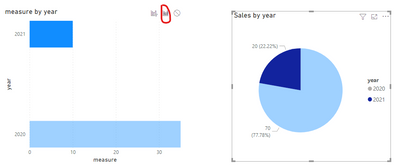
Create another pie chart using same fields that you use to create the bar chart.
Click on the pie chart, then turn on “Edit interactions” under Format ribbon.
This way, you will be able to choose “Highlight” in the bar chart.
For more details, please review the following example.
Best Regards,
Link
If this post helps then please consider Accept it as the solution to help the other members find it more quickly.
Helpful resources

Microsoft Fabric Learn Together
Covering the world! 9:00-10:30 AM Sydney, 4:00-5:30 PM CET (Paris/Berlin), 7:00-8:30 PM Mexico City

Power BI Monthly Update - April 2024
Check out the April 2024 Power BI update to learn about new features.

| User | Count |
|---|---|
| 111 | |
| 95 | |
| 77 | |
| 68 | |
| 54 |
| User | Count |
|---|---|
| 144 | |
| 105 | |
| 102 | |
| 89 | |
| 63 |


