- Power BI forums
- Updates
- News & Announcements
- Get Help with Power BI
- Desktop
- Service
- Report Server
- Power Query
- Mobile Apps
- Developer
- DAX Commands and Tips
- Custom Visuals Development Discussion
- Health and Life Sciences
- Power BI Spanish forums
- Translated Spanish Desktop
- Power Platform Integration - Better Together!
- Power Platform Integrations (Read-only)
- Power Platform and Dynamics 365 Integrations (Read-only)
- Training and Consulting
- Instructor Led Training
- Dashboard in a Day for Women, by Women
- Galleries
- Community Connections & How-To Videos
- COVID-19 Data Stories Gallery
- Themes Gallery
- Data Stories Gallery
- R Script Showcase
- Webinars and Video Gallery
- Quick Measures Gallery
- 2021 MSBizAppsSummit Gallery
- 2020 MSBizAppsSummit Gallery
- 2019 MSBizAppsSummit Gallery
- Events
- Ideas
- Custom Visuals Ideas
- Issues
- Issues
- Events
- Upcoming Events
- Community Blog
- Power BI Community Blog
- Custom Visuals Community Blog
- Community Support
- Community Accounts & Registration
- Using the Community
- Community Feedback
Register now to learn Fabric in free live sessions led by the best Microsoft experts. From Apr 16 to May 9, in English and Spanish.
- Power BI forums
- Forums
- Get Help with Power BI
- Desktop
- Highlight Maximum Deviation
- Subscribe to RSS Feed
- Mark Topic as New
- Mark Topic as Read
- Float this Topic for Current User
- Bookmark
- Subscribe
- Printer Friendly Page
- Mark as New
- Bookmark
- Subscribe
- Mute
- Subscribe to RSS Feed
- Permalink
- Report Inappropriate Content
Highlight Maximum Deviation
Hi,
On a line chart visual, "actual sales" and "target sales" are on Y-axis and "date" is on X-axis . On the secondary Y-axis, showing the "difference" (actual and target sales).
I have to highlight the highest "difference" ( with different colour/marker) on the chart.
Please help me out to achieve this.
Thanks
Solved! Go to Solution.
- Mark as New
- Bookmark
- Subscribe
- Mute
- Subscribe to RSS Feed
- Permalink
- Report Inappropriate Content
@jitpbi
First create a difference column between actual and target sales:
Diff=
VAR a = [actual sales]-[target sales]
Return
VALUE(RIGHT(a,LEN(a)- IFERROR(FIND("-",a),0)))
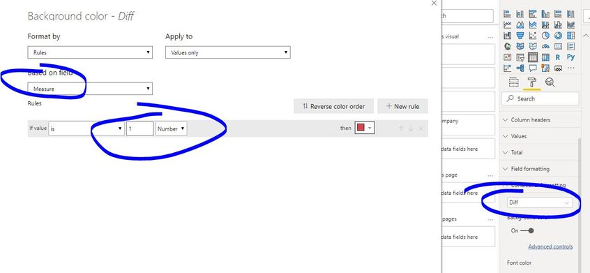
Then flag the highest difference with measure:
Measure = IF(SUM('Table'[Diff])=CALCULATE(MAX([Diff]),ALL('Table')),1,0)
Paul Zheng _ Community Support Team
If this post helps, then please consider Accept it as the solution to help the other members find it more quickly.
- Mark as New
- Bookmark
- Subscribe
- Mute
- Subscribe to RSS Feed
- Permalink
- Report Inappropriate Content
@jitpbi
Try like
FormatMeasure =
VAR MaxAmount = CALCULATE(MAXX(VALUES('Table'[Difference]),[Sales Amount]),ALL('Table'[Region]))
VAR LineAmonut = [Actual]
RETURN
SWITCH (
    TRUE(),
    LineAmonut = MaxAmount, "GREEN",
    LineAmonut = MinAmount, "RED"
)
________________________
Did I answer your question? Mark this post as a solution, this will help others!.
Click on the Thumbs-Up icon on the right if you like this reply 🙂
⭕ Subscribe and learn Power BI from these videos
⚪ Website ⚪ LinkedIn ⚪ PBI User Group
- Mark as New
- Bookmark
- Subscribe
- Mute
- Subscribe to RSS Feed
- Permalink
- Report Inappropriate Content
@jitpbi , I doubt conditional format work with more than one measure.
You can create two-measure highest and lowest difference and plot them with a marker .
use the idea used in -https://community.powerbi.com/t5/Community-Blog/Display-Label-Only-on-the-Last-Data-Point-of-the-Lin...
Microsoft Power BI Learning Resources, 2023 !!
Learn Power BI - Full Course with Dec-2022, with Window, Index, Offset, 100+ Topics !!
Did I answer your question? Mark my post as a solution! Appreciate your Kudos !! Proud to be a Super User! !!
Helpful resources

Microsoft Fabric Learn Together
Covering the world! 9:00-10:30 AM Sydney, 4:00-5:30 PM CET (Paris/Berlin), 7:00-8:30 PM Mexico City

Power BI Monthly Update - April 2024
Check out the April 2024 Power BI update to learn about new features.

| User | Count |
|---|---|
| 111 | |
| 95 | |
| 80 | |
| 68 | |
| 59 |
| User | Count |
|---|---|
| 150 | |
| 119 | |
| 104 | |
| 87 | |
| 67 |

