- Power BI forums
- Updates
- News & Announcements
- Get Help with Power BI
- Desktop
- Service
- Report Server
- Power Query
- Mobile Apps
- Developer
- DAX Commands and Tips
- Custom Visuals Development Discussion
- Health and Life Sciences
- Power BI Spanish forums
- Translated Spanish Desktop
- Power Platform Integration - Better Together!
- Power Platform Integrations (Read-only)
- Power Platform and Dynamics 365 Integrations (Read-only)
- Training and Consulting
- Instructor Led Training
- Dashboard in a Day for Women, by Women
- Galleries
- Community Connections & How-To Videos
- COVID-19 Data Stories Gallery
- Themes Gallery
- Data Stories Gallery
- R Script Showcase
- Webinars and Video Gallery
- Quick Measures Gallery
- 2021 MSBizAppsSummit Gallery
- 2020 MSBizAppsSummit Gallery
- 2019 MSBizAppsSummit Gallery
- Events
- Ideas
- Custom Visuals Ideas
- Issues
- Issues
- Events
- Upcoming Events
- Community Blog
- Power BI Community Blog
- Custom Visuals Community Blog
- Community Support
- Community Accounts & Registration
- Using the Community
- Community Feedback
Register now to learn Fabric in free live sessions led by the best Microsoft experts. From Apr 16 to May 9, in English and Spanish.
- Power BI forums
- Forums
- Get Help with Power BI
- Desktop
- Help with structure/calculations on the way to a P...
- Subscribe to RSS Feed
- Mark Topic as New
- Mark Topic as Read
- Float this Topic for Current User
- Bookmark
- Subscribe
- Printer Friendly Page
- Mark as New
- Bookmark
- Subscribe
- Mute
- Subscribe to RSS Feed
- Permalink
- Report Inappropriate Content
Help with structure/calculations on the way to a Pareto chart.
Hi. We have "test data" in rows. Each test has 36 factors (the columns) that can cause the test to fail.
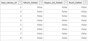
The raw data table, Test_Values, looks like this (this table is a data source in Power BI).
The test_details_id column relates to a table that provides some category & time structure.
Next, each factor has a formula which determines Pass/Fail so we've created a table, Test_Results, in Power Query to calculate failures. This table is basically a mirror of the Test_Values table and is related via the test_values_id.
The next step is a Pareto chart where each factor (column) represents a histogram bucket.
I've found many of the examples/questions in this forum and online, but none of them have this type of pass/fail data.
Here's where I need help...
- How do we calculate the pass/fail rates in a way that makes sense for the histogram buckets? Do I need to create 36 separate measures, one for each column?
- Is there an approach that will eventually make the cummulative line in the Perato simpler to calculate?
- Is there a better way to structure the data to accomplish the task? We completely control the structure.
Thank you! 🙌
- Mark as New
- Bookmark
- Subscribe
- Mute
- Subscribe to RSS Feed
- Permalink
- Report Inappropriate Content
Hi @Anonymous
1). In order to start I think you can structure the data, you have 36 factors columns, so you are thinking of creating 36 measures. Try to do the unpivot/mutirow of factor table data, so that you have just one factor value column and a factor attribute column for identification, now you can think of creating just 1 measure. Please let me know if this makes in order to start the structure and let me know if you require more details.
2). Second table already looks in good format.
3). mirror table I am not clear, seems you are creating out of first table, but not sure why you are doing that, need more details. I think
From data structure side, first try to create the vertical data in multirow format then, probably you will require a separate mapping tables to join Ids (although not necessary but it depends). If you have these data strucutre and calculations and creating visualization will be easier.
Let me know if above makes sense.
- Mark as New
- Bookmark
- Subscribe
- Mute
- Subscribe to RSS Feed
- Permalink
- Report Inappropriate Content
@mhossainThanks for the help! I'm very grateful. 👊
The unpivot idea makes perfect sense. It also helps me better explain the third table.
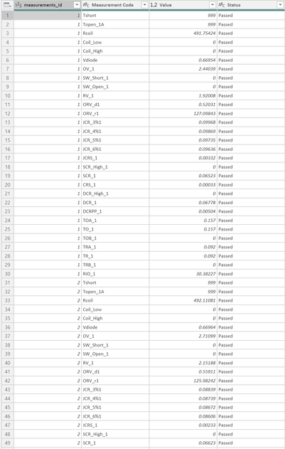
If I unpivot the first table it looks like this...
This structure makes a lot of sense. I'm starting to get a better database mindset instead of spreadsheet.
The third table is a "calculated table". Each Measurement_Code has a different forumula that represents PASS/FAIL. The third table had a column for each measurement showing if it failed.
For example, the Tshort formula is...
Tshort_Failed = RELATED(Test_Values[Tshort]) <> 999but the Rcoil is more complicated...
Rcoil_Failed = OR(RELATED(Test_Values[Rcoil]) < RELATED(Test_Details[Rcoil_min]), RELATED(Test_Values[Rcoil]) > RELATED(Test_Details[Rcoil_max]))
About 20 of the pass/fail calculations are the same as the Rcoil, reading the max/min out of the details table.
But, the other 15 are different logic like Tshort.
I think the ideal structure is to remove the Test_Results table completely and add a Measurement_Failed column to the unpivoted table but then I'm stuck on how to do the pass/fail calculations. Thoughts?
- Mark as New
- Bookmark
- Subscribe
- Mute
- Subscribe to RSS Feed
- Permalink
- Report Inappropriate Content
Hi @Anonymous
I think after the unpivoting we have multiple ways to solve, lets see the simple way which you already have created.
1). The main table you have alread done the unpivotting now, so you have measurement code and measure value in vertical format in rows basically.
2). Second table is good
3). 3rd table which you have already created in the powerquery for pass/fail, unpivot this table similar to 1st table, so you will have measurement code and pass/fail value similar structure to 1st table.
Finally --- Create a unique key with ID & measurement code in the 1st table, and Create a unique key with ID & measurement code in the 3rd table. And go to 1st table and using merge functionality bring the pass/fail column into the 1st table from 3rd table in powerquery window, or alternatively you can use lookupvalue to bring the pass/fail in 1st table outside powerquery window in the dax environment.
So now in the 1st table you have , measurement code, measurement value and pass/fail together. Please let me know if this makes sense, feel free to let me know for any details.
Other method will be, create 36 measures, seems factors are fixed. and once 36 measures are created, using switch function in DAX you will create a virtual range/table which will be used for the charts, like we do in excel for creating a dynamic charts, this will be little tricky.
- Mark as New
- Bookmark
- Subscribe
- Mute
- Subscribe to RSS Feed
- Permalink
- Report Inappropriate Content
Hi @mhossain,
Thanks to your help I was able to get a table that includes all the data.
Now I have Measurement table with thousands of rows ane repeating Measurement Codes.
Now I'm feeling really boneheaded because I can't figure out the next step.
I'm looking to make the clustered column chart showing the count of failures for each Measurement Code.
My redimentary thought is to create a measure for each Measurement Code.
Rcoil Fail Count =
CALCULATE(
    COUNTROWS(Measurement),
    Measurement[Measurement Code] = "Rcoil",
    Measurement[Status] = "failed"
)
Then drag all 30 of these onto a Clustered Columns chart.
I'm certain this is a bad approach.
Can you point me into the right direction again? I'm hoping there's one Measure that will do the aggregation I need.
Thanks!
- Mark as New
- Bookmark
- Subscribe
- Mute
- Subscribe to RSS Feed
- Permalink
- Report Inappropriate Content
Hi @Anonymous
Seems as per your new table creation, you don't require to create 30 measures for 'Fail' as you already have column Pass/Fail status in the table, I might be wrong, let's see:
Just create a measure
Fail Count =
CALCULATE(
COUNTROWS(Measurement),
Measurement[Status] = "failed"
)
Drag this measure to the value in cluster column chart, and in x axis bring the measurement column, sort the chart as per values/measures.
Please see if above makes sense, if not please explain more, or upload some sample data if possible, I can try.
And
- Mark as New
- Bookmark
- Subscribe
- Mute
- Subscribe to RSS Feed
- Permalink
- Report Inappropriate Content
I knew with 100% certainty that I was missing something simple there. 😃
I'm learning a lot. Thanks again @mhossain 👊
Now we're super close! The last bit is a cummulative failure percentage. I've tried following some of the examples on the forum and in stackoverflow and some blogs... but they all seem more complicated than necessary.
Here's the current setup.
The Failure Percentage is calculated like this...
Failure Percentage = DIVIDE(
    CALCULATE(
        COUNTROWS(Measurement),
        Measurement[Status] = "failed"
    ),
    [Failed]
)
Needed is the cummulative sum of the percentages.
It would look like (starting at the top)... 82.12%, 92.88%, 96.03%, etc.
I've tried a few things without success.
Do you have another simple solution?
Thank you!
- Mark as New
- Bookmark
- Subscribe
- Mute
- Subscribe to RSS Feed
- Permalink
- Report Inappropriate Content
Hi @Anonymous
Try this link https://www.daxpatterns.com/cumulative-total/
Please let me know if above link helps.
- Mark as New
- Bookmark
- Subscribe
- Mute
- Subscribe to RSS Feed
- Permalink
- Report Inappropriate Content
Hi @mhossain.
The challenge I face compared to all the examples out there is I don't have a table column to sort on. They all use an existing date column. I just want to sort on the max cumulative percentage.... which is already a calculated measure with can't be used in the MAX or MIN functions.
I was able to accomplish a chart that represents all the data by following this approach.
But it requires creating a new table and doesn't track any of the other filters on the page. It just remains a static representation of the full data.
- Mark as New
- Bookmark
- Subscribe
- Mute
- Subscribe to RSS Feed
- Permalink
- Report Inappropriate Content
@Anonymous , Not very clear to me
Histogram
https://www.youtube.com/watch?v=9kp2Nu_LuXg
https://appsource.microsoft.com/en-us/product/power-bi-visuals/WA104380776?mktcmpid=Pickitli&tab=Overview
https://powerbi.tips/2016/04/power-bi-histogram-with-bins/
pareto
https://www.youtube.com/watch?v=rlUBO5qoKow
https://powerbi.tips/2016/10/pareto-charting/
https://www.mssqltips.com/sqlservertip/6152/how-to-create-a-pareto-chart-in-power-bi-desktop/
Microsoft Power BI Learning Resources, 2023 !!
Learn Power BI - Full Course with Dec-2022, with Window, Index, Offset, 100+ Topics !!
Did I answer your question? Mark my post as a solution! Appreciate your Kudos !! Proud to be a Super User! !!
- Mark as New
- Bookmark
- Subscribe
- Mute
- Subscribe to RSS Feed
- Permalink
- Report Inappropriate Content
@amitchandakThanks for the response. I was afraid this was too much information to get an answer. I should have started smaller.
Can you help with this more simple version?
There is a table with 36 columns filled with TRUE/FALSE in the rows.
I want to create a bar chart where each bar represents the percent TRUE in a given column.
The only way I can think to make this happen is to create a measure for each column that does the percent true calculation.
(Count = True) / Count
But, this seems so inefficient. Being new to PowerBI I'm curious what might be a better way.
Helpful resources

Microsoft Fabric Learn Together
Covering the world! 9:00-10:30 AM Sydney, 4:00-5:30 PM CET (Paris/Berlin), 7:00-8:30 PM Mexico City

Power BI Monthly Update - April 2024
Check out the April 2024 Power BI update to learn about new features.

| User | Count |
|---|---|
| 113 | |
| 97 | |
| 85 | |
| 70 | |
| 61 |
| User | Count |
|---|---|
| 151 | |
| 121 | |
| 104 | |
| 87 | |
| 67 |


