- Power BI forums
- Updates
- News & Announcements
- Get Help with Power BI
- Desktop
- Service
- Report Server
- Power Query
- Mobile Apps
- Developer
- DAX Commands and Tips
- Custom Visuals Development Discussion
- Health and Life Sciences
- Power BI Spanish forums
- Translated Spanish Desktop
- Power Platform Integration - Better Together!
- Power Platform Integrations (Read-only)
- Power Platform and Dynamics 365 Integrations (Read-only)
- Training and Consulting
- Instructor Led Training
- Dashboard in a Day for Women, by Women
- Galleries
- Community Connections & How-To Videos
- COVID-19 Data Stories Gallery
- Themes Gallery
- Data Stories Gallery
- R Script Showcase
- Webinars and Video Gallery
- Quick Measures Gallery
- 2021 MSBizAppsSummit Gallery
- 2020 MSBizAppsSummit Gallery
- 2019 MSBizAppsSummit Gallery
- Events
- Ideas
- Custom Visuals Ideas
- Issues
- Issues
- Events
- Upcoming Events
- Community Blog
- Power BI Community Blog
- Custom Visuals Community Blog
- Community Support
- Community Accounts & Registration
- Using the Community
- Community Feedback
Register now to learn Fabric in free live sessions led by the best Microsoft experts. From Apr 16 to May 9, in English and Spanish.
- Power BI forums
- Forums
- Get Help with Power BI
- Desktop
- Help with graphing
- Subscribe to RSS Feed
- Mark Topic as New
- Mark Topic as Read
- Float this Topic for Current User
- Bookmark
- Subscribe
- Printer Friendly Page
- Mark as New
- Bookmark
- Subscribe
- Mute
- Subscribe to RSS Feed
- Permalink
- Report Inappropriate Content
Help with graphing
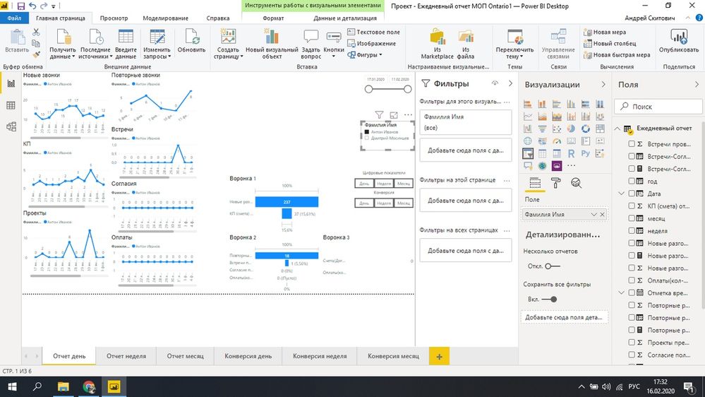
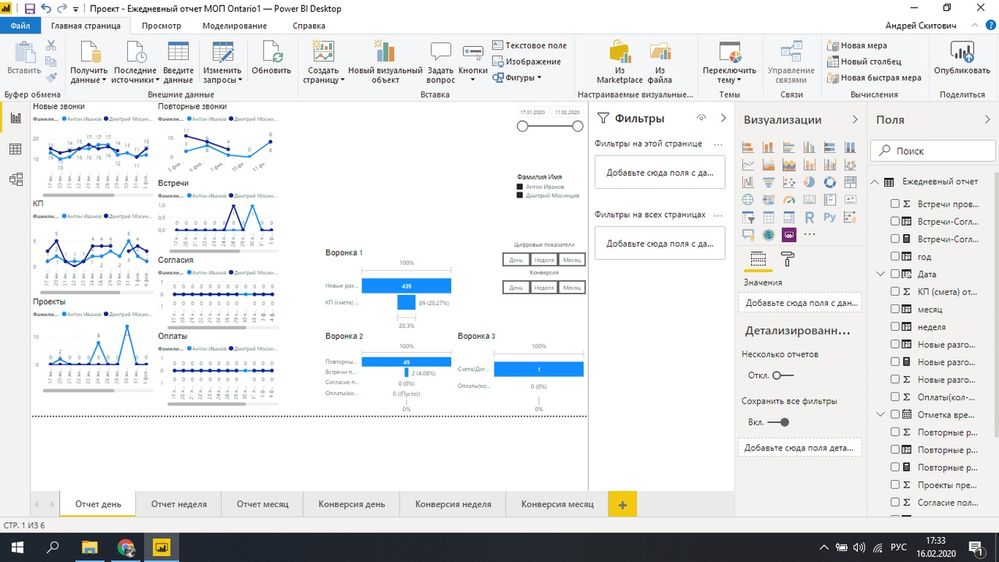
Good afternoon. I would be very grateful if you help with one question. In general, there are graphs shown in the first figure. When choosing a manager, only the selected manager is shown on the slice. When choosing two managers (Fig. 2), their comparison is shown. The question is this. How to make sure that their sum is displayed, that is, one line when no manager on the slice is selected. The slice is highlighted in the photo. I will be very grateful. I rack my brains for a long time.
Solved! Go to Solution.
- Mark as New
- Bookmark
- Subscribe
- Mute
- Subscribe to RSS Feed
- Permalink
- Report Inappropriate Content
Hi,
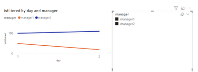
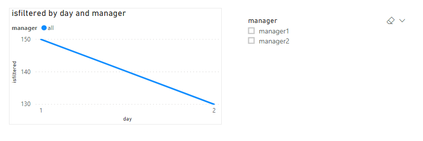
After trying some things i came up with a solution, I don't know if it's the best possible solution, but it seems to work for me.
First i added a new custom column to your existing table with managers, with all values being "all"
ifnotfiltered = "all"
Then I created a new table, with all the distinct managers and an extra row for "all":
filtertable = UNION(CALCULATETABLE(DISTINCT('Table'[manager])); ROW("manager"; "all"))
Then in the model window i created two relationships:
- 'filtertable'[manager] > 'Table'[Manager]
- 'filtertable'[manager] > 'Table'[ifnotfiltered]
Then create a measure that checks if the manager is filtered or not, if there is a filter we use the regular relationship, else we use the second relationship where the manager is "all"
isfiltered = if(ISFILTERED('Table'[manager]); CALCULATE(SUM('Table'[value]) ; USERELATIONSHIP('Table'[manager]; filtertable[manager])) ;CALCULATE( SUM('Table'[value]); USERELATIONSHIP('Table'[ifnotfiltered]; filtertable[manager])))
Use this measure as the Values of your charts. & it should be working.
note: Due to my regional settings I use ' ; ' instead of ' , ' so maybe you need to change the semicolons to comma's in your measures
- Mark as New
- Bookmark
- Subscribe
- Mute
- Subscribe to RSS Feed
- Permalink
- Report Inappropriate Content
Thanks. I will try and be sure to give feedback
- Mark as New
- Bookmark
- Subscribe
- Mute
- Subscribe to RSS Feed
- Permalink
- Report Inappropriate Content
Doesn't work. Send you a private message
Helpful resources

Microsoft Fabric Learn Together
Covering the world! 9:00-10:30 AM Sydney, 4:00-5:30 PM CET (Paris/Berlin), 7:00-8:30 PM Mexico City

Power BI Monthly Update - April 2024
Check out the April 2024 Power BI update to learn about new features.

| User | Count |
|---|---|
| 114 | |
| 99 | |
| 82 | |
| 70 | |
| 61 |
| User | Count |
|---|---|
| 149 | |
| 114 | |
| 107 | |
| 89 | |
| 67 |


