- Power BI forums
- Updates
- News & Announcements
- Get Help with Power BI
- Desktop
- Service
- Report Server
- Power Query
- Mobile Apps
- Developer
- DAX Commands and Tips
- Custom Visuals Development Discussion
- Health and Life Sciences
- Power BI Spanish forums
- Translated Spanish Desktop
- Power Platform Integration - Better Together!
- Power Platform Integrations (Read-only)
- Power Platform and Dynamics 365 Integrations (Read-only)
- Training and Consulting
- Instructor Led Training
- Dashboard in a Day for Women, by Women
- Galleries
- Community Connections & How-To Videos
- COVID-19 Data Stories Gallery
- Themes Gallery
- Data Stories Gallery
- R Script Showcase
- Webinars and Video Gallery
- Quick Measures Gallery
- 2021 MSBizAppsSummit Gallery
- 2020 MSBizAppsSummit Gallery
- 2019 MSBizAppsSummit Gallery
- Events
- Ideas
- Custom Visuals Ideas
- Issues
- Issues
- Events
- Upcoming Events
- Community Blog
- Power BI Community Blog
- Custom Visuals Community Blog
- Community Support
- Community Accounts & Registration
- Using the Community
- Community Feedback
Register now to learn Fabric in free live sessions led by the best Microsoft experts. From Apr 16 to May 9, in English and Spanish.
- Power BI forums
- Forums
- Get Help with Power BI
- Desktop
- Help with Percentage spent of a total budget over ...
- Subscribe to RSS Feed
- Mark Topic as New
- Mark Topic as Read
- Float this Topic for Current User
- Bookmark
- Subscribe
- Printer Friendly Page
- Mark as New
- Bookmark
- Subscribe
- Mute
- Subscribe to RSS Feed
- Permalink
- Report Inappropriate Content
Help with Percentage spent of a total budget over time, using a running total.
Hello all,
I am remaking this question as my last question was hard to follow. I tend to give wayyy too much information but if you wish to see that one too, here is the link.
I am trying to take a total dollar value, lets say $1000. I wish to display the $1000 the y axis and make it a percentage. So it should read 0-100%. On the x axis, I would like to show the date. Specifically, it will be a fiscal year. The data being graphed will be the total amount of the $1000 that is spent for each day that the data is loaded. The visual should look something like this: ***Ignore the 3 different lines (which are different budgets), I am trying for just one right now. Maybe more later***
My model overall has 16 Fields. I made some very simplified example data since this particular qustion can be done using at most 3. They are the 'Budget', 'Date Table', and 'Location'. They are pictured below, respectively.


Relationships are:
'Location'[Budget Name] --> ''Budget'[Name]
'Budget'[Date Loaded] --> 'Date Table'[Date]
Okay! I think that is enough without being too much. Please let me know if you have any questions.
-NoMy
***EDIT*** I think my issue is translating the running total to the graph. I am able to get the graph to show the correct percentage for the date, but not a running total from each day I load the data. I do have a running total messure. It is below:
- Mark as New
- Bookmark
- Subscribe
- Mute
- Subscribe to RSS Feed
- Permalink
- Report Inappropriate Content
@nmyre ,Can you share sample data and sample output in table format?
Microsoft Power BI Learning Resources, 2023 !!
Learn Power BI - Full Course with Dec-2022, with Window, Index, Offset, 100+ Topics !!
Did I answer your question? Mark my post as a solution! Appreciate your Kudos !! Proud to be a Super User! !!
- Mark as New
- Bookmark
- Subscribe
- Mute
- Subscribe to RSS Feed
- Permalink
- Report Inappropriate Content
I will try my best, but I am warning you it gets complicated. I am unable to use the real data set as some of it is for internal company reference and made public after the fact. I Made an excel document that is meant to represent the BI Visual, and then the 4 fields that are conncted with relationships. Please let me know if you cannot access it via this link. The goal: Make a line graph of the percentage of a total annual budget being spent over time. I need it to update every time I upload data. My initial thought is a running total. I will attempt a slow walk through the different sheets.
'Values (BI Visual Table)'
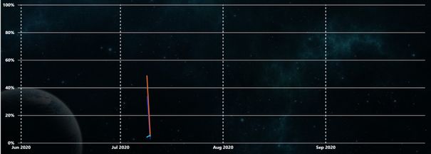
This is the table format of the sample output. Our internal vocabulary gets confusing. Total Annual Budget = Total Authority // Obs = Spent Money. The current line graph looks like this:
'Location (Table 1)'
Simply lists unique numbers for each store. A number, funds code, and city.
'Ob % per day_month (Date Table)'
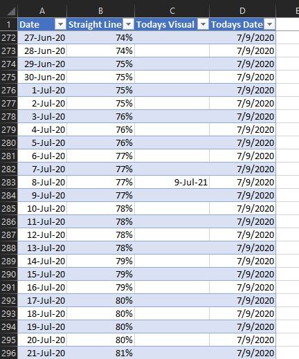
Looks like alot, but it really isn't. Just different ways to break out the dates. Such as quarter, percentage, months, and julian days. Column K-O are inserted functions. The [Todays Date] and [Todays Visual] are used to display the day in real time. The [Running column] was made and used in the model because otherwise the line graph would display the last amount to the end of the year. So if on July 10th the graph was at 55%, from July 10th to the end of the year would be a line at 55%. The [Obs running Column] is for a different visual.
'SOF ALL (Table 3)'
This is a simplified version of the daily spending. The [Load date] is the day I pull the data, [Store Number], [Funding Code], [Program], and [Invoice] are all unique identifiers for the money being spent. The [Total Authority] is determined by the store number, funding code, and program. The program is the lowes level of total budget determination. The [Obs] are simply how much was spent on that invoice.
'Key Measures (Table 4)'
This is table built to hold measures. The two used in the line graph are [Total Authority], which is calculating the sum of total authority. And Obs running, which is a running total of the money being spent.
Relationships are:
'Location'[Funding Code] --> 'SOF ALL'[Funding Code]
'Ob % per day_month'[Data Date] --> 'SOF ALL'[Load Date]
That should be enough to go off of. So I will again warn you, here is the complicated part (at least to me). The Visual Table's [Budget (Auth)] column splits the total budget. So if you add the like regions, it equals the total budget on the 'SOF ALL' table. The [Spent (Obs)] seems right... so an example: The visual table, 30 SW on July 9 has a total budget of $116,332,050 and of that, $96,889,049 is spent. So the total spent divided by the total budget should make the point for July 9th at 83% in the visual. And on the 10, the spent dollars goes up to $100,716,155. Divide that by the total budget and July 10ths point should be at 87%.
I am unsure if this helps or hinders... I am sorry, the model I am working in is massive. Let me know if you have further questions or how I can help.
-Nolan
Helpful resources

Microsoft Fabric Learn Together
Covering the world! 9:00-10:30 AM Sydney, 4:00-5:30 PM CET (Paris/Berlin), 7:00-8:30 PM Mexico City

Power BI Monthly Update - April 2024
Check out the April 2024 Power BI update to learn about new features.

| User | Count |
|---|---|
| 107 | |
| 98 | |
| 78 | |
| 66 | |
| 53 |
| User | Count |
|---|---|
| 144 | |
| 104 | |
| 100 | |
| 86 | |
| 64 |


