- Power BI forums
- Updates
- News & Announcements
- Get Help with Power BI
- Desktop
- Service
- Report Server
- Power Query
- Mobile Apps
- Developer
- DAX Commands and Tips
- Custom Visuals Development Discussion
- Health and Life Sciences
- Power BI Spanish forums
- Translated Spanish Desktop
- Power Platform Integration - Better Together!
- Power Platform Integrations (Read-only)
- Power Platform and Dynamics 365 Integrations (Read-only)
- Training and Consulting
- Instructor Led Training
- Dashboard in a Day for Women, by Women
- Galleries
- Community Connections & How-To Videos
- COVID-19 Data Stories Gallery
- Themes Gallery
- Data Stories Gallery
- R Script Showcase
- Webinars and Video Gallery
- Quick Measures Gallery
- 2021 MSBizAppsSummit Gallery
- 2020 MSBizAppsSummit Gallery
- 2019 MSBizAppsSummit Gallery
- Events
- Ideas
- Custom Visuals Ideas
- Issues
- Issues
- Events
- Upcoming Events
- Community Blog
- Power BI Community Blog
- Custom Visuals Community Blog
- Community Support
- Community Accounts & Registration
- Using the Community
- Community Feedback
Register now to learn Fabric in free live sessions led by the best Microsoft experts. From Apr 16 to May 9, in English and Spanish.
- Power BI forums
- Forums
- Get Help with Power BI
- Desktop
- Help with Line Chart & relationship of tables
- Subscribe to RSS Feed
- Mark Topic as New
- Mark Topic as Read
- Float this Topic for Current User
- Bookmark
- Subscribe
- Printer Friendly Page
- Mark as New
- Bookmark
- Subscribe
- Mute
- Subscribe to RSS Feed
- Permalink
- Report Inappropriate Content
Help with Line Chart & relationship of tables
Hello -
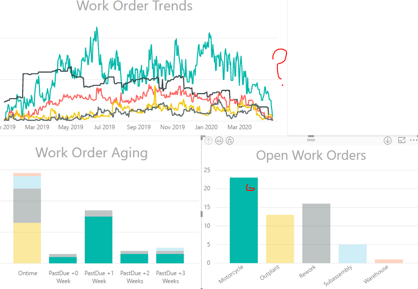
Entry lvl noob with power bi. however, I have some experience with ssms & excel. I have a datatable with work orders, where they start on a date and finish on a date. So this is my transaction table. I've also categorized all work orders into one of five flavors/categories. This has worked well to make simple charts. I wanted to make a trending report over the last two years or so, where on any given day, it will calculate open many open work orders were there on that day, and want a series for each flavor. To do this, I ended up making a new table (calendar) in power bi, where it has a row for every date, and then created a calculated column where I had to hardcode the flavor into the column and then setup a formula to calculate what work orders were open based on the row/day of the calendar. I repeated this for each flavor, and ended up with a reasonable looking line chart. However, after all this I ended up noticing a wrinkle, and these flavors/categories are divorced from all my other charts. I.E. when I click on one of the lines, it focus'es on that line but the other charts don't follow suit.
I need help with how to rework this so that they are not divorced. I am unable to setup a relationship since the calculated columns have hardcoded data. I split this calendar table which held all flavors, into a mini calendar for each flavor and this didn't help. I am sure I am doing this in a weird way, given I am new user. Finding this problem tough to google/youtube to find the proper training video. Any help would be greatly appreciated.
Nick
- Mark as New
- Bookmark
- Subscribe
- Mute
- Subscribe to RSS Feed
- Permalink
- Report Inappropriate Content
@Nicho247 ,The information you have provided is not making the problem clear to me. Can you please explain with an example.
But, I think this blog should help a bit: https://community.powerbi.com/t5/Community-Blog/HR-Analytics-Active-Employee-Hire-and-Termination-tr...
Microsoft Power BI Learning Resources, 2023 !!
Learn Power BI - Full Course with Dec-2022, with Window, Index, Offset, 100+ Topics !!
Did I answer your question? Mark my post as a solution! Appreciate your Kudos !! Proud to be a Super User! !!
- Mark as New
- Bookmark
- Subscribe
- Mute
- Subscribe to RSS Feed
- Permalink
- Report Inappropriate Content
Hello Amitchandak -
Thank you for the link. It is a step in the right direction. Unfortunately, it doesn't help me. My dataset is very similiar to what you have provided. Your final table is basically summarizing the # of current employees on a given date, over some period of time. I am doing the same thing, however I have multiple classifications/categories. So to extend this to your data set, I need the employees broken down by type of employee, e.g. hourly/salary, or worker/supervisor/manager, etc. The problem is how you store those separate totals of categories. E.G. a date column, a column of worker, a column of supervisor, a column of manager. The rows would be # of people employed on those days. Your formula would hardcode the category in the calculated column. This would prevent it from being related to other charts because there isn't a relatable column for categories. I may have to provide a picture due to my lack of proper power bi verbage. Let me know if help you understand my problem. By the way, going to try your current employees formula.
current employees = calculate(countx(filter(employee,employee[start date]<=max('date'[date]) && (Isblank(employee[end date]) || employee[end date]>max('date'[Date]))),(employee[employee id])))
This is what I was doing, and it is essentially a countifs in excel. In the current formula I made a specific table for "subassemblies", think of it as "supervisor" and it didn't work as hoped.
SubassemblyTrend =
COUNTROWS(
FILTER(
RELATEDTABLE(WKO),
WKO[RefAlias] = 'Subassembly'[RefAlias] &&
WKO[StartDate] <= 'Subassembly'[Date] &&
WKO[CompletedDate] >= 'Subassembly'[Date]
)
)
- Mark as New
- Bookmark
- Subscribe
- Mute
- Subscribe to RSS Feed
- Permalink
- Report Inappropriate Content
Here are two pictures. Unable to make a relationship to refalias (which is just a few categories/values). I'm assuming its how I made the calculated columns because I had to hardcode the categories to do the sum/counts. Now, on the graphs, I have selected the green color, and you can see in the trends graph all of hte colors are active. I would want only the green to be active.
- Mark as New
- Bookmark
- Subscribe
- Mute
- Subscribe to RSS Feed
- Permalink
- Report Inappropriate Content
HI @Nicho247
If possible, could you please share your sample pbix file for us have a test, that will be a great help.
Regards,
Lin
If this post helps, then please consider Accept it as the solution to help the other members find it more quickly.
- Mark as New
- Bookmark
- Subscribe
- Mute
- Subscribe to RSS Feed
- Permalink
- Report Inappropriate Content
Hello Lin -
I have now created a sample power bi file with some random data to replicate what I am doing with my databases. The raw data is referenced to an excel file unsure if you would need that as well so I can send both. The power BI problem is clearly demonstrated with the sample file. The aging and open WO charts are together, but the trending chart is not linked. I need help in figuring out how to link them and likely results in reworking how the trending chart is made. This is just a simple countifs that I would do in excel in a few minutes.
I just realized this forum prevents me from uploading attachments. Lame. Is there a mail feature inside forum or anything like that? I don't use onedrive.
- Mark as New
- Bookmark
- Subscribe
- Mute
- Subscribe to RSS Feed
- Permalink
- Report Inappropriate Content
hi @Nicho247
For example, you can upload it to OneDrive buiness and post the link here. Do mask sensitive data before uploading.
Regards,
Lin
If this post helps, then please consider Accept it as the solution to help the other members find it more quickly.
- Mark as New
- Bookmark
- Subscribe
- Mute
- Subscribe to RSS Feed
- Permalink
- Report Inappropriate Content
- Mark as New
- Bookmark
- Subscribe
- Mute
- Subscribe to RSS Feed
- Permalink
- Report Inappropriate Content
hi @Nicho247
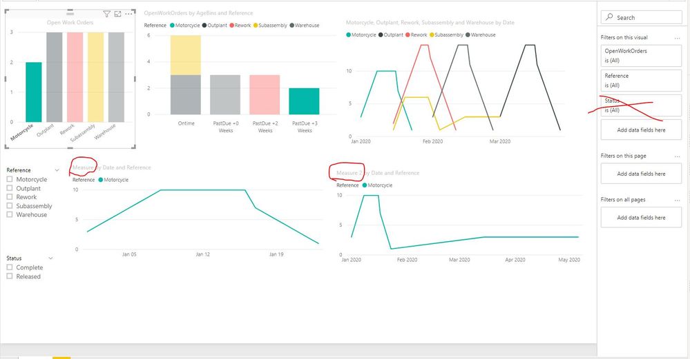
You need to create a measure instead of column for each "Reference" by this formula
Measure =
COUNTROWS(
    FILTER(
        GENERATE(WKO,WKOTrends),
        WKO[StartDate] <= WKOTrends[Date] &&
        WKO[CompletedDate] >= WKOTrends[Date]
    )
)
Measure 2 =
COUNTROWS(
FILTER(
GENERATE(WKO,WKOTrends),
WKO[StartDate] <= WKOTrends[Date] &&
IF(ISBLANK(WKO[CompletedDate]),TODAY(),WKO[CompletedDate]) >= WKOTrends[Date]
)
)
then create the visual by this measure and drag [Reference] into Legend of visual.
By the way, for you have add a visual level filter "Status" is "Released", it will pass this filter to line chart too. so I would suggest you add this filter into the measure as below not in visual level filter:
OpenWorkOrders = CALCULATE(COUNT(WKO[Reference]),FILTER(WKO,WKO[Status]="Released"))Result:
here is sample pbix file, please try it.
Regards,
Lin
If this post helps, then please consider Accept it as the solution to help the other members find it more quickly.
- Mark as New
- Bookmark
- Subscribe
- Mute
- Subscribe to RSS Feed
- Permalink
- Report Inappropriate Content
Hello Lin,
This did the trick. I needed to use generate & a measure. You were right on the additional note about the visual filter. Thank you, thank you, thank you!
Nick
- Mark as New
- Bookmark
- Subscribe
- Mute
- Subscribe to RSS Feed
- Permalink
- Report Inappropriate Content
Hi Lin - Great idea. It'll take me a little bit, have to make some sample data and re-create all the graphs.
- Mark as New
- Bookmark
- Subscribe
- Mute
- Subscribe to RSS Feed
- Permalink
- Report Inappropriate Content
Thanks. I'll check out the link. If it doesn't help, I elaborate a little further!
Nick
Helpful resources

Microsoft Fabric Learn Together
Covering the world! 9:00-10:30 AM Sydney, 4:00-5:30 PM CET (Paris/Berlin), 7:00-8:30 PM Mexico City

Power BI Monthly Update - April 2024
Check out the April 2024 Power BI update to learn about new features.

| User | Count |
|---|---|
| 112 | |
| 97 | |
| 84 | |
| 67 | |
| 60 |
| User | Count |
|---|---|
| 150 | |
| 120 | |
| 99 | |
| 87 | |
| 68 |


