- Power BI forums
- Updates
- News & Announcements
- Get Help with Power BI
- Desktop
- Service
- Report Server
- Power Query
- Mobile Apps
- Developer
- DAX Commands and Tips
- Custom Visuals Development Discussion
- Health and Life Sciences
- Power BI Spanish forums
- Translated Spanish Desktop
- Power Platform Integration - Better Together!
- Power Platform Integrations (Read-only)
- Power Platform and Dynamics 365 Integrations (Read-only)
- Training and Consulting
- Instructor Led Training
- Dashboard in a Day for Women, by Women
- Galleries
- Community Connections & How-To Videos
- COVID-19 Data Stories Gallery
- Themes Gallery
- Data Stories Gallery
- R Script Showcase
- Webinars and Video Gallery
- Quick Measures Gallery
- 2021 MSBizAppsSummit Gallery
- 2020 MSBizAppsSummit Gallery
- 2019 MSBizAppsSummit Gallery
- Events
- Ideas
- Custom Visuals Ideas
- Issues
- Issues
- Events
- Upcoming Events
- Community Blog
- Power BI Community Blog
- Custom Visuals Community Blog
- Community Support
- Community Accounts & Registration
- Using the Community
- Community Feedback
Register now to learn Fabric in free live sessions led by the best Microsoft experts. From Apr 16 to May 9, in English and Spanish.
- Power BI forums
- Forums
- Get Help with Power BI
- Desktop
- Re: Help with Chart set up
- Subscribe to RSS Feed
- Mark Topic as New
- Mark Topic as Read
- Float this Topic for Current User
- Bookmark
- Subscribe
- Printer Friendly Page
- Mark as New
- Bookmark
- Subscribe
- Mute
- Subscribe to RSS Feed
- Permalink
- Report Inappropriate Content
Help with Chart set up
Hey folks,
If you want to skip the context, my question is lower down in bold.
First and foremost, I have 0 experience with Power BI, database management, or report creation (outside of Excel). I've been tasked to take a large dataset (large here meaning an Excel file export of about 100,000 rows x 25 columns) and create a report out of it.
Power BI was recommended, and so far it's been pretty easy to use for importing data. But I'm on the part to create reports and I'm just lost and overwhelmed by the large amount of very lengthy, detailed resources available online.
Simply put, my question is this: How can I create a chart that shows Course Completions by Program, where Course Completions are the statuses of learners for a particular course, and Program is the high level title of where each course "lives"?
I've linked a screenshot to show what I mean.
(Currently the chart is just counting the total number of completions per program and not specifying the completion type, i.e. complete, in progress, not started, etc.)
Also, does anyone know of a good resource for people new to this kind of work? i.e. Power BI for dummies? I need to learn how to use this program but there's just so much information out there that I'm not sure where to start and what resources are aimed at new dummies like me...
Any and all help would be GREATLY appreciated! 🙂
Solved! Go to Solution.
- Mark as New
- Bookmark
- Subscribe
- Mute
- Subscribe to RSS Feed
- Permalink
- Report Inappropriate Content
Hi @Anonymous ,
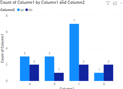
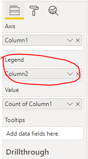
According to your discription, you need to add legend in the visual like the following image.
If this post helps, then please consider Accept it as the solution to help the other members find it.
- Mark as New
- Bookmark
- Subscribe
- Mute
- Subscribe to RSS Feed
- Permalink
- Report Inappropriate Content
That worked, thank you so much!
- Mark as New
- Bookmark
- Subscribe
- Mute
- Subscribe to RSS Feed
- Permalink
- Report Inappropriate Content
Hi
Did you try to use a table? Also, do you have the marked for course completion status, if so you can just drop it on the table.
Thank you
Tomas Santandreu Polanco |Principal Business Intelligence Consultant
www.designmind.com
- Mark as New
- Bookmark
- Subscribe
- Mute
- Subscribe to RSS Feed
- Permalink
- Report Inappropriate Content
Hey there,
I have a table set up (I think) with all the fields I intend to use and/or manipulate. Here's the screenshot: https://i.imgur.com/mshLX6c.png
For the Completions by Program, it keeps defaulting to doing a Count of Completions which is what's giving it the number of completions regardless of the value in that column (i.e. if there are 6 "Completed" records and 4 "In Progress" records, it shows a value of 10 Completions rather than 6 Completed, 4 In Progress).
I want it to instead show a bar chart that would show 6 Completed, 4 In Progress for a total of 10 rather than JUST the total, if that makes sense.
I tried looking up a tutorial on how to do this but nothing I found explained things simply enough. The videos you linked look like they may work, but that goes back into my previous statement about all the resources being TOO long/lengthy. The video you linked has so much context and other pieces that it's more confusing than helpful...
I'm going to be learning over time, and will definitely use the video you provided and the 3,000 page PBI Get Started PDF for help, but in this instance it's extremely frustrating to be stuck not being able to do something so simple without combing through literally hours of videos or hundreds of pages of text, y'know?
- Mark as New
- Bookmark
- Subscribe
- Mute
- Subscribe to RSS Feed
- Permalink
- Report Inappropriate Content
Hi
Can we try the following:
Add Completion as column
Add Program as a row
Add Completion as value: select count
Thank you
Tomas Santandreu Polanco |Principal Business Intelligence Consultant
www.designmind.com
- Mark as New
- Bookmark
- Subscribe
- Mute
- Subscribe to RSS Feed
- Permalink
- Report Inappropriate Content
Resources:
This section is a video collection of our latest talks on Business Intelligence.
Dashboard in a Day: https://www.youtube.com/watch?v=hfyoPYEM4Ek
https://www.youtube.com/watch?v=AGrl-H87pRU
Thank you
Tomas Santandreu Polanco |Principal Business Intelligence Consultant
www.designmind.com
Helpful resources

Microsoft Fabric Learn Together
Covering the world! 9:00-10:30 AM Sydney, 4:00-5:30 PM CET (Paris/Berlin), 7:00-8:30 PM Mexico City

Power BI Monthly Update - April 2024
Check out the April 2024 Power BI update to learn about new features.

| User | Count |
|---|---|
| 114 | |
| 99 | |
| 83 | |
| 70 | |
| 60 |
| User | Count |
|---|---|
| 150 | |
| 115 | |
| 104 | |
| 89 | |
| 65 |


