- Power BI forums
- Updates
- News & Announcements
- Get Help with Power BI
- Desktop
- Service
- Report Server
- Power Query
- Mobile Apps
- Developer
- DAX Commands and Tips
- Custom Visuals Development Discussion
- Health and Life Sciences
- Power BI Spanish forums
- Translated Spanish Desktop
- Power Platform Integration - Better Together!
- Power Platform Integrations (Read-only)
- Power Platform and Dynamics 365 Integrations (Read-only)
- Training and Consulting
- Instructor Led Training
- Dashboard in a Day for Women, by Women
- Galleries
- Community Connections & How-To Videos
- COVID-19 Data Stories Gallery
- Themes Gallery
- Data Stories Gallery
- R Script Showcase
- Webinars and Video Gallery
- Quick Measures Gallery
- 2021 MSBizAppsSummit Gallery
- 2020 MSBizAppsSummit Gallery
- 2019 MSBizAppsSummit Gallery
- Events
- Ideas
- Custom Visuals Ideas
- Issues
- Issues
- Events
- Upcoming Events
- Community Blog
- Power BI Community Blog
- Custom Visuals Community Blog
- Community Support
- Community Accounts & Registration
- Using the Community
- Community Feedback
Register now to learn Fabric in free live sessions led by the best Microsoft experts. From Apr 16 to May 9, in English and Spanish.
- Power BI forums
- Forums
- Get Help with Power BI
- Desktop
- Help on stacked column chart legend data
- Subscribe to RSS Feed
- Mark Topic as New
- Mark Topic as Read
- Float this Topic for Current User
- Bookmark
- Subscribe
- Printer Friendly Page
- Mark as New
- Bookmark
- Subscribe
- Mute
- Subscribe to RSS Feed
- Permalink
- Report Inappropriate Content
Help on stacked column chart legend data
Hi,
i have two tables called "movecount" and time dimenssion table (which is created from sql query) :
this table data is coming from postgres :
| Country | operator | S_name | arrival_time |
| Finland | line | Africa||wca1 | 19-12-2020 |
| Angola | hsbc | Africa||wca1 | 19-01-2021 |
| africa | bcm | unknown | 15-12-2020 |
| asia | mcc | inter regional ||wfa-1 | 17-12-2020 |
| china | cosc | Asia|| wfa-2 | 15-010-2021 |
and i have created one time dimensional table which has all weeks,monthnames,years and i have joined both tables with relation of date.
Note : The above table data is dummy data
i have provided 3filters which is operator ,country and date range.
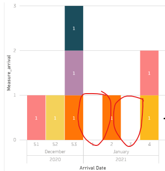
In Axis am giving week number,year and month.In legend am giving S_name and in values am calculating count of S_name.
when am plotting this stacked column chart whenever there is a zero call it was eliminating that week itself and in above graph am filtering data by country,operator,date but it is display total S_names of both 1st and 3rd week not according to the filters(means the data is displaying wrongly).
Measure :
count of S_name = if(isblank(count(S_name)),0) ,count(s_name)
i need to achieve if there is any zero call then it should display zerocall in legend.
Can someone please help me with this.
Thanks in advance
Solved! Go to Solution.
- Mark as New
- Bookmark
- Subscribe
- Mute
- Subscribe to RSS Feed
- Permalink
- Report Inappropriate Content
Hi, @Rup10
According to your sample picture, it seems that the zero calls are displayed in your column chart but their data label disappeared because its color is white, you can try to change the data label color of this column chart to a dark color to make it display:
https://www.c-sharpcorner.com/blogs/data-labels-and-axis-style-formatting-in-power-bi-report
If this result is not what you want, you can post some sample data(without sensitive data) and your expected result.
How to Get Your Question Answered Quickly
Thank you very much!
Best Regards,
Community Support Team _Robert Qin
If this post helps, then please consider Accept it as the solution to help the other members find it more quickly.
- Mark as New
- Bookmark
- Subscribe
- Mute
- Subscribe to RSS Feed
- Permalink
- Report Inappropriate Content
Hi @Rup10 ,
You can include the blanks by enabling "Show items with no data". Click on the downward arrow next to your axis field. Seel below:
Also, you can rename the field under "Values" to your desired name instead of auto generated total_S names and upon right clicking on that field you can switch btween multiple options like average, count, sum etc.
Thanks,
Dheeraj
Please mark as solution and give kudos if this helps you.
Helpful resources

Microsoft Fabric Learn Together
Covering the world! 9:00-10:30 AM Sydney, 4:00-5:30 PM CET (Paris/Berlin), 7:00-8:30 PM Mexico City

Power BI Monthly Update - April 2024
Check out the April 2024 Power BI update to learn about new features.

| User | Count |
|---|---|
| 113 | |
| 97 | |
| 85 | |
| 70 | |
| 61 |
| User | Count |
|---|---|
| 151 | |
| 121 | |
| 104 | |
| 87 | |
| 67 |


