- Power BI forums
- Updates
- News & Announcements
- Get Help with Power BI
- Desktop
- Service
- Report Server
- Power Query
- Mobile Apps
- Developer
- DAX Commands and Tips
- Custom Visuals Development Discussion
- Health and Life Sciences
- Power BI Spanish forums
- Translated Spanish Desktop
- Power Platform Integration - Better Together!
- Power Platform Integrations (Read-only)
- Power Platform and Dynamics 365 Integrations (Read-only)
- Training and Consulting
- Instructor Led Training
- Dashboard in a Day for Women, by Women
- Galleries
- Community Connections & How-To Videos
- COVID-19 Data Stories Gallery
- Themes Gallery
- Data Stories Gallery
- R Script Showcase
- Webinars and Video Gallery
- Quick Measures Gallery
- 2021 MSBizAppsSummit Gallery
- 2020 MSBizAppsSummit Gallery
- 2019 MSBizAppsSummit Gallery
- Events
- Ideas
- Custom Visuals Ideas
- Issues
- Issues
- Events
- Upcoming Events
- Community Blog
- Power BI Community Blog
- Custom Visuals Community Blog
- Community Support
- Community Accounts & Registration
- Using the Community
- Community Feedback
Register now to learn Fabric in free live sessions led by the best Microsoft experts. From Apr 16 to May 9, in English and Spanish.
- Power BI forums
- Forums
- Get Help with Power BI
- Desktop
- Help on modeling to calculate specific row values ...
- Subscribe to RSS Feed
- Mark Topic as New
- Mark Topic as Read
- Float this Topic for Current User
- Bookmark
- Subscribe
- Printer Friendly Page
- Mark as New
- Bookmark
- Subscribe
- Mute
- Subscribe to RSS Feed
- Permalink
- Report Inappropriate Content
Help on modeling to calculate specific row values and displaying as a 'card' in power BI
Hi, I'm having trouble using the DAX functions on getting my desired outcome.
I have a piece of excel sheet that has the following data.
1. June's target sales number for SMB
2. June's current sales number for SMB
3. June's target sales number for Enterprise
4. June's current sales number for Enterprise
5. Accumulated target sales number (up to June) for SMB
6. Accumulated actual sales number (up to June) for SMB
7. Accumulated target sales number (up to June) for Enterprise
8. Accumulated actual sales number (up to June) for Enterprise
9. Total target sales number (for this year) for SMB
10. Total target sales number (for this year) for Enterprise
11. Total target sales number (for this year)
12. Total actual sales number (for thi syear)
My first desired outcome is as following
1. Bar chart displaying #2 vs. #1
2. Bar chart displaying #4 vs. #3
3. Bar chart displaying #6 vs. #5
4. Bar chart displaying #8 vs. #7
5. Bar chart displaying #9 vs. #6
6. Bar chart displaying #10 vs. #7
7. Bar chart displaying #12 vs. #11
(The bar charts don't have to be separated but I would like the charts to display my desired outcome)
My second desired outcome is as following
1. Card displaying percentage attain rate for #1 bar chart
2. Card displaying percentage attain rate for #2 bar chart
3. Card displaying percentage attain rate for #3 bar chart
4. Card displaying percentage attain rate for #4 bar chart
5. Card displaying percentage attain rate for #5 bar chart
6. Card displaying percentage attain rate for #6 bar chart
7. Card displaying percentage attain rate for #7 bar chart
I know the logic may be quite complicated but the ultimate purpose is to provide a dashboard for sales to visualize the current sales status. I am open to all problem solving techniques to solve the above problem.
Excel sheet download path: https://bit.ly/2KdFQl6
Thank you
- Mark as New
- Bookmark
- Subscribe
- Mute
- Subscribe to RSS Feed
- Permalink
- Report Inappropriate Content
Hi @onixlee,
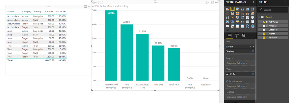
You can try to use below formula to get the percent between actual and target.
Act Vs Tar =
CALCULATE (
    SUM ( Table1[Amount] ),
    VALUES ( Table1[Month] ),
    VALUES ( Table1[Territory] ),
    Table1[Category] = "Actual"
)
    / CALCULATE (
        SUM ( Table1[Amount] ),
        VALUES ( Table1[Month] ),
        VALUES ( Table1[Territory] ),
        Table1[Category] = "Target"
    )
+0
Regards,
Xiaoxin Sheng
If this post helps, please consider accept as solution to help other members find it more quickly.
- Mark as New
- Bookmark
- Subscribe
- Mute
- Subscribe to RSS Feed
- Permalink
- Report Inappropriate Content
Hello Xiaoxin,
Thanks for your reply. Since I am not familiar with Power BI, it's difficult for me to input the formula.
I am sorry but can you please attach the pbix file for the below screenshot?
Thank you
Han
- Mark as New
- Bookmark
- Subscribe
- Mute
- Subscribe to RSS Feed
- Permalink
- Report Inappropriate Content
Hi @onixlee,
I attached sample pbix file below.
Regards,
Xiaoxin Sheng
If this post helps, please consider accept as solution to help other members find it more quickly.
Helpful resources

Microsoft Fabric Learn Together
Covering the world! 9:00-10:30 AM Sydney, 4:00-5:30 PM CET (Paris/Berlin), 7:00-8:30 PM Mexico City

Power BI Monthly Update - April 2024
Check out the April 2024 Power BI update to learn about new features.

| User | Count |
|---|---|
| 111 | |
| 95 | |
| 77 | |
| 68 | |
| 54 |
| User | Count |
|---|---|
| 144 | |
| 105 | |
| 102 | |
| 89 | |
| 63 |

