- Power BI forums
- Updates
- News & Announcements
- Get Help with Power BI
- Desktop
- Service
- Report Server
- Power Query
- Mobile Apps
- Developer
- DAX Commands and Tips
- Custom Visuals Development Discussion
- Health and Life Sciences
- Power BI Spanish forums
- Translated Spanish Desktop
- Power Platform Integration - Better Together!
- Power Platform Integrations (Read-only)
- Power Platform and Dynamics 365 Integrations (Read-only)
- Training and Consulting
- Instructor Led Training
- Dashboard in a Day for Women, by Women
- Galleries
- Community Connections & How-To Videos
- COVID-19 Data Stories Gallery
- Themes Gallery
- Data Stories Gallery
- R Script Showcase
- Webinars and Video Gallery
- Quick Measures Gallery
- 2021 MSBizAppsSummit Gallery
- 2020 MSBizAppsSummit Gallery
- 2019 MSBizAppsSummit Gallery
- Events
- Ideas
- Custom Visuals Ideas
- Issues
- Issues
- Events
- Upcoming Events
- Community Blog
- Power BI Community Blog
- Custom Visuals Community Blog
- Community Support
- Community Accounts & Registration
- Using the Community
- Community Feedback
Register now to learn Fabric in free live sessions led by the best Microsoft experts. From Apr 16 to May 9, in English and Spanish.
- Power BI forums
- Forums
- Get Help with Power BI
- Desktop
- Re: Help needed
- Subscribe to RSS Feed
- Mark Topic as New
- Mark Topic as Read
- Float this Topic for Current User
- Bookmark
- Subscribe
- Printer Friendly Page
- Mark as New
- Bookmark
- Subscribe
- Mute
- Subscribe to RSS Feed
- Permalink
- Report Inappropriate Content
Help needed
Hello all
I am trying to recreate the following excel chart creating a total but by excluding Brand 5
Anyone has an idea how to ?
| Excl. Brand 5 | Brand 1 | Brand 2 | Brand 3 | Brand 4 | Brand 5 | Excl. Brand 5 | Brand 1 | Brand 2 | Brand 3 | Brand 4 | Brand 5 | |
| 1000 | 100 | 200 | 300 | 400 | 500 | 24% | 20% | 25% | 23% | 25% | 33% | |
| 1100 | 200 | 200 | 300 | 400 | 100 | 26% | 40% | 25% | 23% | 25% | 7% | |
| 1150 | 100 | 200 | 450 | 400 | 600 | 27% | 20% | 25% | 35% | 25% | 39% | |
| 950 | 100 | 200 | 250 | 400 | 333 | 23% | 20% | 25% | 19% | 25% | 22% |
Solved! Go to Solution.
- Mark as New
- Bookmark
- Subscribe
- Mute
- Subscribe to RSS Feed
- Permalink
- Report Inappropriate Content
Here is one way of doing this.
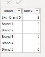
1) Create a table listing the x-axis categories. I've called it "Categories Table"
The model looks like this. Notice how this Categories Table is unrelated in the model.
2) Create the measures for the category "Excl, Brand 5"
Sum of values ecluding Brand 5
SUM excl B5 = CALCULATE([Sum of Values], FILTER('Dim Brand', 'Dim Brand'[Brand] <> "Brand 5"))% of Excl B5 by Series
% Excl. Brand 5 =
VAR ExcSumTotal = CALCULATE([SUM excl B5], ALL('Dim Series'[Series]))
Return
DIVIDE([SUM excl B5], ExcSumTotal)
3) Create the measures for the Brand Values:
% per brand =
Var BrandTotal = CALCULATE([Sum of Values], ALL('Dim Series'[Series]))
Return
DIVIDE([Sum of Values], BrandTotal)
4) Create the measure to filter by brands the category table
% per Brand for chart = CALCULATE([% per brand], TREATAS(VALUES('Categories Table'[Brand]), 'Dim Brand'[Brand]))
5) And finally the measure to include in the stacked chart visual:
Measure for visual =
IF(SELECTEDVALUE('Categories Table'[Brand]) = "Excl. Brand 5",
    [% Excl. Brand 5],
        [% per Brand for chart])
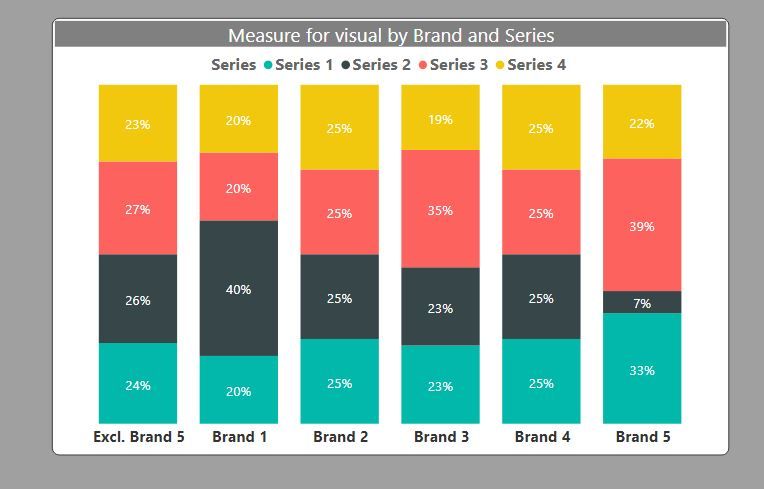
Now create the visual using the "Category Table" as the x-axis and add this final [Measure for visual]
and you get this:
I've included the sample PBIX file for your reference
Did I answer your question? Mark my post as a solution!
In doing so, you are also helping me. Thank you!
Proud to be a Super User!
Paul on Linkedin.
- Mark as New
- Bookmark
- Subscribe
- Mute
- Subscribe to RSS Feed
- Permalink
- Report Inappropriate Content
Hello there
Yes this is doing the trick
Thanks
- Mark as New
- Bookmark
- Subscribe
- Mute
- Subscribe to RSS Feed
- Permalink
- Report Inappropriate Content
@Matricola , Unpivot the data.https://radacad.com/pivot-and-unpivot-with-power-bi
You can create 100% stacked visual . Remove Brand 5 using sclicer of visual level filter
or have measure like
divide(Sum(Table[Value]), calculate(Sum(Table[Value]), all(Table))
Microsoft Power BI Learning Resources, 2023 !!
Learn Power BI - Full Course with Dec-2022, with Window, Index, Offset, 100+ Topics !!
Did I answer your question? Mark my post as a solution! Appreciate your Kudos !! Proud to be a Super User! !!
Helpful resources

Microsoft Fabric Learn Together
Covering the world! 9:00-10:30 AM Sydney, 4:00-5:30 PM CET (Paris/Berlin), 7:00-8:30 PM Mexico City

Power BI Monthly Update - April 2024
Check out the April 2024 Power BI update to learn about new features.

| User | Count |
|---|---|
| 110 | |
| 95 | |
| 76 | |
| 65 | |
| 51 |
| User | Count |
|---|---|
| 146 | |
| 109 | |
| 106 | |
| 88 | |
| 61 |


