- Power BI forums
- Updates
- News & Announcements
- Get Help with Power BI
- Desktop
- Service
- Report Server
- Power Query
- Mobile Apps
- Developer
- DAX Commands and Tips
- Custom Visuals Development Discussion
- Health and Life Sciences
- Power BI Spanish forums
- Translated Spanish Desktop
- Power Platform Integration - Better Together!
- Power Platform Integrations (Read-only)
- Power Platform and Dynamics 365 Integrations (Read-only)
- Training and Consulting
- Instructor Led Training
- Dashboard in a Day for Women, by Women
- Galleries
- Community Connections & How-To Videos
- COVID-19 Data Stories Gallery
- Themes Gallery
- Data Stories Gallery
- R Script Showcase
- Webinars and Video Gallery
- Quick Measures Gallery
- 2021 MSBizAppsSummit Gallery
- 2020 MSBizAppsSummit Gallery
- 2019 MSBizAppsSummit Gallery
- Events
- Ideas
- Custom Visuals Ideas
- Issues
- Issues
- Events
- Upcoming Events
- Community Blog
- Power BI Community Blog
- Custom Visuals Community Blog
- Community Support
- Community Accounts & Registration
- Using the Community
- Community Feedback
Register now to learn Fabric in free live sessions led by the best Microsoft experts. From Apr 16 to May 9, in English and Spanish.
- Power BI forums
- Forums
- Get Help with Power BI
- Desktop
- Help for Newbie -Relationship Database to show rel...
- Subscribe to RSS Feed
- Mark Topic as New
- Mark Topic as Read
- Float this Topic for Current User
- Bookmark
- Subscribe
- Printer Friendly Page
- Mark as New
- Bookmark
- Subscribe
- Mute
- Subscribe to RSS Feed
- Permalink
- Report Inappropriate Content
Help for Newbie -Relationship Database to show relative data
Hello,
I am building a dashboard for HR but i am using multiple reports from Workday to do this.
I want to focus on attrition metrics. Its very easy to build the report to show attriton by region, by quarter.
What i am trying to achieve is actually showing how attrtion is relative to the total number for each region.
So take a region who has 6,000 active Employees. I want to show the percentage for the quarter of those 6,000 employees who have left,
I have two tables.
Attrition Table (6month view)
Total Workers Table (up to date of total workforce)
both tables have Employee ID tab.
I followed this, but doesnt seem to work. I also need the regions to match match too. Both tables have region, but different column names.
I have watched this video and many others - https://www.youtube.com/watch?v=fVW4MCr0APA
Any help appreciated.
Ben
Solved! Go to Solution.
- Mark as New
- Bookmark
- Subscribe
- Mute
- Subscribe to RSS Feed
- Permalink
- Report Inappropriate Content
Hi @bengia,
Based on your description, you could refer to my steps below:
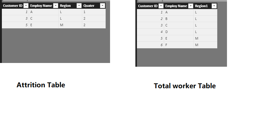
1.I have entered two table data like the picture below:
2.Create three measures to show the Attrition amount, related region amount and the percentage.
Attrition amount = CALCULATE(COUNT('Attrition Table'[Employ Name]),FILTER('Total worker Table','Total worker Table'[Region1]=MIN('Attrition Table'[Region])))
Total account = COUNTX('Total worker Table','Total worker Table'[Region1])
Percentage = [Attrition amount]/[Total account]
3.Create a Table visual and add the related column and create a slicer visual to add the [Quarter] field.
Now you can get the percentage of attrition amount based on the region and you can choose the different quarter by the slicer.
If I misunderstood you, could you offer me some sample data to test for your problem, If the file does contain sensitive data, please upload your report to your OneDrive and send the link to me via private message.
You can also download the PBIX file to have a view.
Regards,
Daniel He
If this post helps, then please consider Accept it as the solution to help the other members find it more quickly.
- Mark as New
- Bookmark
- Subscribe
- Mute
- Subscribe to RSS Feed
- Permalink
- Report Inappropriate Content
This is amazing, thanks so much for your help.
Im going to setup some time next week to sort this out
thanks so much again for your guidence. Once ive validated it I will accept the solution.
Helpful resources

Microsoft Fabric Learn Together
Covering the world! 9:00-10:30 AM Sydney, 4:00-5:30 PM CET (Paris/Berlin), 7:00-8:30 PM Mexico City

Power BI Monthly Update - April 2024
Check out the April 2024 Power BI update to learn about new features.

| User | Count |
|---|---|
| 117 | |
| 105 | |
| 69 | |
| 67 | |
| 43 |
| User | Count |
|---|---|
| 148 | |
| 103 | |
| 103 | |
| 88 | |
| 66 |


