- Power BI forums
- Updates
- News & Announcements
- Get Help with Power BI
- Desktop
- Service
- Report Server
- Power Query
- Mobile Apps
- Developer
- DAX Commands and Tips
- Custom Visuals Development Discussion
- Health and Life Sciences
- Power BI Spanish forums
- Translated Spanish Desktop
- Power Platform Integration - Better Together!
- Power Platform Integrations (Read-only)
- Power Platform and Dynamics 365 Integrations (Read-only)
- Training and Consulting
- Instructor Led Training
- Dashboard in a Day for Women, by Women
- Galleries
- Community Connections & How-To Videos
- COVID-19 Data Stories Gallery
- Themes Gallery
- Data Stories Gallery
- R Script Showcase
- Webinars and Video Gallery
- Quick Measures Gallery
- 2021 MSBizAppsSummit Gallery
- 2020 MSBizAppsSummit Gallery
- 2019 MSBizAppsSummit Gallery
- Events
- Ideas
- Custom Visuals Ideas
- Issues
- Issues
- Events
- Upcoming Events
- Community Blog
- Power BI Community Blog
- Custom Visuals Community Blog
- Community Support
- Community Accounts & Registration
- Using the Community
- Community Feedback
Register now to learn Fabric in free live sessions led by the best Microsoft experts. From Apr 16 to May 9, in English and Spanish.
- Power BI forums
- Forums
- Get Help with Power BI
- Desktop
- Having a value from a column constantly on a visua...
- Subscribe to RSS Feed
- Mark Topic as New
- Mark Topic as Read
- Float this Topic for Current User
- Bookmark
- Subscribe
- Printer Friendly Page
- Mark as New
- Bookmark
- Subscribe
- Mute
- Subscribe to RSS Feed
- Permalink
- Report Inappropriate Content
Having a value from a column constantly on a visual and then using a slicer to add more data
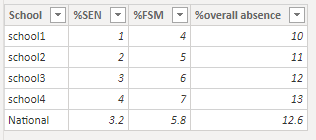
For reference my data roughly looks like this :
| School | %SEN | %FSM | %overall absence |
| school1 | 1 | 4 | 10 |
| school2 | 2 | 5 | 11 |
| school3 | 3 | 6 | 12 |
| school4 | 4 | 7 | 13 |
| National | 3.2 | 5.8 | 12.6 |
I would like to create a visual for each of the columns (excluding the school name) and on the visual I would like to always have the national data on there and then use a slicer to select the school that the user would like to compare with the national data.
I have tried using the filter pane on the visula but that does not seem to work.
Any help would be appreciated.
- Mark as New
- Bookmark
- Subscribe
- Mute
- Subscribe to RSS Feed
- Permalink
- Report Inappropriate Content
Hi, @lukeSDM
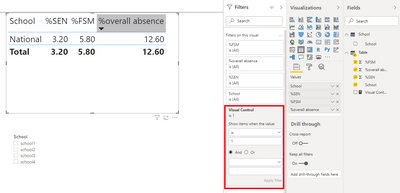
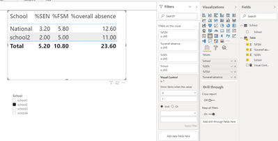
Based on your description, I created data to reproduce your scenario. The pbix file is attached in the end.
Table:
School(a calculated table):
School =
FILTER(
    DISTINCT('Table'[School]),
    CONTAINSSTRINGEXACT([School],"school")
)
You may create a measure as below.
Visual Control =
var _school = SELECTEDVALUE('Table'[School])
return
IF(
    _school = "National",
    1,
    IF(
        ISFILTERED(School[School]),
        IF(
            _school in DISTINCT(School[School]),
            1,
            0
        ),
        0
    )
)
Then you need to put the measure in the visual level filter and use the 'school' column from 'School' table to filter the result.
Best Regards
Allan
If this post helps, then please consider Accept it as the solution to help the other members find it more quickly.
- Mark as New
- Bookmark
- Subscribe
- Mute
- Subscribe to RSS Feed
- Permalink
- Report Inappropriate Content
Hi @v-alq-msft ,
is there any way to get you r solution to work in a graph rather than a matrix?
I have tried myself to get it to work in a bar graph and when no shcool is selected the national data show but when I select a school from the slicer no data is displayed at all...
Any help would be appreciated
Thanks
- Mark as New
- Bookmark
- Subscribe
- Mute
- Subscribe to RSS Feed
- Permalink
- Report Inappropriate Content
Hi, @lukeSDM
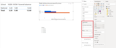
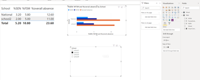
I tested with 'Clustered bar chart'and it worked properly. The pbix file is attached in the end.
Result:
Best Regards
Allan
If this post helps, then please consider Accept it as the solution to help the other members find it more quickly.
- Mark as New
- Bookmark
- Subscribe
- Mute
- Subscribe to RSS Feed
- Permalink
- Report Inappropriate Content
Hi @v-alq-msft ,
When i put the post up i forgot to add that the data has a year column and I think this is where the issue is, I downloaded your file and changed it so it is more representative of my data and that is when I have an issue when creating the measure would it be a case of filtering for the year for the national?
Please your document attached with the changes.
I really appreciate your help and look forward to your response!
Thanks
https://drive.google.com/file/d/1iFCduVFnUTdCaimnKU3mX5qGLmas3QaE/view?usp=sharing
- Mark as New
- Bookmark
- Subscribe
- Mute
- Subscribe to RSS Feed
- Permalink
- Report Inappropriate Content
Hi, @lukeSDM
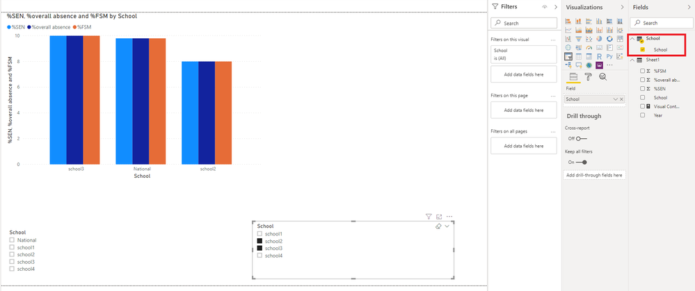
You need to use the 'school' column from 'School' table to filter the result instead of the 'school' column from 'Sheet1' table. The pbix file is attached in the end.
Best Regards
Allan
If this post helps, then please consider Accept it as the solution to help the other members find it more quickly.
- Mark as New
- Bookmark
- Subscribe
- Mute
- Subscribe to RSS Feed
- Permalink
- Report Inappropriate Content
Hi,
This still does not work as I realised in the DAX it filters it to contain "school" but in reality all the school names are different i need to it to exclude the National from the school column really is there a dax expression for that?
Thanks
- Mark as New
- Bookmark
- Subscribe
- Mute
- Subscribe to RSS Feed
- Permalink
- Report Inappropriate Content
Hi, @lukeSDM
You may try the following dax to get a table excluding 'National'.
Tab =
FILTER(
    DISTINCT('Table'[School]),
    'Table'[School]<>"National"
)
Best Regards
Allan
If this post helps, then please consider Accept it as the solution to help the other members find it more quickly.
- Mark as New
- Bookmark
- Subscribe
- Mute
- Subscribe to RSS Feed
- Permalink
- Report Inappropriate Content
@lukeSDM , you can have sum and Avg with all
calculate(sum(Table[%SEN]),all(Table])
There is an option like removefilters. Refer to my blog to check that
https://www.linkedin.com/pulse/five-recent-power-bi-functions-you-should-use-more-often-amit-chandak
There s pbix with the blog to get ALL, remove filters usages
Microsoft Power BI Learning Resources, 2023 !!
Learn Power BI - Full Course with Dec-2022, with Window, Index, Offset, 100+ Topics !!
Did I answer your question? Mark my post as a solution! Appreciate your Kudos !! Proud to be a Super User! !!
- Mark as New
- Bookmark
- Subscribe
- Mute
- Subscribe to RSS Feed
- Permalink
- Report Inappropriate Content
ShowColumns =
Var SlicerSelection = VALUES(Slicer[Select])
Var AlwaysShow = {("A1"), ("A2"), ("A3")}
Var ShowValues = UNION(SlicerSelection, AlwaysShow)
RETURN
IF(SELECTEDVALUE('Table'[Attribute]) IN ShowValues, 1, 0)
https://community.powerbi.com/t5/Desktop/How-could-implement-selecting-columns-which-shows-in-table/...
So for your scenario would require having a table of schools that is not connected to the rest of the data model and using "National" instead of ("A1"), ("A2"), ("A3")
Let us know if you need more details.
Please @mention me in your reply if you want a response.
Copying DAX from this post? Click here for a hack to quickly replace it with your own table names
Has this post solved your problem? Please Accept as Solution so that others can find it quickly and to let the community know your problem has been solved.
If you found this post helpful, please give Kudos C
I work as a Microsoft trainer and consultant, specialising in Power BI and Power Query.
www.excelwithallison.com
- Mark as New
- Bookmark
- Subscribe
- Mute
- Subscribe to RSS Feed
- Permalink
- Report Inappropriate Content
Hi @lukeSDM ,
Create a measure for your National level metric something as follows so it doesn't chnage with the slicers:
%SEN National = CALCULATE(SUM(Table1[%SEN]), ALL(Table1))
Similary, create for other columns as well. You can modify your summarisation in above DAX as per the requirement.
Then move these national figures, say, to a visual along with the columns from your table.
Whenever you select a value from a slicer, these National level measures won't change, but your other values will change.
Thanks,
Pragati
- Mark as New
- Bookmark
- Subscribe
- Mute
- Subscribe to RSS Feed
- Permalink
- Report Inappropriate Content
It seems when doing this it adds all the values in that column and does not filter to the national data ?
- Mark as New
- Bookmark
- Subscribe
- Mute
- Subscribe to RSS Feed
- Permalink
- Report Inappropriate Content
HI @lukeSDM ,
Please use dax as follows:
%SEN National = CALCULATE(SUM(Table1[%SEN]), ALL(Table1), Table1[School] = "National")
Thanks,
Pragati
- Mark as New
- Bookmark
- Subscribe
- Mute
- Subscribe to RSS Feed
- Permalink
- Report Inappropriate Content
%SEN National = CALCULATE(SUM(Table1[%SEN]), ALL(Table1), Table1[School] = "National")
Please @mention me in your reply if you want a response.
Copying DAX from this post? Click here for a hack to quickly replace it with your own table names
Has this post solved your problem? Please Accept as Solution so that others can find it quickly and to let the community know your problem has been solved.
If you found this post helpful, please give Kudos C
I work as a Microsoft trainer and consultant, specialising in Power BI and Power Query.
www.excelwithallison.com
- Mark as New
- Bookmark
- Subscribe
- Mute
- Subscribe to RSS Feed
- Permalink
- Report Inappropriate Content
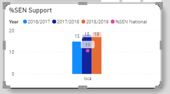
Uing Pragati11 method the only way I can get it display is by using the line and column visual.
My issues with this are:
The national data is for 2018/2019 so its over the wrong column
I would prefer it to be a column next to the school selected from the slicer
See picture attached:
- Mark as New
- Bookmark
- Subscribe
- Mute
- Subscribe to RSS Feed
- Permalink
- Report Inappropriate Content
Hi @lukeSDM ,
I am not clear on your chart. What value have to moved to x-axis?
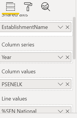
Can you share screesnhots of details on this chart from visualisation pane?
Also, the sample data which you shared earlier, hasn't got any DATE column in it. Try sharing your exact sample data.
Is it possible to share your pbix file?
Thanks,
Pragati
- Mark as New
- Bookmark
- Subscribe
- Mute
- Subscribe to RSS Feed
- Permalink
- Report Inappropriate Content
Sorry I tried to make the data a bit easier to understand.
if you treat the URN as the school name and then keep the same columns I orginally said ill be able to match them up to my table.

- Mark as New
- Bookmark
- Subscribe
- Mute
- Subscribe to RSS Feed
- Permalink
- Report Inappropriate Content
Hi @lukeSDM ,
Can you show some screesnhots on what's on working and how you are applying the above solution?
Thanks,
Pragati
Helpful resources

Microsoft Fabric Learn Together
Covering the world! 9:00-10:30 AM Sydney, 4:00-5:30 PM CET (Paris/Berlin), 7:00-8:30 PM Mexico City

Power BI Monthly Update - April 2024
Check out the April 2024 Power BI update to learn about new features.

| User | Count |
|---|---|
| 109 | |
| 98 | |
| 77 | |
| 66 | |
| 54 |
| User | Count |
|---|---|
| 144 | |
| 104 | |
| 101 | |
| 86 | |
| 64 |
