- Power BI forums
- Updates
- News & Announcements
- Get Help with Power BI
- Desktop
- Service
- Report Server
- Power Query
- Mobile Apps
- Developer
- DAX Commands and Tips
- Custom Visuals Development Discussion
- Health and Life Sciences
- Power BI Spanish forums
- Translated Spanish Desktop
- Power Platform Integration - Better Together!
- Power Platform Integrations (Read-only)
- Power Platform and Dynamics 365 Integrations (Read-only)
- Training and Consulting
- Instructor Led Training
- Dashboard in a Day for Women, by Women
- Galleries
- Community Connections & How-To Videos
- COVID-19 Data Stories Gallery
- Themes Gallery
- Data Stories Gallery
- R Script Showcase
- Webinars and Video Gallery
- Quick Measures Gallery
- 2021 MSBizAppsSummit Gallery
- 2020 MSBizAppsSummit Gallery
- 2019 MSBizAppsSummit Gallery
- Events
- Ideas
- Custom Visuals Ideas
- Issues
- Issues
- Events
- Upcoming Events
- Community Blog
- Power BI Community Blog
- Custom Visuals Community Blog
- Community Support
- Community Accounts & Registration
- Using the Community
- Community Feedback
Register now to learn Fabric in free live sessions led by the best Microsoft experts. From Apr 16 to May 9, in English and Spanish.
- Power BI forums
- Forums
- Get Help with Power BI
- Desktop
- Re: Have salary raise (dummy) data - trying to vis...
- Subscribe to RSS Feed
- Mark Topic as New
- Mark Topic as Read
- Float this Topic for Current User
- Bookmark
- Subscribe
- Printer Friendly Page
- Mark as New
- Bookmark
- Subscribe
- Mute
- Subscribe to RSS Feed
- Permalink
- Report Inappropriate Content
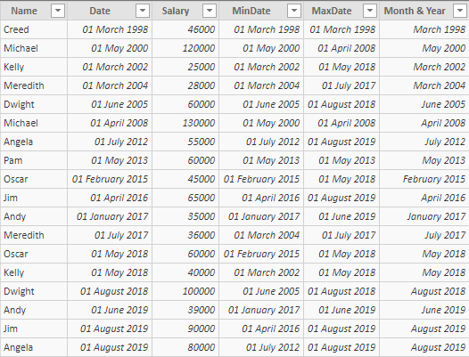
Have salary raise (dummy) data - trying to visualise the months in between raises
Hello,
our company has data on when people have been given raises - as seen in the dummy data above. The HR manager would like to visualise this data, showing people's salaries in between their raises (she is not bothered by getting the actualy monthly salary, she just wants to visualise for every month in between what the annual salary of the employee was.
So let's take Angela for example, she wants to show Angela's salary as 55,000 from July 2012 to July 2019, and then 80,000 from August 2019 goinf forwards. How can we achieve that?
If this is about adding new rows into the data for all of the missing months (grouped by employee), could someone help me do this?
Even better, is there a way to calculate this as a measure that would work on a line chart? (showing all of the months in between July 2012 to August 2019 as 55k for Angela, rather than just two spikes in July 2012 and August 2019).
Thank you,
your help is greatly appreciated.
Solved! Go to Solution.
- Mark as New
- Bookmark
- Subscribe
- Mute
- Subscribe to RSS Feed
- Permalink
- Report Inappropriate Content
@Anonymous -
Using Power Query you can likely acheive your desired results as I proposed in this post https://community.powerbi.com/t5/Desktop/Writing-Rows-in-a-Calculated-Table-From-Flat-Data-and-Building-a/m-p/786013#M378542
Did I answer your question? Mark my post as a solution!
Did my answers help arrive at a solution? Give it a kudos by clicking the Thumbs Up!
Proud to be a Super User!
- Mark as New
- Bookmark
- Subscribe
- Mute
- Subscribe to RSS Feed
- Permalink
- Report Inappropriate Content
I mean it's not the solution I am looking for, but sure, since other people can accept solution on my behalf, you can have it, I guess?
- Mark as New
- Bookmark
- Subscribe
- Mute
- Subscribe to RSS Feed
- Permalink
- Report Inappropriate Content
@Anonymous
You may drag date from a separate calendar table and use the following measure.
Measure =
VAR d =
    MAX ( 'Table 2'[Date] )
RETURN
    MAXX (
        TOPN ( 1, FILTER ( 'Table', 'Table'[Date] <= d ), 'Table'[Date], DESC ),
        'Table'[Salary]
    )
If this post helps, then please consider Accept it as the solution to help the other members find it more quickly.
- Mark as New
- Bookmark
- Subscribe
- Mute
- Subscribe to RSS Feed
- Permalink
- Report Inappropriate Content
Nope, this just shows the two months - their initial salary and their raise. On a line graph, this doesn't fill in the months in between. Sorry, not what I'm looking for. Thank you though.
Helpful resources

Microsoft Fabric Learn Together
Covering the world! 9:00-10:30 AM Sydney, 4:00-5:30 PM CET (Paris/Berlin), 7:00-8:30 PM Mexico City

Power BI Monthly Update - April 2024
Check out the April 2024 Power BI update to learn about new features.

| User | Count |
|---|---|
| 118 | |
| 107 | |
| 70 | |
| 70 | |
| 43 |
| User | Count |
|---|---|
| 148 | |
| 106 | |
| 104 | |
| 89 | |
| 65 |

