- Power BI forums
- Updates
- News & Announcements
- Get Help with Power BI
- Desktop
- Service
- Report Server
- Power Query
- Mobile Apps
- Developer
- DAX Commands and Tips
- Custom Visuals Development Discussion
- Health and Life Sciences
- Power BI Spanish forums
- Translated Spanish Desktop
- Power Platform Integration - Better Together!
- Power Platform Integrations (Read-only)
- Power Platform and Dynamics 365 Integrations (Read-only)
- Training and Consulting
- Instructor Led Training
- Dashboard in a Day for Women, by Women
- Galleries
- Community Connections & How-To Videos
- COVID-19 Data Stories Gallery
- Themes Gallery
- Data Stories Gallery
- R Script Showcase
- Webinars and Video Gallery
- Quick Measures Gallery
- 2021 MSBizAppsSummit Gallery
- 2020 MSBizAppsSummit Gallery
- 2019 MSBizAppsSummit Gallery
- Events
- Ideas
- Custom Visuals Ideas
- Issues
- Issues
- Events
- Upcoming Events
- Community Blog
- Power BI Community Blog
- Custom Visuals Community Blog
- Community Support
- Community Accounts & Registration
- Using the Community
- Community Feedback
Register now to learn Fabric in free live sessions led by the best Microsoft experts. From Apr 16 to May 9, in English and Spanish.
- Power BI forums
- Forums
- Get Help with Power BI
- Desktop
- HR Churn visual in HR Sample
- Subscribe to RSS Feed
- Mark Topic as New
- Mark Topic as Read
- Float this Topic for Current User
- Bookmark
- Subscribe
- Printer Friendly Page
- Mark as New
- Bookmark
- Subscribe
- Mute
- Subscribe to RSS Feed
- Permalink
- Report Inappropriate Content
HR Churn visual in HR Sample
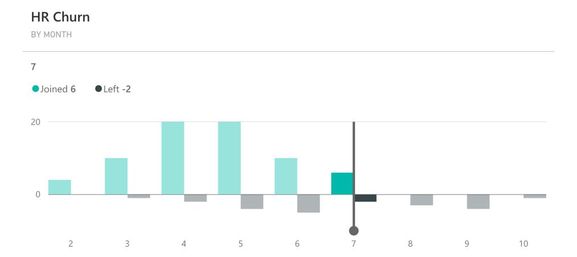
I am new to Power BI and would like to create the HR Churn visual that is part of the mobile HR Sample.
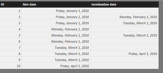
My table has the employee ID, hire date, and termination date if terminated. What columns/measures do I create for the HR Churn visual?
Solved! Go to Solution.
- Mark as New
- Bookmark
- Subscribe
- Mute
- Subscribe to RSS Feed
- Permalink
- Report Inappropriate Content
Try to use a calculated table following below steps.
- The dataset is as below
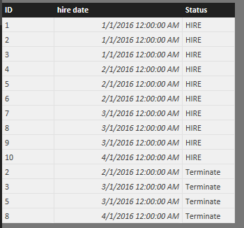
- Create a calculated table
newTable = UNION(ADDCOLUMNS(ALL(Emp[ID],Emp[hire date]),"Status","HIRE"),ADDCOLUMNS(FILTER(ALL(Emp[ID],Emp[termination date]),ISBLANK(Emp[termination date])=FALSE()),"Status","Terminate"))
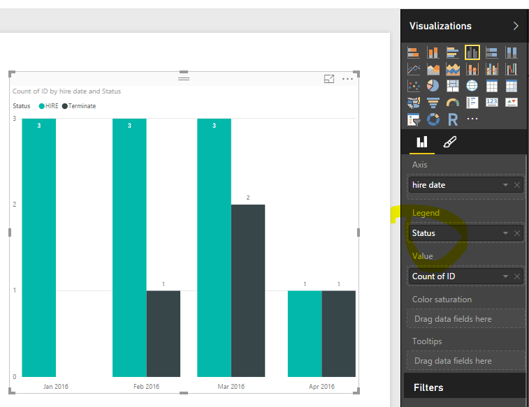
- Done
I don't have idea on "HR Churn visual" which seems a 3rd party visual. You can tweak the steps in the visual accordingly.
- Mark as New
- Bookmark
- Subscribe
- Mute
- Subscribe to RSS Feed
- Permalink
- Report Inappropriate Content
Eric,
Thanks for the suggestion to use a calculated table.
I changed the table to:
HRChurnTable = UNION(ADDCOLUMNS(ALL(EmpComp[EecEEID],EmpComp[Last Hire Date]),"Joined", 1, "Left", 0), ADDCOLUMNS(FILTER(ALL(EmpComp[EecEEID],EmpComp[Termination Date]),ISBLANK(EmpComp[Termination Date])=FALSE()),"Joined", 0,"Left",-1))
and did the graph summing the "Joined" and "Left" columns. That gave me positive and negative numbers on the clustered column chart.
Thanks again!
- Mark as New
- Bookmark
- Subscribe
- Mute
- Subscribe to RSS Feed
- Permalink
- Report Inappropriate Content
You're welcome. 🙂
If there's no further questions, to close this thread, you can accpet the suggestion(s) that help as solution.
- Mark as New
- Bookmark
- Subscribe
- Mute
- Subscribe to RSS Feed
- Permalink
- Report Inappropriate Content
Sorry for bringing this thread back to life. This solution worked perfectly for me. I'm wondering how I can calculate the total number of employees over time to add it as a secondary axis line chart? For example, if a new company started with 5 employees in 2016, then in 2017 they added another 10, but lost 3; the line would chart at 5 in 2016 and then 12 in 2017.
Helpful resources

Microsoft Fabric Learn Together
Covering the world! 9:00-10:30 AM Sydney, 4:00-5:30 PM CET (Paris/Berlin), 7:00-8:30 PM Mexico City

Power BI Monthly Update - April 2024
Check out the April 2024 Power BI update to learn about new features.

| User | Count |
|---|---|
| 111 | |
| 97 | |
| 80 | |
| 69 | |
| 59 |
| User | Count |
|---|---|
| 150 | |
| 119 | |
| 104 | |
| 87 | |
| 67 |


