- Power BI forums
- Updates
- News & Announcements
- Get Help with Power BI
- Desktop
- Service
- Report Server
- Power Query
- Mobile Apps
- Developer
- DAX Commands and Tips
- Custom Visuals Development Discussion
- Health and Life Sciences
- Power BI Spanish forums
- Translated Spanish Desktop
- Power Platform Integration - Better Together!
- Power Platform Integrations (Read-only)
- Power Platform and Dynamics 365 Integrations (Read-only)
- Training and Consulting
- Instructor Led Training
- Dashboard in a Day for Women, by Women
- Galleries
- Community Connections & How-To Videos
- COVID-19 Data Stories Gallery
- Themes Gallery
- Data Stories Gallery
- R Script Showcase
- Webinars and Video Gallery
- Quick Measures Gallery
- 2021 MSBizAppsSummit Gallery
- 2020 MSBizAppsSummit Gallery
- 2019 MSBizAppsSummit Gallery
- Events
- Ideas
- Custom Visuals Ideas
- Issues
- Issues
- Events
- Upcoming Events
- Community Blog
- Power BI Community Blog
- Custom Visuals Community Blog
- Community Support
- Community Accounts & Registration
- Using the Community
- Community Feedback
Register now to learn Fabric in free live sessions led by the best Microsoft experts. From Apr 16 to May 9, in English and Spanish.
- Power BI forums
- Forums
- Get Help with Power BI
- Desktop
- [HELP] Compare two datasets to calculate participa...
- Subscribe to RSS Feed
- Mark Topic as New
- Mark Topic as Read
- Float this Topic for Current User
- Bookmark
- Subscribe
- Printer Friendly Page
- Mark as New
- Bookmark
- Subscribe
- Mute
- Subscribe to RSS Feed
- Permalink
- Report Inappropriate Content
[HELP] Compare two datasets to calculate participation rate
I have two sets of data. For example:
Staff List (1000 staff)
Participation list (800 staff)
These two lists have common fields. For example:
Staff ID
Department
I want to create a 100% stacked bar chart showing participation rates by department, for example:
Finance - 80%
Operations - 100%
Audit - 99%
HR - 45%
How do I do this?
Solved! Go to Solution.
- Mark as New
- Bookmark
- Subscribe
- Mute
- Subscribe to RSS Feed
- Permalink
- Report Inappropriate Content
Hi, @Anonymous
According to your description and sample pictures, I can clearly understand what you want to get, I think you can achieve this using measure and clustered bar chart. You can try my steps:
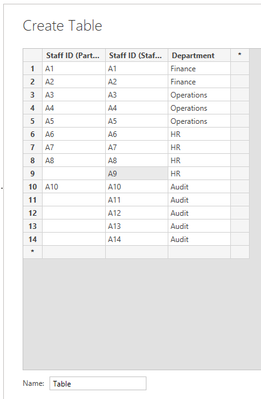
This is my test data based on your sample picture:
- I created a measure and set the measure format to “Percentage” in the Measure Tool, like this:
Percentage =

var _Countofparticipation=

COUNTX(FILTER('Table',[Staff ID (Participation list)]<>BLANK()),[Staff ID (Participation list)] )

var _Countofall =

COUNTX('Table',[Staff ID (Staff list)])

return

DIVIDE(_Countofparticipation,_Countofall)- Then I created a clustered bar chart and place it like this:
And you can get what you want.
You can download my test pbix file here
Best Regards,
Community Support Team _Robert Qin
If this post helps, then please consider Accept it as the solution to help the other members find it more quickly.
- Mark as New
- Bookmark
- Subscribe
- Mute
- Subscribe to RSS Feed
- Permalink
- Report Inappropriate Content
Hi @Anonymous ,
For 100% Stacked bar chart, you would have to select Department in the Axis section and participation rates in the values.
If you don't have the participation rates already, you need to create a measure to calculate it.
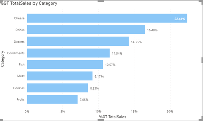
The graph would look something like this:
But looking at your expected outcome, I would see you go with Stacked bar chart and change the measure as percentage if not already it is. Please refer the below:
See if it satisfies your requirement.
If you found the answer interesting, please provide a Kudos.
Mark it as solution if it helped you solve your query.
- Mark as New
- Bookmark
- Subscribe
- Mute
- Subscribe to RSS Feed
- Permalink
- Report Inappropriate Content
Thanks for the reply.
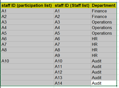
The confusion Im having is how do I use relationships to tie the unique staff IDs from the two datasets together.
For example:
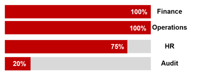
Based on the example above, I want to get a graph showing:
How do i do this?
Helpful resources

Microsoft Fabric Learn Together
Covering the world! 9:00-10:30 AM Sydney, 4:00-5:30 PM CET (Paris/Berlin), 7:00-8:30 PM Mexico City

Power BI Monthly Update - April 2024
Check out the April 2024 Power BI update to learn about new features.

| User | Count |
|---|---|
| 117 | |
| 107 | |
| 69 | |
| 68 | |
| 43 |
| User | Count |
|---|---|
| 148 | |
| 104 | |
| 102 | |
| 88 | |
| 66 |


