- Power BI forums
- Updates
- News & Announcements
- Get Help with Power BI
- Desktop
- Service
- Report Server
- Power Query
- Mobile Apps
- Developer
- DAX Commands and Tips
- Custom Visuals Development Discussion
- Health and Life Sciences
- Power BI Spanish forums
- Translated Spanish Desktop
- Power Platform Integration - Better Together!
- Power Platform Integrations (Read-only)
- Power Platform and Dynamics 365 Integrations (Read-only)
- Training and Consulting
- Instructor Led Training
- Dashboard in a Day for Women, by Women
- Galleries
- Community Connections & How-To Videos
- COVID-19 Data Stories Gallery
- Themes Gallery
- Data Stories Gallery
- R Script Showcase
- Webinars and Video Gallery
- Quick Measures Gallery
- 2021 MSBizAppsSummit Gallery
- 2020 MSBizAppsSummit Gallery
- 2019 MSBizAppsSummit Gallery
- Events
- Ideas
- Custom Visuals Ideas
- Issues
- Issues
- Events
- Upcoming Events
- Community Blog
- Power BI Community Blog
- Custom Visuals Community Blog
- Community Support
- Community Accounts & Registration
- Using the Community
- Community Feedback
Register now to learn Fabric in free live sessions led by the best Microsoft experts. From Apr 16 to May 9, in English and Spanish.
- Power BI forums
- Forums
- Get Help with Power BI
- Desktop
- Re: Grouping values into more than one group
- Subscribe to RSS Feed
- Mark Topic as New
- Mark Topic as Read
- Float this Topic for Current User
- Bookmark
- Subscribe
- Printer Friendly Page
- Mark as New
- Bookmark
- Subscribe
- Mute
- Subscribe to RSS Feed
- Permalink
- Report Inappropriate Content
Grouping values into more than one group
I'm hoping there is a simple solution to this:
I've created a column chart with months in the x-axis and a total column in the y-axis. I now want to display multiple year-to-date (YTD) columns along the x-axis rather than individual months. For example, I'd like to see Feb YTD, Mar YTD, Apr YTD, May YTD, ..., Dec YTD on the x-axis. Groups seems to be the answer to this problem, but it looks like I can only add an ungrouped value to one group, not multiple groups. For example, I can only add January and February to the Feb YTD group and not to another group like Mar YTD. Essentially, it seems that values and groups are a 1-to-1 relationship, instead of a 1-to-many relationship.
Does someone know how to allow values to be grouped into multiple groups? Or is there some DAX expression for what I'm trying to do?
Thank you for your help!
Solved! Go to Solution.
- Mark as New
- Bookmark
- Subscribe
- Mute
- Subscribe to RSS Feed
- Permalink
- Report Inappropriate Content
By default, the engine does not handle n:n relationships, so DAX will be required to do a YTD calculation.
If you use April release, you may want to try the new quick measures feature preview:
https://powerbi.microsoft.com/en-us/blog/quick-measures-preview/
If you need more help, don't hesitate to ask here (with a description of your model).
- Mark as New
- Bookmark
- Subscribe
- Mute
- Subscribe to RSS Feed
- Permalink
- Report Inappropriate Content
Thanks, LaurentCouartou! Quick measures worked :).
- Mark as New
- Bookmark
- Subscribe
- Mute
- Subscribe to RSS Feed
- Permalink
- Report Inappropriate Content
Assuming you have a calendar table, you can first create a measure to SUM up your sales, or in my example Revenue
Revenue = SUM(Sales[Order Revenue])
Then just create a TOTALYTD measure that calculates revenue YTD based on your sale date or order date or whatever date:
Revenue YTD = TOTALYTD([Revenue],'Calendar'[Date])
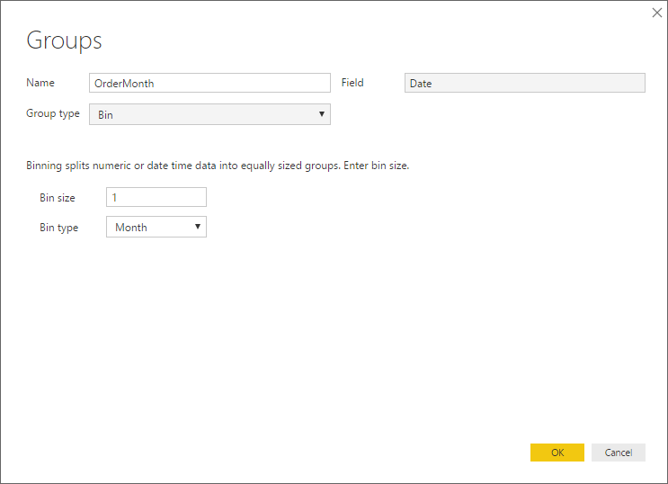
Then if you group up your calendar date by month:
and make it your axis of your column chart, and make Revenue YTD your value, it should look like this:
- Mark as New
- Bookmark
- Subscribe
- Mute
- Subscribe to RSS Feed
- Permalink
- Report Inappropriate Content
For doing this you should calculate a measure with TOTALYTD then used that as your values in the visuals.
Example: YTDMEASURE = TOTALYTD (SUM(Table[columnvalue]), table1[date])
Use the date column as your x-axis, there is also available the QTD and MTD calculation.
Regards,
Mfelix
Regards
Miguel Félix
Did I answer your question? Mark my post as a solution!
Proud to be a Super User!
Check out my blog: Power BI em PortuguêsHelpful resources

Microsoft Fabric Learn Together
Covering the world! 9:00-10:30 AM Sydney, 4:00-5:30 PM CET (Paris/Berlin), 7:00-8:30 PM Mexico City

Power BI Monthly Update - April 2024
Check out the April 2024 Power BI update to learn about new features.

| User | Count |
|---|---|
| 109 | |
| 99 | |
| 77 | |
| 66 | |
| 54 |
| User | Count |
|---|---|
| 144 | |
| 104 | |
| 102 | |
| 87 | |
| 64 |


