- Power BI forums
- Updates
- News & Announcements
- Get Help with Power BI
- Desktop
- Service
- Report Server
- Power Query
- Mobile Apps
- Developer
- DAX Commands and Tips
- Custom Visuals Development Discussion
- Health and Life Sciences
- Power BI Spanish forums
- Translated Spanish Desktop
- Power Platform Integration - Better Together!
- Power Platform Integrations (Read-only)
- Power Platform and Dynamics 365 Integrations (Read-only)
- Training and Consulting
- Instructor Led Training
- Dashboard in a Day for Women, by Women
- Galleries
- Community Connections & How-To Videos
- COVID-19 Data Stories Gallery
- Themes Gallery
- Data Stories Gallery
- R Script Showcase
- Webinars and Video Gallery
- Quick Measures Gallery
- 2021 MSBizAppsSummit Gallery
- 2020 MSBizAppsSummit Gallery
- 2019 MSBizAppsSummit Gallery
- Events
- Ideas
- Custom Visuals Ideas
- Issues
- Issues
- Events
- Upcoming Events
- Community Blog
- Power BI Community Blog
- Custom Visuals Community Blog
- Community Support
- Community Accounts & Registration
- Using the Community
- Community Feedback
Register now to learn Fabric in free live sessions led by the best Microsoft experts. From Apr 16 to May 9, in English and Spanish.
- Power BI forums
- Forums
- Get Help with Power BI
- Desktop
- Re: Grouping of dynamic values in Pie chart
- Subscribe to RSS Feed
- Mark Topic as New
- Mark Topic as Read
- Float this Topic for Current User
- Bookmark
- Subscribe
- Printer Friendly Page
- Mark as New
- Bookmark
- Subscribe
- Mute
- Subscribe to RSS Feed
- Permalink
- Report Inappropriate Content
Grouping of dynamic values in Pie chart
I am stuck in some weird dilemma with some not so friendly pie chart data set.
I have a data set based on survey questions and values. Survey contains 25questions and each has a text value answer. My team wants to showcase one particular question in that survey in form a pie-chart only. As it is survey, some answers have high entry rate than others. For e.g.
User 1 - Question 4- Not interested to disclose
User 2- Question 4: >35000
User 3-Question 4: >5000 and so on
Now when I am creating pie-chart for Question 4, values like "Not interested to disclose" take up 32% of pie, some other value take 15%, whereas values such ">35000" take up only 2% pie area. These values get squeezed and difficult to select. The scenario mentioned at last occurs for 8 kind of responses with all taking something between 5% to 0.7% of pie area. Like I mentioned before, all these 8 values are difficult to view or select. Showcasing top N is not helpful as all values are important from business perspective.
So is it possible we can dynamically group all these low hanging values in one as "Other"? And then use tool tip or some other bookmark method to showcase the small values in form of bar chart? Zoomcharts donut chart was not helpful because of watermark.
Also can we show legends as "Not interested to disclose- 35%" instead of just 35%?
Thanks for your help.
Solved! Go to Solution.
- Mark as New
- Bookmark
- Subscribe
- Mute
- Subscribe to RSS Feed
- Permalink
- Report Inappropriate Content
Hi,
According to your description, i create a sample to test:
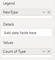
Then please try to create a column to show new type:
NewType = IF(CALCULATE(COUNTROWS('Table'),ALLEXCEPT('Table','Table'[Type]))/COUNTROWS('Table')<=0.1,"Other",'Table'[Type])Choose pie chart, it shows:
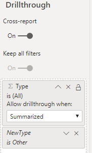
Then create a new page, choose [Type] as Pie chart, and apply a filter to it, it shows:
Turn on DrillThrough function:
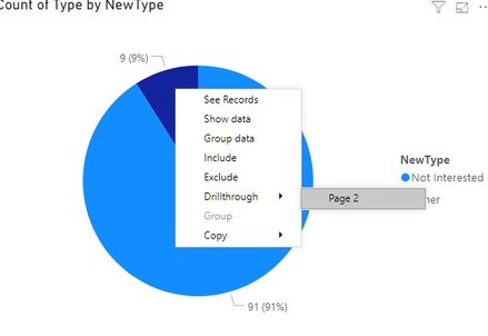
When you choose 'Other' type in the first page, you can drill through to see its details:
Here is my test pbix file:
Hope this helps.
Best Regards,
Giotto Zhi
- Mark as New
- Bookmark
- Subscribe
- Mute
- Subscribe to RSS Feed
- Permalink
- Report Inappropriate Content
v-gizhi-msft - Great solution. Thanks your help along with PBIX file. You are the best!
- Mark as New
- Bookmark
- Subscribe
- Mute
- Subscribe to RSS Feed
- Permalink
- Report Inappropriate Content
Refer :https://docs.microsoft.com/en-us/power-bi/desktop-grouping-and-binning
Microsoft Power BI Learning Resources, 2023 !!
Learn Power BI - Full Course with Dec-2022, with Window, Index, Offset, 100+ Topics !!
Did I answer your question? Mark my post as a solution! Appreciate your Kudos !! Proud to be a Super User! !!
Helpful resources

Microsoft Fabric Learn Together
Covering the world! 9:00-10:30 AM Sydney, 4:00-5:30 PM CET (Paris/Berlin), 7:00-8:30 PM Mexico City

Power BI Monthly Update - April 2024
Check out the April 2024 Power BI update to learn about new features.

| User | Count |
|---|---|
| 106 | |
| 94 | |
| 76 | |
| 62 | |
| 50 |
| User | Count |
|---|---|
| 147 | |
| 106 | |
| 104 | |
| 87 | |
| 61 |


