- Power BI forums
- Updates
- News & Announcements
- Get Help with Power BI
- Desktop
- Service
- Report Server
- Power Query
- Mobile Apps
- Developer
- DAX Commands and Tips
- Custom Visuals Development Discussion
- Health and Life Sciences
- Power BI Spanish forums
- Translated Spanish Desktop
- Power Platform Integration - Better Together!
- Power Platform Integrations (Read-only)
- Power Platform and Dynamics 365 Integrations (Read-only)
- Training and Consulting
- Instructor Led Training
- Dashboard in a Day for Women, by Women
- Galleries
- Community Connections & How-To Videos
- COVID-19 Data Stories Gallery
- Themes Gallery
- Data Stories Gallery
- R Script Showcase
- Webinars and Video Gallery
- Quick Measures Gallery
- 2021 MSBizAppsSummit Gallery
- 2020 MSBizAppsSummit Gallery
- 2019 MSBizAppsSummit Gallery
- Events
- Ideas
- Custom Visuals Ideas
- Issues
- Issues
- Events
- Upcoming Events
- Community Blog
- Power BI Community Blog
- Custom Visuals Community Blog
- Community Support
- Community Accounts & Registration
- Using the Community
- Community Feedback
Register now to learn Fabric in free live sessions led by the best Microsoft experts. From Apr 16 to May 9, in English and Spanish.
- Power BI forums
- Forums
- Get Help with Power BI
- Desktop
- Group or Sum up daily data into month so that char...
- Subscribe to RSS Feed
- Mark Topic as New
- Mark Topic as Read
- Float this Topic for Current User
- Bookmark
- Subscribe
- Printer Friendly Page
- Mark as New
- Bookmark
- Subscribe
- Mute
- Subscribe to RSS Feed
- Permalink
- Report Inappropriate Content
Group or Sum up daily data into month so that chart won't be overcrowded with daily data
Hi all,
We are trying to display time series data in line chart based on the dropdown slicer. E.g. if I choose Last 7 Days, the line chart will display two lines, one is the last 7 days, another line stacked will be showing previous 7 days (i.e. 7 days before the last 7 days).
Our data is continuous daily date (e.g. 01/10/2021, 02/10/2021, 03/10/2021, etc). So for a Last 7 Days data, it looks good because it's showing only seven data points, as for Last 14 Days it is still bearable. However, for Last 30 Days, Last 3 Months, Last 6 Months, Last 12 Months and All (consist of 3 years of data), the two lines in the line chart are "overcrowded" fitting in one small chart and bring no meaning for comparisons.
Is there a way to group, auto group or sum up, e.g. for Last 3 Months, just summarise/sum up each month's total and make the line chart to show just three data points because it's "3 months" (e.g. Aug, Sep, Oct) instead of like the screenshot below (which shows all of the daily data points). Same goes to if it's "All" being selected, then only sum up to three data points (e.g. year 2019, 2020, 2021).
Here's the measures if helps.
x-axis:
PeriodFiltering = 'dashboard'[Period].[Date]
y-axis:
TotalCountPrev3Month = CALCULATE([TotalCountWithoutZero],REMOVEFILTERS('SpecialDates'[Period]),(DATEADD('dashboard'[PeriodFiltering], -3, MONTH)))


TestingLinePrevGraphSelection = SWITCH (
    TRUE (),
     SELECTEDVALUE('SpecialDates'[Period])=="Last 3 Months", 'dashboard'[TotalCountPrev3Month]
)


TotalCountWithoutZero = DISTINCTCOUNT('dashboard'[user_id])
We are very new to Power BI and have searched for many days but to no avail, could be due to incorrect terminology search. Appreciate any help from the community experts. Thank you!
Solved! Go to Solution.
- Mark as New
- Bookmark
- Subscribe
- Mute
- Subscribe to RSS Feed
- Permalink
- Report Inappropriate Content
Hi @ps ,
You can group like as follows.
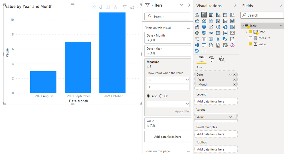
Put the date hierarchy ‘Year-Month’ into the axis, then create a measure, put it in a filter, and set Show items when the value is 1.
Best Regards,
Stephen Tao
If this post helps, then please consider Accept it as the solution to help the other members find it more quickly.
Helpful resources

Microsoft Fabric Learn Together
Covering the world! 9:00-10:30 AM Sydney, 4:00-5:30 PM CET (Paris/Berlin), 7:00-8:30 PM Mexico City

Power BI Monthly Update - April 2024
Check out the April 2024 Power BI update to learn about new features.

| User | Count |
|---|---|
| 107 | |
| 98 | |
| 78 | |
| 66 | |
| 53 |
| User | Count |
|---|---|
| 144 | |
| 104 | |
| 100 | |
| 86 | |
| 64 |


