- Power BI forums
- Updates
- News & Announcements
- Get Help with Power BI
- Desktop
- Service
- Report Server
- Power Query
- Mobile Apps
- Developer
- DAX Commands and Tips
- Custom Visuals Development Discussion
- Health and Life Sciences
- Power BI Spanish forums
- Translated Spanish Desktop
- Power Platform Integration - Better Together!
- Power Platform Integrations (Read-only)
- Power Platform and Dynamics 365 Integrations (Read-only)
- Training and Consulting
- Instructor Led Training
- Dashboard in a Day for Women, by Women
- Galleries
- Community Connections & How-To Videos
- COVID-19 Data Stories Gallery
- Themes Gallery
- Data Stories Gallery
- R Script Showcase
- Webinars and Video Gallery
- Quick Measures Gallery
- 2021 MSBizAppsSummit Gallery
- 2020 MSBizAppsSummit Gallery
- 2019 MSBizAppsSummit Gallery
- Events
- Ideas
- Custom Visuals Ideas
- Issues
- Issues
- Events
- Upcoming Events
- Community Blog
- Power BI Community Blog
- Custom Visuals Community Blog
- Community Support
- Community Accounts & Registration
- Using the Community
- Community Feedback
Register now to learn Fabric in free live sessions led by the best Microsoft experts. From Apr 16 to May 9, in English and Spanish.
- Power BI forums
- Forums
- Get Help with Power BI
- Desktop
- Graphing two date slicer selections in one graph w...
- Subscribe to RSS Feed
- Mark Topic as New
- Mark Topic as Read
- Float this Topic for Current User
- Bookmark
- Subscribe
- Printer Friendly Page
- Mark as New
- Bookmark
- Subscribe
- Mute
- Subscribe to RSS Feed
- Permalink
- Report Inappropriate Content
Graphing two date slicer selections in one graph with altered dates
I am trying to use two date slicer selections similar to how it is done in this blog https://www.sqlbi.com/articles/filtering-and-comparing-different-time-periods-with-power-bi/ . All that is fine and well and has been working for some time...
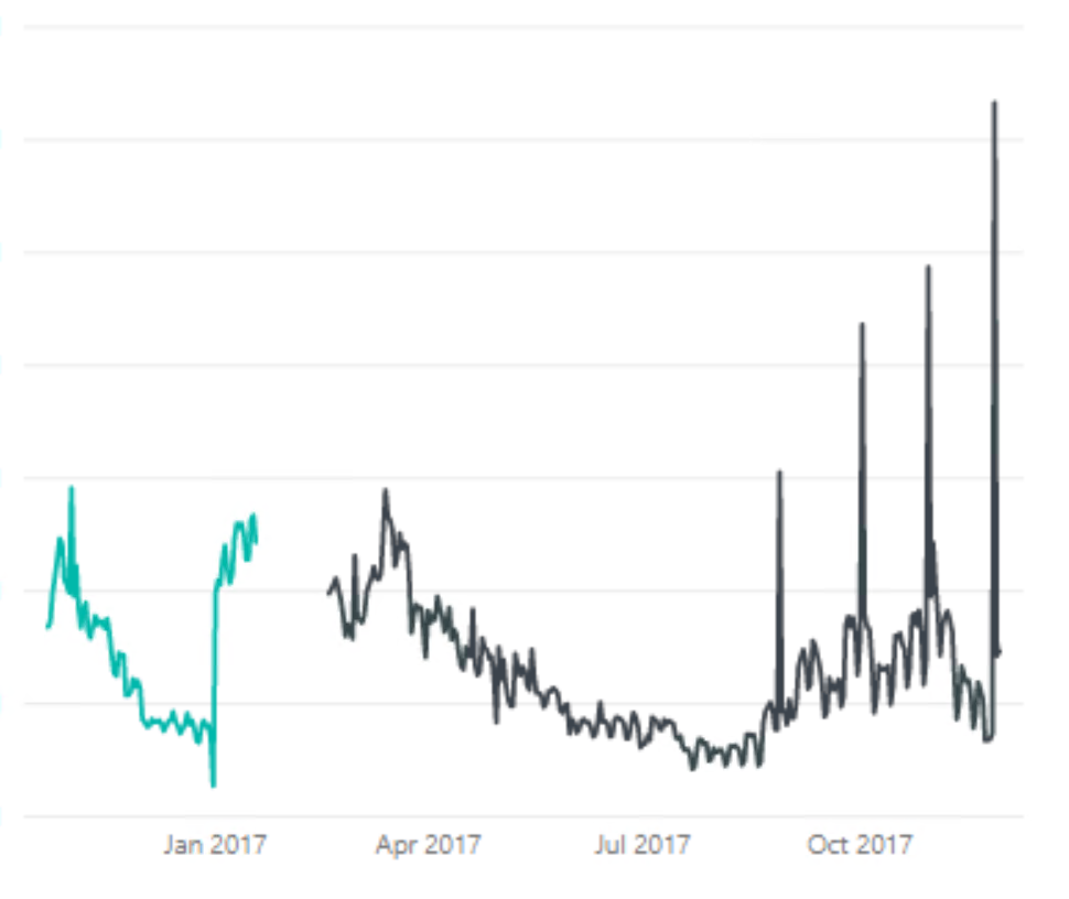
The plot thickens because what I am trying to do on top of that is graph every date in those two selections on a line chart but the second selected date range needs to be adjusted so that it is on top of the first selected date. The x axis will show the date selected by the first slicer. The date for the second slicer will appear incorrectly, but it needs to appear correctly in the tooltip.
This image shows two separate selected periods, but I want the first date of the black one to appear like it is the same as the first day as the blue one. The tooltip should have the correct date the black one starts on.
Solved! Go to Solution.
- Mark as New
- Bookmark
- Subscribe
- Mute
- Subscribe to RSS Feed
- Permalink
- Report Inappropriate Content
@almckenz to post a sample you need to upload to a public file sharing site like onedrive, box, drive or whatever and share a link. I ended up mocking up some data. My initial solution suggestion using calcualted columns didnt' work so I needed to implement with measures. Im sure there is another solution with RANK and earlier or somthing but I have not mastered those functions. Sorry if I ws cranky but ended putting a few hours into this and while I'm sure you have been pulling your hair out its not clear what you tried and if I endeded up duplicating efforts. It was an interesting problem tho so thank you.
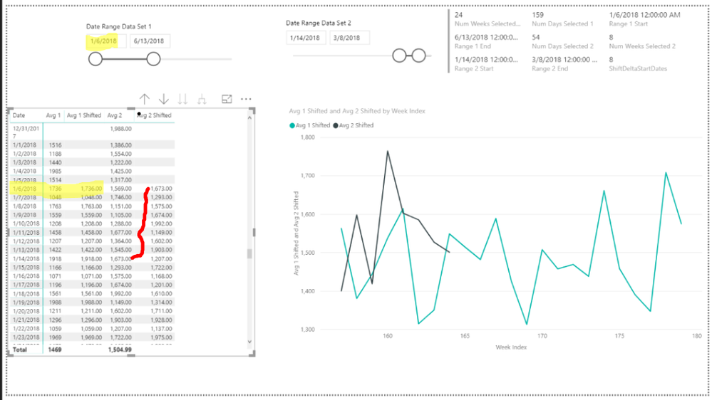
My solution uses a date table to link the two tables and shifts the dates using DATEADD with an offset equal to the Delta in the start dates. The tricky part was the dynamic start and end dates for each table and having to test which one comes first and then adapting. The calculations are done on a daily level and I added indexes for DAY, Week and Month to display arbitrary index on axis vs a date and allow aggegration at the Weekly and Monthly Levels. The hardest part was figuring out how to calculate the shiifts and get the signs right.
Note, I used disconnected slicers build dymaically from the two fact tables to avoid the complicatons of needing to use ALL all over the place to remove filters if you tried to slice directly on the fact tables. I then wrote measures to harvest the selected values that I used in my measures.
Here is a link to my solutuion : https://1drv.ms/u/s!AuCIkLeqFmlhhJkIcpsdkWzMMqeBBw I test a few scenarios and I belive it will work for any arbitrary set of dates. But please test it out.
Here is a sample of the DAX for Average of the first table.
Avg 1 Shifted = IF([Range 1 Start]<=[Range 2 Start],
    // If the earliest date is from range 1 just use range 1 values but limit to the selected rante
   IF([Range 1 Start]<=MAX(Dates[Date])&&[Range 1 End]>=MAX(Dates[Date]),AVERAGE('Range 1'[Value])),
   // ELSE imit to the number of selected dates in range 1 and then calculate for Range 1 but shift dates back by the difference in the start dates
   IF([Range 2 Start]<=MAX(Dates[Date])&&[Range 2 Start]+[Num Days Selected 1]-1>=MAX(Dates[Date]),CALCULATE(AVERAGE('Range 1'[Value]),DATEADD(Dates[Date],-[ShiftDeltaStartDates],DAY))))
Helpful resources

Microsoft Fabric Learn Together
Covering the world! 9:00-10:30 AM Sydney, 4:00-5:30 PM CET (Paris/Berlin), 7:00-8:30 PM Mexico City

Power BI Monthly Update - April 2024
Check out the April 2024 Power BI update to learn about new features.

| User | Count |
|---|---|
| 112 | |
| 100 | |
| 80 | |
| 64 | |
| 57 |
| User | Count |
|---|---|
| 146 | |
| 110 | |
| 93 | |
| 84 | |
| 67 |


