- Power BI forums
- Updates
- News & Announcements
- Get Help with Power BI
- Desktop
- Service
- Report Server
- Power Query
- Mobile Apps
- Developer
- DAX Commands and Tips
- Custom Visuals Development Discussion
- Health and Life Sciences
- Power BI Spanish forums
- Translated Spanish Desktop
- Power Platform Integration - Better Together!
- Power Platform Integrations (Read-only)
- Power Platform and Dynamics 365 Integrations (Read-only)
- Training and Consulting
- Instructor Led Training
- Dashboard in a Day for Women, by Women
- Galleries
- Community Connections & How-To Videos
- COVID-19 Data Stories Gallery
- Themes Gallery
- Data Stories Gallery
- R Script Showcase
- Webinars and Video Gallery
- Quick Measures Gallery
- 2021 MSBizAppsSummit Gallery
- 2020 MSBizAppsSummit Gallery
- 2019 MSBizAppsSummit Gallery
- Events
- Ideas
- Custom Visuals Ideas
- Issues
- Issues
- Events
- Upcoming Events
- Community Blog
- Power BI Community Blog
- Custom Visuals Community Blog
- Community Support
- Community Accounts & Registration
- Using the Community
- Community Feedback
Register now to learn Fabric in free live sessions led by the best Microsoft experts. From Apr 16 to May 9, in English and Spanish.
- Power BI forums
- Forums
- Get Help with Power BI
- Desktop
- Re: Graphing Temperature Changes Overtime
- Subscribe to RSS Feed
- Mark Topic as New
- Mark Topic as Read
- Float this Topic for Current User
- Bookmark
- Subscribe
- Printer Friendly Page
- Mark as New
- Bookmark
- Subscribe
- Mute
- Subscribe to RSS Feed
- Permalink
- Report Inappropriate Content
Graphing Temperature Changes Overtime
Hello,
I have a CSV that has MM/DD/YY HH:MM:SS and Temperature in decimal format. I have linked the CSV with Power BI Desktop. I am able to get the system to display the correct Date. In Data Modeling I have changed Default Summarization: Don't Summarize for the Temperature values.
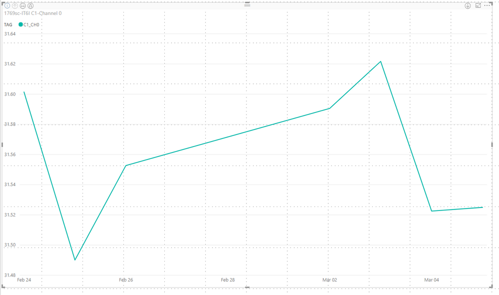
The issue I have is that when I graph using Line Chart, Power BI is automatically summarizing all of the temperature values, which is not what I need it to do. What I am wanting to do is graph out temperature changes over time by HH:MM:SS.

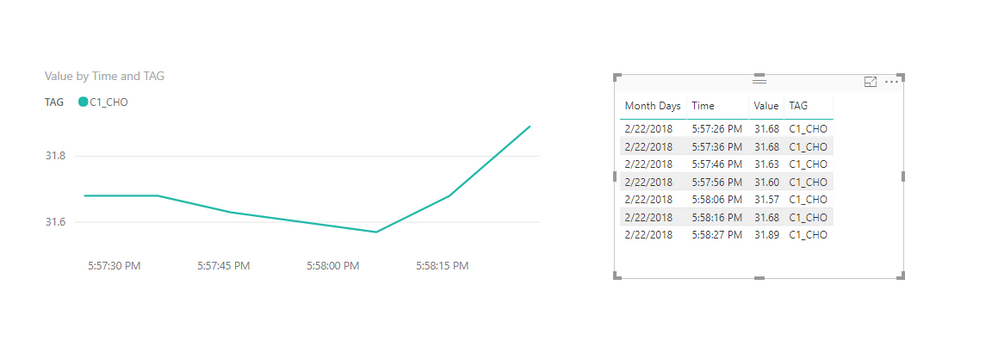
Below is a snap shot of what the data looks like in Power BI.

As you can see the temperature is being recorded 10 seconds. I want to graph each temperature change. So how can I either force PowerBI to stop summarizing OR is there a different chart type that is better suited for this application? Any other suggestions would be appreciated.
Solved! Go to Solution.
- Mark as New
- Bookmark
- Subscribe
- Mute
- Subscribe to RSS Feed
- Permalink
- Report Inappropriate Content
Xi Jin,
The proposed solution does not work when you span days as PowerBI does not appear to be able to handle the DATE + Time when they are separated in the source data. To make the graph work, I combined the DATE + TIME in the source data to ONE field. After that, the graphing worked as desired.
- Mark as New
- Bookmark
- Subscribe
- Mute
- Subscribe to RSS Feed
- Permalink
- Report Inappropriate Content
Hi @knotpc,
The aggregate function in Values is by design.
In your scenario, since you only use the Month Days as Axis for line chart and there exists duplicate Month Days like 2/22/2018 in the sample data. It also means that you are graphing temperature change based on each Month Days group. And for sure, to display temperature of each Month Days group, we should sum all the values for each group. So your line chart is right.
Then to achieve your requirement which is graphing each temperature change. You just need to change the Axis to Time column or be more precise change it to Datetime column. Make sure that there will not exist duplicate Axis values and SUM means nothing.
Something like:
Thanks,
Xi Jin.
- Mark as New
- Bookmark
- Subscribe
- Mute
- Subscribe to RSS Feed
- Permalink
- Report Inappropriate Content
Xi Jin,
The proposed solution does not work when you span days as PowerBI does not appear to be able to handle the DATE + Time when they are separated in the source data. To make the graph work, I combined the DATE + TIME in the source data to ONE field. After that, the graphing worked as desired.
Helpful resources

Microsoft Fabric Learn Together
Covering the world! 9:00-10:30 AM Sydney, 4:00-5:30 PM CET (Paris/Berlin), 7:00-8:30 PM Mexico City

Power BI Monthly Update - April 2024
Check out the April 2024 Power BI update to learn about new features.

| User | Count |
|---|---|
| 119 | |
| 107 | |
| 69 | |
| 68 | |
| 43 |
| User | Count |
|---|---|
| 148 | |
| 104 | |
| 102 | |
| 89 | |
| 66 |

