- Power BI forums
- Updates
- News & Announcements
- Get Help with Power BI
- Desktop
- Service
- Report Server
- Power Query
- Mobile Apps
- Developer
- DAX Commands and Tips
- Custom Visuals Development Discussion
- Health and Life Sciences
- Power BI Spanish forums
- Translated Spanish Desktop
- Power Platform Integration - Better Together!
- Power Platform Integrations (Read-only)
- Power Platform and Dynamics 365 Integrations (Read-only)
- Training and Consulting
- Instructor Led Training
- Dashboard in a Day for Women, by Women
- Galleries
- Community Connections & How-To Videos
- COVID-19 Data Stories Gallery
- Themes Gallery
- Data Stories Gallery
- R Script Showcase
- Webinars and Video Gallery
- Quick Measures Gallery
- 2021 MSBizAppsSummit Gallery
- 2020 MSBizAppsSummit Gallery
- 2019 MSBizAppsSummit Gallery
- Events
- Ideas
- Custom Visuals Ideas
- Issues
- Issues
- Events
- Upcoming Events
- Community Blog
- Power BI Community Blog
- Custom Visuals Community Blog
- Community Support
- Community Accounts & Registration
- Using the Community
- Community Feedback
Register now to learn Fabric in free live sessions led by the best Microsoft experts. From Apr 16 to May 9, in English and Spanish.
- Power BI forums
- Forums
- Get Help with Power BI
- Desktop
- Graphing Measures on a Bar Plot with Named Bar Val...
- Subscribe to RSS Feed
- Mark Topic as New
- Mark Topic as Read
- Float this Topic for Current User
- Bookmark
- Subscribe
- Printer Friendly Page
- Mark as New
- Bookmark
- Subscribe
- Mute
- Subscribe to RSS Feed
- Permalink
- Report Inappropriate Content
Graphing Measures on a Bar Plot with Named Bar Values
Hello everyone,
I am trying to create a bar graph that consists of multiple measures. On the x-axis, I want to provide a name for each measure (bar) that I graph. I learned about the concept of a measure table. In my scenario, how would this work? Is it possible to provide, in my measure table, an association between a name and a measure that returns a scalar value?
Thank you.
- Mark as New
- Bookmark
- Subscribe
- Mute
- Subscribe to RSS Feed
- Permalink
- Report Inappropriate Content
Hi @saimachi
Could you tell me if your problem has been solved? If it is, kindly Accept it as the solution. More people will benefit from it. Or you are still confused about it, please provide me with more details about your table and your problem or share me with your pbix file from your Onedrive for Business.
Best Regards,
Rico Zhou
- Mark as New
- Bookmark
- Subscribe
- Mute
- Subscribe to RSS Feed
- Permalink
- Report Inappropriate Content
Hi @saimachi
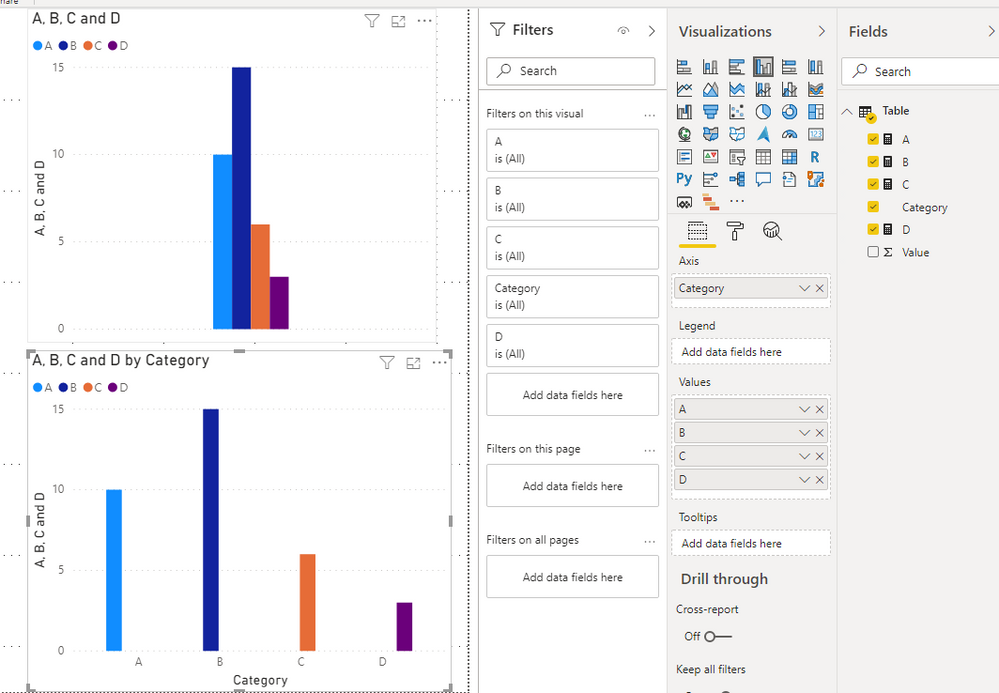
You might only add measures into value without add Name into axis.
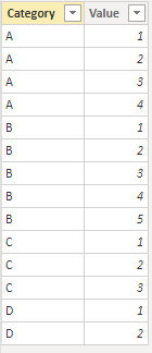
My sample table:
If it is possible you could add measure name or category in axis, and you could see measure name in X axis.
Or you can build a Measure Name Table and build a matrix by add Name into row and group two visuals.
You can download the pbix file from this link: Graphing Measures on a Bar Plot with Named Bar Values
Best Regards,
Rico Zhou
If this post helps, then please consider Accept it as the solution to help the other members find it more quickly.
- Mark as New
- Bookmark
- Subscribe
- Mute
- Subscribe to RSS Feed
- Permalink
- Report Inappropriate Content
@saimachi , The information you have provided is not making the problem clear to me. Can you please explain with an example?
What I getting is that you are looking for measure slicer
https://radacad.com/change-the-column-or-measure-value-in-a-power-bi-visual-by-selection-of-the-slic...
https://community.powerbi.com/t5/Desktop/Slicer-MTD-QTD-YTD-to-filter-dates-using-the-slicer/td-p/50...
https://www.youtube.com/watch?v=vlnx7QUVYME
Appreciate your Kudos.
Microsoft Power BI Learning Resources, 2023 !!
Learn Power BI - Full Course with Dec-2022, with Window, Index, Offset, 100+ Topics !!
Did I answer your question? Mark my post as a solution! Appreciate your Kudos !! Proud to be a Super User! !!
- Mark as New
- Bookmark
- Subscribe
- Mute
- Subscribe to RSS Feed
- Permalink
- Report Inappropriate Content
Hi @amitchandak,
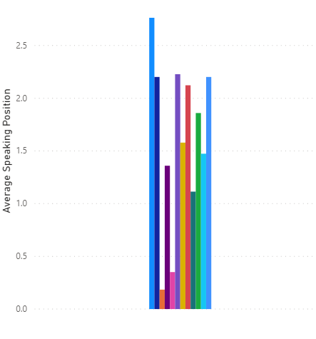
The image below shows my current configuration. I am plotting 12 measures, and they are all clustered together, and besides the legend, each bar does not have a name associated with it, which is what I'd like to do.
I have populated my measure table with the names I want below each bar. That way, I can set the Name column of the table as the x-axis of the plot. I was wondering if I could populate a second column of my table with the associated measure value.
Thanks for the resources you gave, I'll take a look through them.
- Mark as New
- Bookmark
- Subscribe
- Mute
- Subscribe to RSS Feed
- Permalink
- Report Inappropriate Content
@saimachi , you can either have a legend of multiple measures. you can not have both. You can enable show legend to show the legend name
Microsoft Power BI Learning Resources, 2023 !!
Learn Power BI - Full Course with Dec-2022, with Window, Index, Offset, 100+ Topics !!
Did I answer your question? Mark my post as a solution! Appreciate your Kudos !! Proud to be a Super User! !!
Helpful resources

Microsoft Fabric Learn Together
Covering the world! 9:00-10:30 AM Sydney, 4:00-5:30 PM CET (Paris/Berlin), 7:00-8:30 PM Mexico City

Power BI Monthly Update - April 2024
Check out the April 2024 Power BI update to learn about new features.

| User | Count |
|---|---|
| 115 | |
| 99 | |
| 88 | |
| 70 | |
| 62 |
| User | Count |
|---|---|
| 151 | |
| 120 | |
| 103 | |
| 87 | |
| 68 |


