- Power BI forums
- Updates
- News & Announcements
- Get Help with Power BI
- Desktop
- Service
- Report Server
- Power Query
- Mobile Apps
- Developer
- DAX Commands and Tips
- Custom Visuals Development Discussion
- Health and Life Sciences
- Power BI Spanish forums
- Translated Spanish Desktop
- Power Platform Integration - Better Together!
- Power Platform Integrations (Read-only)
- Power Platform and Dynamics 365 Integrations (Read-only)
- Training and Consulting
- Instructor Led Training
- Dashboard in a Day for Women, by Women
- Galleries
- Community Connections & How-To Videos
- COVID-19 Data Stories Gallery
- Themes Gallery
- Data Stories Gallery
- R Script Showcase
- Webinars and Video Gallery
- Quick Measures Gallery
- 2021 MSBizAppsSummit Gallery
- 2020 MSBizAppsSummit Gallery
- 2019 MSBizAppsSummit Gallery
- Events
- Ideas
- Custom Visuals Ideas
- Issues
- Issues
- Events
- Upcoming Events
- Community Blog
- Power BI Community Blog
- Custom Visuals Community Blog
- Community Support
- Community Accounts & Registration
- Using the Community
- Community Feedback
Register now to learn Fabric in free live sessions led by the best Microsoft experts. From Apr 16 to May 9, in English and Spanish.
- Power BI forums
- Forums
- Get Help with Power BI
- Desktop
- Graph with Sales 2014 and Sales 2013 on the same a...
- Subscribe to RSS Feed
- Mark Topic as New
- Mark Topic as Read
- Float this Topic for Current User
- Bookmark
- Subscribe
- Printer Friendly Page
- Mark as New
- Bookmark
- Subscribe
- Mute
- Subscribe to RSS Feed
- Permalink
- Report Inappropriate Content
Graph with Sales 2014 and Sales 2013 on the same axis
Hello,
I have only one column of Dates and one column of Sales.
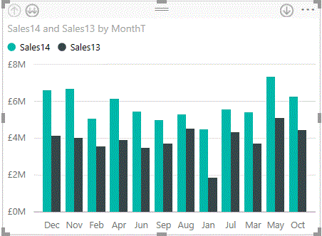
How do you built a graph with sales of 2 years on the same axis like this one :
Thanks for your help
Solved! Go to Solution.
- Mark as New
- Bookmark
- Subscribe
- Mute
- Subscribe to RSS Feed
- Permalink
- Report Inappropriate Content
Make sure you have selected Clustered Column Chart. Put Month on Axis, Year on Legend.
Here is a sample workbook. https://www.dropbox.com/s/ul1fj7yqzvn74xd/2%20years.pbix?dl=0
- Mark as New
- Bookmark
- Subscribe
- Mute
- Subscribe to RSS Feed
- Permalink
- Report Inappropriate Content
I assume you have both of these columns in 1 table. Create a second table "Calendar" and put a column of dates (same date range as your sales table) and then add a column called "Year" that just contains the year for each date. Join the date column in your Sales table to the date column in your calendar table. Then put the Year column from the calendar table on Axis to get the result. You can also add a column for Month, Quarter, Week, Day Name etc to extend your calendar table so it becomes more useful for different reporting needs.
- Mark as New
- Bookmark
- Subscribe
- Mute
- Subscribe to RSS Feed
- Permalink
- Report Inappropriate Content
Hi,
I still have two issues:
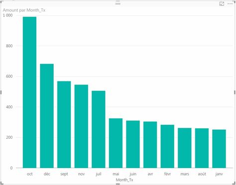
- I have only one column for each month, which is the total of 2015 and 2016 years. I expected two column on each month, one for 2015 and the other for 2016.
- Monyhs are sorted by decreasing amount. The Sort by...Month_Tx doesn't work
What did I miss?

- Mark as New
- Bookmark
- Subscribe
- Mute
- Subscribe to RSS Feed
- Permalink
- Report Inappropriate Content
Make sure you have selected Clustered Column Chart. Put Month on Axis, Year on Legend.
Here is a sample workbook. https://www.dropbox.com/s/ul1fj7yqzvn74xd/2%20years.pbix?dl=0
- Mark as New
- Bookmark
- Subscribe
- Mute
- Subscribe to RSS Feed
- Permalink
- Report Inappropriate Content
Hi MAllington,
Thanks a lot!
That works!
- Mark as New
- Bookmark
- Subscribe
- Mute
- Subscribe to RSS Feed
- Permalink
- Report Inappropriate Content
It might be more of a workaround, but it worked for me when I was having the same issue as you.
You could also create three tables:
- Date table with 'date', 'month', 'year', etc.
- Sales 2013 table
- Sales 2014 table
Then create some relations between the dates in sales2013 and sales2014 and your date table. Like this:
- Sales 2013 [date] --> Date [date]
- Sales 2014 [date] --> Date [date]
Make sure the dates in the date-table are of a unique value, so you can properly filter on them.
Then create a barchart, insert the total € of sales 2013 and sales 2014 in the value-field. And the month_name (from the date-table) in the axis-value.
After that you could create a slicer to filter on year, month, quartile or whatever you want to filter on.
Helpful resources

Microsoft Fabric Learn Together
Covering the world! 9:00-10:30 AM Sydney, 4:00-5:30 PM CET (Paris/Berlin), 7:00-8:30 PM Mexico City

Power BI Monthly Update - April 2024
Check out the April 2024 Power BI update to learn about new features.

| User | Count |
|---|---|
| 113 | |
| 100 | |
| 78 | |
| 76 | |
| 52 |
| User | Count |
|---|---|
| 146 | |
| 109 | |
| 106 | |
| 88 | |
| 61 |


