- Power BI forums
- Updates
- News & Announcements
- Get Help with Power BI
- Desktop
- Service
- Report Server
- Power Query
- Mobile Apps
- Developer
- DAX Commands and Tips
- Custom Visuals Development Discussion
- Health and Life Sciences
- Power BI Spanish forums
- Translated Spanish Desktop
- Power Platform Integration - Better Together!
- Power Platform Integrations (Read-only)
- Power Platform and Dynamics 365 Integrations (Read-only)
- Training and Consulting
- Instructor Led Training
- Dashboard in a Day for Women, by Women
- Galleries
- Community Connections & How-To Videos
- COVID-19 Data Stories Gallery
- Themes Gallery
- Data Stories Gallery
- R Script Showcase
- Webinars and Video Gallery
- Quick Measures Gallery
- 2021 MSBizAppsSummit Gallery
- 2020 MSBizAppsSummit Gallery
- 2019 MSBizAppsSummit Gallery
- Events
- Ideas
- Custom Visuals Ideas
- Issues
- Issues
- Events
- Upcoming Events
- Community Blog
- Power BI Community Blog
- Custom Visuals Community Blog
- Community Support
- Community Accounts & Registration
- Using the Community
- Community Feedback
Register now to learn Fabric in free live sessions led by the best Microsoft experts. From Apr 16 to May 9, in English and Spanish.
- Power BI forums
- Forums
- Get Help with Power BI
- Desktop
- Graph showing x-weeks rolling data over multiple y...
- Subscribe to RSS Feed
- Mark Topic as New
- Mark Topic as Read
- Float this Topic for Current User
- Bookmark
- Subscribe
- Printer Friendly Page
- Mark as New
- Bookmark
- Subscribe
- Mute
- Subscribe to RSS Feed
- Permalink
- Report Inappropriate Content
Graph showing x-weeks rolling data over multiple years
Dear all,
I have been working on some data that is being reported on a weekly basis (i.e. each week is one data entry). All seemed to work fine until I wanted to refresh my data for the first time in 2022. I then got some strange results because of weeknumbers partly falling into both years, etc.
Currently my view is as follows
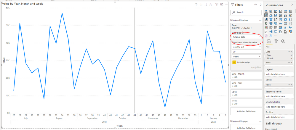
I would like to have my x-axis showing the week numbers, but it should obviously 'reset' the count once the new year starts (as in below example by @v-rzhou-msft ). I tried some things (e.g. adding the year number to the week number to make it work in chronological order) but I haven't figured out the correct solution for now.
Additionally, once my x-axis is fixed, I would like to show the data of the last x-number (26 or 52) of weeks, preferably updated automatically.
Could anyone help me out with this? Thanks a lot!
Solved! Go to Solution.
- Mark as New
- Bookmark
- Subscribe
- Mute
- Subscribe to RSS Feed
- Permalink
- Report Inappropriate Content
Hi @NiekHacquebord ,
Add a week column to the table.
week = WEEKNUM('Table'[Date],2)Then use date heirarchy and [week] as x-axis and turn off concatenate labels under format -> x-axis.
To only show the latest number of weeks, you could add the [date] column to visual filter then use Relative date filter feature.
Best Regards,
Jay
If this post helps, then please consider Accept it as the solution to help the other members find it.
- Mark as New
- Bookmark
- Subscribe
- Mute
- Subscribe to RSS Feed
- Permalink
- Report Inappropriate Content
@NiekHacquebord , use datesYTD
YTD Sales = CALCULATE(SUM(Sales[Sales Amount]),DATESYTD('Date'[Date],"12/31"))
or a measure like
YTD= CALCULATE(sum('Table'[Qty]), FILTER(ALL('Date'),'Date'[Year]=max('Date'[Year]) && 'Date'[Week] <= Max('Date'[Week]) ))
Use a separate date or year week table
Microsoft Power BI Learning Resources, 2023 !!
Learn Power BI - Full Course with Dec-2022, with Window, Index, Offset, 100+ Topics !!
Did I answer your question? Mark my post as a solution! Appreciate your Kudos !! Proud to be a Super User! !!
- Mark as New
- Bookmark
- Subscribe
- Mute
- Subscribe to RSS Feed
- Permalink
- Report Inappropriate Content
Hi Amit,
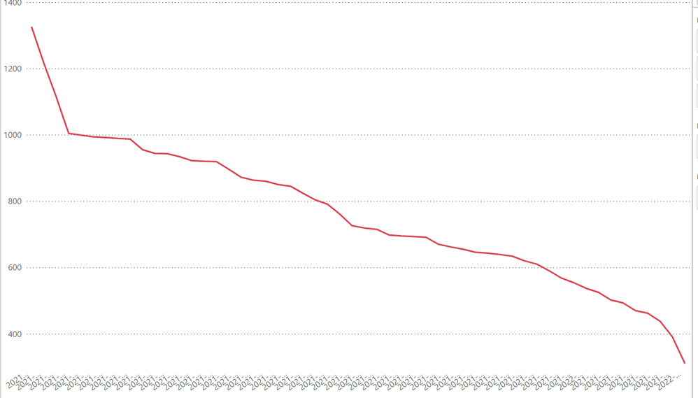
Thanks for your reply! Still haven't managed to make it work, but I am not sure whether I phrased my question correctly. What I tried previously is to use some kind of "YearWeek" column to fix my data (see below). However, the x-axis then has type "categorical", whereas I want to show it chronological order. Is there any way to fix this? Or should I maybe just number all the weeks over all the years and then use "continuous" on the x-axis? Then I probably won't be able to show correct values on the x-axis..
Hope this clarifies my question a bit more.
Helpful resources

Microsoft Fabric Learn Together
Covering the world! 9:00-10:30 AM Sydney, 4:00-5:30 PM CET (Paris/Berlin), 7:00-8:30 PM Mexico City

Power BI Monthly Update - April 2024
Check out the April 2024 Power BI update to learn about new features.

| User | Count |
|---|---|
| 110 | |
| 94 | |
| 80 | |
| 66 | |
| 58 |
| User | Count |
|---|---|
| 150 | |
| 119 | |
| 104 | |
| 87 | |
| 67 |


