- Power BI forums
- Updates
- News & Announcements
- Get Help with Power BI
- Desktop
- Service
- Report Server
- Power Query
- Mobile Apps
- Developer
- DAX Commands and Tips
- Custom Visuals Development Discussion
- Health and Life Sciences
- Power BI Spanish forums
- Translated Spanish Desktop
- Power Platform Integration - Better Together!
- Power Platform Integrations (Read-only)
- Power Platform and Dynamics 365 Integrations (Read-only)
- Training and Consulting
- Instructor Led Training
- Dashboard in a Day for Women, by Women
- Galleries
- Community Connections & How-To Videos
- COVID-19 Data Stories Gallery
- Themes Gallery
- Data Stories Gallery
- R Script Showcase
- Webinars and Video Gallery
- Quick Measures Gallery
- 2021 MSBizAppsSummit Gallery
- 2020 MSBizAppsSummit Gallery
- 2019 MSBizAppsSummit Gallery
- Events
- Ideas
- Custom Visuals Ideas
- Issues
- Issues
- Events
- Upcoming Events
- Community Blog
- Power BI Community Blog
- Custom Visuals Community Blog
- Community Support
- Community Accounts & Registration
- Using the Community
- Community Feedback
Register now to learn Fabric in free live sessions led by the best Microsoft experts. From Apr 16 to May 9, in English and Spanish.
- Power BI forums
- Forums
- Get Help with Power BI
- Desktop
- Re: Graph revenue by month without grouping years
- Subscribe to RSS Feed
- Mark Topic as New
- Mark Topic as Read
- Float this Topic for Current User
- Bookmark
- Subscribe
- Printer Friendly Page
- Mark as New
- Bookmark
- Subscribe
- Mute
- Subscribe to RSS Feed
- Permalink
- Report Inappropriate Content
Graph revenue by month without grouping years
I am new to PowerBI and trying to create a simple graph to show revenue vs. month including year. My months seem to get groups reguardless of year, so that Jan 2018 and Jan 2019 all fall to on point on the graph. How can I separate? If I add Year to the hierarchy it gives me wonky results.
If I don't use the hierarchy, individual dates are graphed instead of totals by month.
Any suggestion?
Solved! Go to Solution.
- Mark as New
- Bookmark
- Subscribe
- Mute
- Subscribe to RSS Feed
- Permalink
- Report Inappropriate Content
Hi @JGABRIEL,
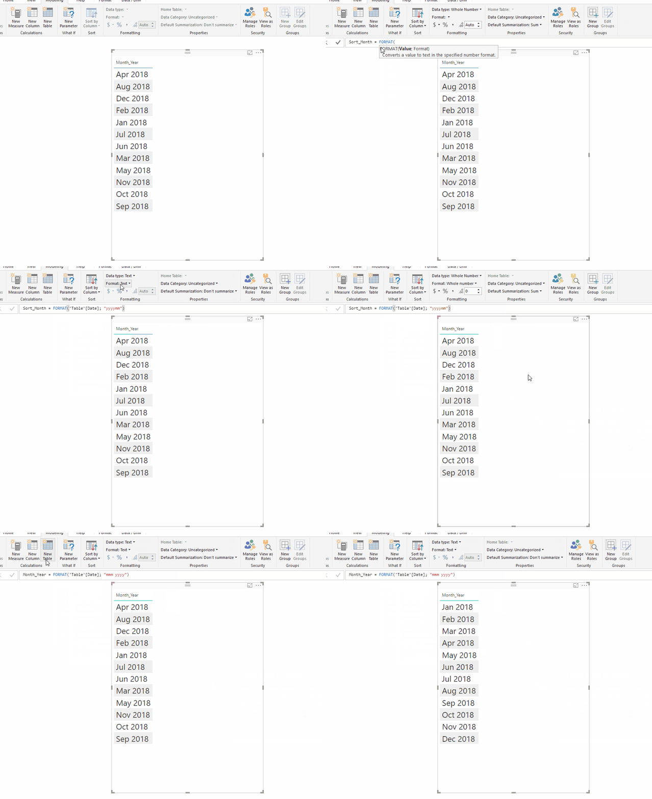
when having several columns in a table you have some difficulty to sort especcially the text column as is the current situation.
Add a new colum with the following formula:
SortMonth = Format (Table[Date]; "YYYYMM")
Then configure this column and Number and after that select the Year_Month column and sort it by this new column should work see below the steps:
Regards,
MFelix
Regards
Miguel Félix
Did I answer your question? Mark my post as a solution!
Proud to be a Super User!
Check out my blog: Power BI em Português- Mark as New
- Bookmark
- Subscribe
- Mute
- Subscribe to RSS Feed
- Permalink
- Report Inappropriate Content
Hi @JGABRIEL,
Create a new column with the following formula:
Year _ Month = Format (Table[Date]; "yy - mmm")
Then use this colum to place on your axis.
Regards,
MFelix
Regards
Miguel Félix
Did I answer your question? Mark my post as a solution!
Proud to be a Super User!
Check out my blog: Power BI em Português- Mark as New
- Bookmark
- Subscribe
- Mute
- Subscribe to RSS Feed
- Permalink
- Report Inappropriate Content
Thanks - that got me really close! Now how do I sort the chart chronologically? Dec 2017 is after Apr 2018, but before Feb 2018?
- Mark as New
- Bookmark
- Subscribe
- Mute
- Subscribe to RSS Feed
- Permalink
- Report Inappropriate Content
Hi @JGABRIEL,
when having several columns in a table you have some difficulty to sort especcially the text column as is the current situation.
Add a new colum with the following formula:
SortMonth = Format (Table[Date]; "YYYYMM")
Then configure this column and Number and after that select the Year_Month column and sort it by this new column should work see below the steps:
Regards,
MFelix
Regards
Miguel Félix
Did I answer your question? Mark my post as a solution!
Proud to be a Super User!
Check out my blog: Power BI em Português- Mark as New
- Bookmark
- Subscribe
- Mute
- Subscribe to RSS Feed
- Permalink
- Report Inappropriate Content
I'm seeing this (type of) question a lot on the forums and always the answer seems something like 'you need to create a new yyyy mm column for this'.
This bazzles me, because I can't imagine that PowerBI can't do such a simple thing on it's own. Date by definition should be totally flexible. In a lot (if not most) cases, users would want to graph data that spans over multiple years by year AND month 'coninuously' and not just see 12 months and have all the months of every year aggregated.
How can this not be a simple setting in the report itself?
- Mark as New
- Bookmark
- Subscribe
- Mute
- Subscribe to RSS Feed
- Permalink
- Report Inappropriate Content
Hi @Chris64,
Power BI is versatil in using this based on the date and Hierarchy, however in most of the cases that I have answer to question here and this is the case the formatting is divergent from what people want, and in that sense there is a need to make some additional columns to your calendar table.
The languange options are very tricky because they depend not only on the PBI settings but also computer settings.
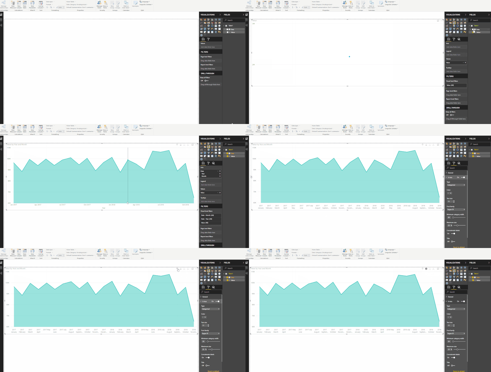
As you can see below adding the date column to a line chart with the hierarchy and making a drill dow is possible to have multiple years and months in the correct way.
In this case by the way the result was presented the best solution was to make an additional column. It all depend on your setup and the way you also setup your charts.
Regards
Miguel Félix
Did I answer your question? Mark my post as a solution!
Proud to be a Super User!
Check out my blog: Power BI em Português- Mark as New
- Bookmark
- Subscribe
- Mute
- Subscribe to RSS Feed
- Permalink
- Report Inappropriate Content
Hi MFelix,
That is exactly what I meant! Somehow, this 'feature' seems a bit hidden in Power BI, since when I have the chart displaying years (highest level of hierarchie), it shows the x-axis categorical by default. If I then switch to 'continuous' and press on 
it somehow switches back to 'categorical', however I can't change this on the X-axis settings, since now that setting has disappeared.
Anyway, by just clicking on 
Thanks!
- Mark as New
- Bookmark
- Subscribe
- Mute
- Subscribe to RSS Feed
- Permalink
- Report Inappropriate Content
Hi @Chris64,
working with PBI for 3 years already I can see whant you mean by having the feature "hidden", however as I said in most of the cases that I have suggested a new column is related with the format people want the data, sometimes without having to use the hierarchy, or something similar.
Glad I have help you to clarify this.
Regards,
MFelix
Regards
Miguel Félix
Did I answer your question? Mark my post as a solution!
Proud to be a Super User!
Check out my blog: Power BI em PortuguêsHelpful resources

Microsoft Fabric Learn Together
Covering the world! 9:00-10:30 AM Sydney, 4:00-5:30 PM CET (Paris/Berlin), 7:00-8:30 PM Mexico City

Power BI Monthly Update - April 2024
Check out the April 2024 Power BI update to learn about new features.

| User | Count |
|---|---|
| 111 | |
| 100 | |
| 80 | |
| 64 | |
| 57 |
| User | Count |
|---|---|
| 146 | |
| 110 | |
| 93 | |
| 84 | |
| 67 |


