- Power BI forums
- Updates
- News & Announcements
- Get Help with Power BI
- Desktop
- Service
- Report Server
- Power Query
- Mobile Apps
- Developer
- DAX Commands and Tips
- Custom Visuals Development Discussion
- Health and Life Sciences
- Power BI Spanish forums
- Translated Spanish Desktop
- Power Platform Integration - Better Together!
- Power Platform Integrations (Read-only)
- Power Platform and Dynamics 365 Integrations (Read-only)
- Training and Consulting
- Instructor Led Training
- Dashboard in a Day for Women, by Women
- Galleries
- Community Connections & How-To Videos
- COVID-19 Data Stories Gallery
- Themes Gallery
- Data Stories Gallery
- R Script Showcase
- Webinars and Video Gallery
- Quick Measures Gallery
- 2021 MSBizAppsSummit Gallery
- 2020 MSBizAppsSummit Gallery
- 2019 MSBizAppsSummit Gallery
- Events
- Ideas
- Custom Visuals Ideas
- Issues
- Issues
- Events
- Upcoming Events
- Community Blog
- Power BI Community Blog
- Custom Visuals Community Blog
- Community Support
- Community Accounts & Registration
- Using the Community
- Community Feedback
Register now to learn Fabric in free live sessions led by the best Microsoft experts. From Apr 16 to May 9, in English and Spanish.
- Power BI forums
- Forums
- Get Help with Power BI
- Desktop
- Re: Graph positive numbers as negative
- Subscribe to RSS Feed
- Mark Topic as New
- Mark Topic as Read
- Float this Topic for Current User
- Bookmark
- Subscribe
- Printer Friendly Page
- Mark as New
- Bookmark
- Subscribe
- Mute
- Subscribe to RSS Feed
- Permalink
- Report Inappropriate Content
Graph positive numbers as negative
Dear colleagues,
I have the next challenge; I am ploting depths. Depth (not height) is a positive value. The largest, the deeper.
I can plot that vs. time on a very simple line chart. But the line climbs up.
First I tried was to create the simplest ever "new column": -[DEPTH]
It works, and the graph now goes down. However the legend is also negative, which I dont like.
Spotfire has an option to graph inversely. But I cant find nothing like that in Power BI.
¿Can any one help, or figure out any way to show the legend without the 'minus'?
Thanks in advance!!
Sergio
Solved! Go to Solution.
- Mark as New
- Bookmark
- Subscribe
- Mute
- Subscribe to RSS Feed
- Permalink
- Report Inappropriate Content
I don't think you can do this with the default visuals. Besides finding a custom visual in the store, here is how to do it with R scripting:
- First, follow this article if you don't have R scripting set up for PBI yet: https://docs.microsoft.com/en-us/power-bi/desktop-r-visuals
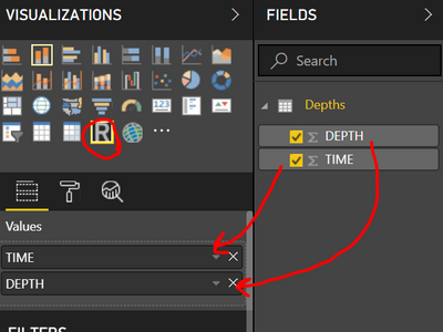
- Once set up, you should have R scripting as a visual option, click it and drag in your TIME and DEPTH columns (make sure it's TIME then DEPTH as that affects structure of what you plot with R), like so:
- Then, in R script editor, enter:
plot(dataset , ylim = rev(range(dataset["DEPTH"])) ,lwd=4 , type="l" , bty="n" , col=rgb(0.2,0.4,0.6,0.8) ,xaxt = "n")
axis(1,at = unlist(dataset["TIME"]))
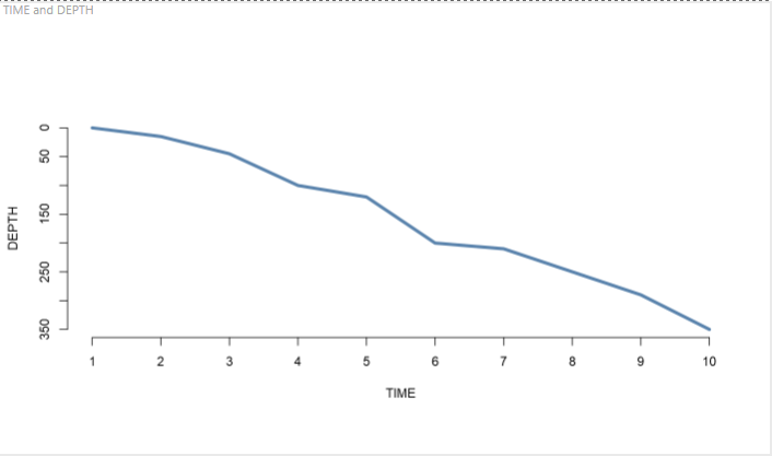
(credit to here for getting me started as I'm an R novice: https://www.r-graph-gallery.com/77-turn-y-axis-upside-down/) - Hit Run script button and you're all set:
- Mark as New
- Bookmark
- Subscribe
- Mute
- Subscribe to RSS Feed
- Permalink
- Report Inappropriate Content
Hi SergioJG,
Could you share some sample data and clarify more details about your requirement?
Regards,
Jimmy Tao
- Mark as New
- Bookmark
- Subscribe
- Mute
- Subscribe to RSS Feed
- Permalink
- Report Inappropriate Content
Imagin a set of data as follows:
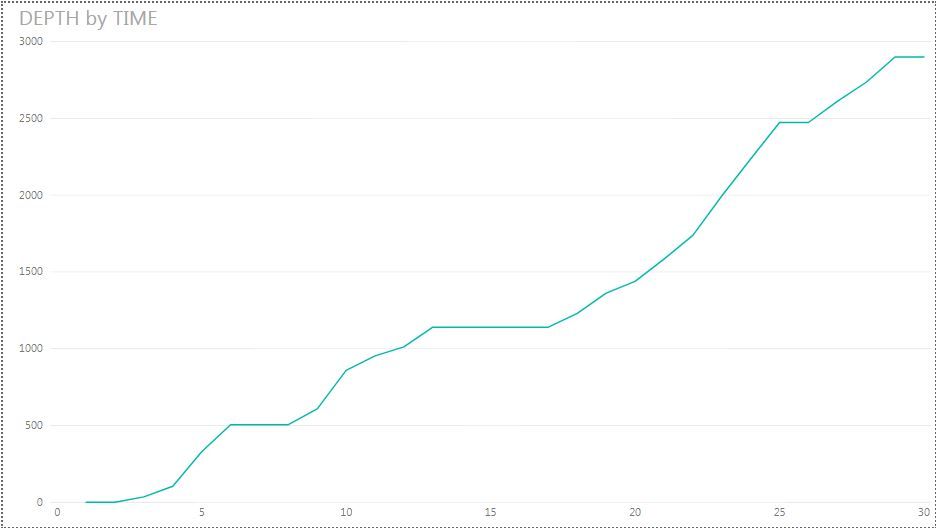
On a standard line graph, that will be line starting on 0,0 going to the right and climbing up:
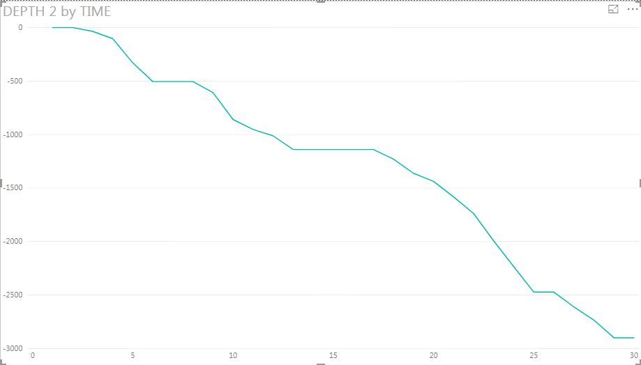
However, I am trying to plot depth, and a positive depth value should be below cero.
First idea was a 'new meassure' turning DEPTH column into a negative value, so the excel input can still be positive:
DEPTH 2 = -[DEPTH]
But still the legend is negative.
How can I plot my positive value in this second way, or hide the "minus" on the Y axis if I just change the sign with a calculated column?
Thanks!!
- Mark as New
- Bookmark
- Subscribe
- Mute
- Subscribe to RSS Feed
- Permalink
- Report Inappropriate Content
I am a bit confused. Can you elaborate which part of the visual you call a legend? Is that the Y axis?
- Mark as New
- Bookmark
- Subscribe
- Mute
- Subscribe to RSS Feed
- Permalink
- Report Inappropriate Content
Thanks for any suggestion!!
- Mark as New
- Bookmark
- Subscribe
- Mute
- Subscribe to RSS Feed
- Permalink
- Report Inappropriate Content
I don't think you can do this with the default visuals. Besides finding a custom visual in the store, here is how to do it with R scripting:
- First, follow this article if you don't have R scripting set up for PBI yet: https://docs.microsoft.com/en-us/power-bi/desktop-r-visuals
- Once set up, you should have R scripting as a visual option, click it and drag in your TIME and DEPTH columns (make sure it's TIME then DEPTH as that affects structure of what you plot with R), like so:
- Then, in R script editor, enter:
plot(dataset , ylim = rev(range(dataset["DEPTH"])) ,lwd=4 , type="l" , bty="n" , col=rgb(0.2,0.4,0.6,0.8) ,xaxt = "n")
axis(1,at = unlist(dataset["TIME"]))
(credit to here for getting me started as I'm an R novice: https://www.r-graph-gallery.com/77-turn-y-axis-upside-down/) - Hit Run script button and you're all set:
- Mark as New
- Bookmark
- Subscribe
- Mute
- Subscribe to RSS Feed
- Permalink
- Report Inappropriate Content
Thanks MarkLaf,
I will try that in the upcoming days and let you know. On your example looks working exactly as I need!
Thank you very much for your time and support.
Sergio.
- Mark as New
- Bookmark
- Subscribe
- Mute
- Subscribe to RSS Feed
- Permalink
- Report Inappropriate Content
Solved!
Thank you very much. Working nicely!!
- Mark as New
- Bookmark
- Subscribe
- Mute
- Subscribe to RSS Feed
- Permalink
- Report Inappropriate Content
Legend and values are different properties of a visual so generally you can use the positive number column for Legend and the negative for Values. But this is just the answer without knowing your case. Probably if you can share some sample of your case? Like a screenshot of the visual?
Helpful resources

Microsoft Fabric Learn Together
Covering the world! 9:00-10:30 AM Sydney, 4:00-5:30 PM CET (Paris/Berlin), 7:00-8:30 PM Mexico City

Power BI Monthly Update - April 2024
Check out the April 2024 Power BI update to learn about new features.

| User | Count |
|---|---|
| 117 | |
| 107 | |
| 69 | |
| 68 | |
| 43 |
| User | Count |
|---|---|
| 148 | |
| 104 | |
| 102 | |
| 88 | |
| 66 |


