- Power BI forums
- Updates
- News & Announcements
- Get Help with Power BI
- Desktop
- Service
- Report Server
- Power Query
- Mobile Apps
- Developer
- DAX Commands and Tips
- Custom Visuals Development Discussion
- Health and Life Sciences
- Power BI Spanish forums
- Translated Spanish Desktop
- Power Platform Integration - Better Together!
- Power Platform Integrations (Read-only)
- Power Platform and Dynamics 365 Integrations (Read-only)
- Training and Consulting
- Instructor Led Training
- Dashboard in a Day for Women, by Women
- Galleries
- Community Connections & How-To Videos
- COVID-19 Data Stories Gallery
- Themes Gallery
- Data Stories Gallery
- R Script Showcase
- Webinars and Video Gallery
- Quick Measures Gallery
- 2021 MSBizAppsSummit Gallery
- 2020 MSBizAppsSummit Gallery
- 2019 MSBizAppsSummit Gallery
- Events
- Ideas
- Custom Visuals Ideas
- Issues
- Issues
- Events
- Upcoming Events
- Community Blog
- Power BI Community Blog
- Custom Visuals Community Blog
- Community Support
- Community Accounts & Registration
- Using the Community
- Community Feedback
Register now to learn Fabric in free live sessions led by the best Microsoft experts. From Apr 16 to May 9, in English and Spanish.
- Power BI forums
- Forums
- Get Help with Power BI
- Desktop
- Re: Graph of monthly returning, lost and new custo...
- Subscribe to RSS Feed
- Mark Topic as New
- Mark Topic as Read
- Float this Topic for Current User
- Bookmark
- Subscribe
- Printer Friendly Page
- Mark as New
- Bookmark
- Subscribe
- Mute
- Subscribe to RSS Feed
- Permalink
- Report Inappropriate Content
Graph of monthly returning, lost and new customers, and table of who they are and their sales
Hi, I've been working on attrition measures for a while now, but have not yet found a post or example that would achieve this on a same report page:
- A graph showing, for each month over a year, three bars:
a) The number of returning customers, eg. who were purchasing last month and are this month too
b) The number of new customers, eg. who were not purchasing last month, but started this month
c) The number of lost customers, negative number, eg. who were purchasing last month but not this month
- On the same report page, clicking one of the above bars would filter another table that lists the customer IDs and their respective sales numbers (or lost sales), for the month corresponding to the selected bar.
In essence, it is similar to what is found here:
https://blog.enterprisedna.co/analyze-who-your-lost-customers-are-using-power-bi-dax/
But with the ability to analyze the returning and new customers, in addition to the lost ones. Does it seem like possible or too complex of a challenge? It seems like the dna example does have the ability to toggle between Lost and New customers, which already would be great, but since the demo does not cover it, I can't seem to figure out out how to do it.
Thanks in advance for your help!
Erik
Solved! Go to Solution.
- Mark as New
- Bookmark
- Subscribe
- Mute
- Subscribe to RSS Feed
- Permalink
- Report Inappropriate Content
Hi @ebeauchamp ,
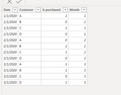
I created a simple table as example:
First create a slice month table that you could dynamically see the changes between months:
slicer table = VALUES('Table'[Month])Then create 6 measures as below;
Flag_The number of lost customers =
var lastmonth=SELECTEDVALUE('slicer table'[Month])-1
var status_lastmonth=CALCULATE(SUM('Table'[is purchased]),FILTER(ALL('Table'),'Table'[Customer]=MAX('Table'[Customer])&&'Table'[Month]=lastmonth))
var status_thismonth=CALCULATE(SUM('Table'[is purchased]),FILTER(ALL('Table'),'Table'[Customer]=MAX('Table'[Customer])&&'Table'[Month]=SELECTEDVALUE('slicer table'[Month])))
Return
IF(status_lastmonth>0&&status_thismonth=0,1,0)
Flag_The number of new customers =
var lastmonth=SELECTEDVALUE('slicer table'[Month])-1
var status_lastmonth=CALCULATE(SUM('Table'[is purchased]),FILTER(ALL('Table'),'Table'[Customer]=MAX('Table'[Customer])&&'Table'[Month]=lastmonth))
var status_thismonth=CALCULATE(SUM('Table'[is purchased]),FILTER(ALL('Table'),'Table'[Customer]=MAX('Table'[Customer])&&'Table'[Month]=SELECTEDVALUE('slicer table'[Month])))
Return
IF(status_lastmonth=0&&status_thismonth>0,1,0)Flag_The number of returning customers =
var lastmonth=SELECTEDVALUE('slicer table'[Month])-1
var status_lastmonth=CALCULATE(SUM('Table'[is purchased]),FILTER(ALL('Table'),'Table'[Customer]=MAX('Table'[Customer])&&'Table'[Month]=lastmonth))
var status_thismonth=CALCULATE(SUM('Table'[is purchased]),FILTER(ALL('Table'),'Table'[Customer]=MAX('Table'[Customer])&&'Table'[Month]=SELECTEDVALUE('slicer table'[Month])))
Return
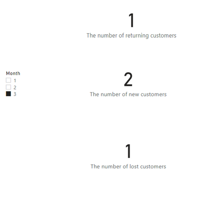
IF(status_lastmonth>0&&status_thismonth>0,1,0)The number of lost customers = SUMX(VALUES('Table'[Customer]),'Table'[Flag_The number of lost customers])The number of new customers = SUMX(VALUES('Table'[Customer]),'Table'[Flag_The number of new customers])The number of returning customers = SUMX(VALUES('Table'[Customer]),'Table'[Flag_The number of returning customers])And you will see:
For the related .pbix file,pls see attached.
Best Regards,
Kelly
Did I answer your question? Mark my post as a solution!
- Mark as New
- Bookmark
- Subscribe
- Mute
- Subscribe to RSS Feed
- Permalink
- Report Inappropriate Content
If you can share your pbix (or a mock up of similar) through a link to Google Drive, OneDrive, etc., specific measures can be proposed.
Regards,
Pat
Did I answer your question? Mark my post as a solution! Kudos are also appreciated!
To learn more about Power BI, follow me on Twitter or subscribe on YouTube.
@mahoneypa HoosierBI on YouTube
- Mark as New
- Bookmark
- Subscribe
- Mute
- Subscribe to RSS Feed
- Permalink
- Report Inappropriate Content
This could all be done except the part about filtering on just one of the bars in the clustered column chart. That click would select the YearMonth not just those customers. However, you could use conditional formatting in the table below (or a disconnected table/slicer) to highlight new/lost/repeat. You would just need to create a measure with two variable (current month and previous month sales) and then do AND(ISBLANK(... kind of logic to tell which type of customer they are and return the right label, number, and/or color.
Regards,
Pat
Did I answer your question? Mark my post as a solution! Kudos are also appreciated!
To learn more about Power BI, follow me on Twitter or subscribe on YouTube.
@mahoneypa HoosierBI on YouTube
- Mark as New
- Bookmark
- Subscribe
- Mute
- Subscribe to RSS Feed
- Permalink
- Report Inappropriate Content
Thanks Pat. Any suggestions regarding the types of Lost/New/Returning measures that would work best to achieve this?
Helpful resources

Microsoft Fabric Learn Together
Covering the world! 9:00-10:30 AM Sydney, 4:00-5:30 PM CET (Paris/Berlin), 7:00-8:30 PM Mexico City

Power BI Monthly Update - April 2024
Check out the April 2024 Power BI update to learn about new features.

| User | Count |
|---|---|
| 107 | |
| 98 | |
| 77 | |
| 66 | |
| 53 |
| User | Count |
|---|---|
| 144 | |
| 104 | |
| 100 | |
| 86 | |
| 64 |


