- Power BI forums
- Updates
- News & Announcements
- Get Help with Power BI
- Desktop
- Service
- Report Server
- Power Query
- Mobile Apps
- Developer
- DAX Commands and Tips
- Custom Visuals Development Discussion
- Health and Life Sciences
- Power BI Spanish forums
- Translated Spanish Desktop
- Power Platform Integration - Better Together!
- Power Platform Integrations (Read-only)
- Power Platform and Dynamics 365 Integrations (Read-only)
- Training and Consulting
- Instructor Led Training
- Dashboard in a Day for Women, by Women
- Galleries
- Community Connections & How-To Videos
- COVID-19 Data Stories Gallery
- Themes Gallery
- Data Stories Gallery
- R Script Showcase
- Webinars and Video Gallery
- Quick Measures Gallery
- 2021 MSBizAppsSummit Gallery
- 2020 MSBizAppsSummit Gallery
- 2019 MSBizAppsSummit Gallery
- Events
- Ideas
- Custom Visuals Ideas
- Issues
- Issues
- Events
- Upcoming Events
- Community Blog
- Power BI Community Blog
- Custom Visuals Community Blog
- Community Support
- Community Accounts & Registration
- Using the Community
- Community Feedback
Register now to learn Fabric in free live sessions led by the best Microsoft experts. From Apr 16 to May 9, in English and Spanish.
- Power BI forums
- Forums
- Get Help with Power BI
- Desktop
- Re: Graph formats percentage from tabular model as...
- Subscribe to RSS Feed
- Mark Topic as New
- Mark Topic as Read
- Float this Topic for Current User
- Bookmark
- Subscribe
- Printer Friendly Page
- Mark as New
- Bookmark
- Subscribe
- Mute
- Subscribe to RSS Feed
- Permalink
- Report Inappropriate Content
Graph formats percentage from tabular model as decimal while table gets it right
Hi,
I'm using a tabular model on Azure Analysis Services, which has a few measures formatted as percentage. These measures display correctly in Excel, as well as in tables in Power BI. However, when I put them in a graph, the formatting suddenly changes to decimals, while I didn't change anything to the formatting (which is also not possible in Power BI itself with a live connection).
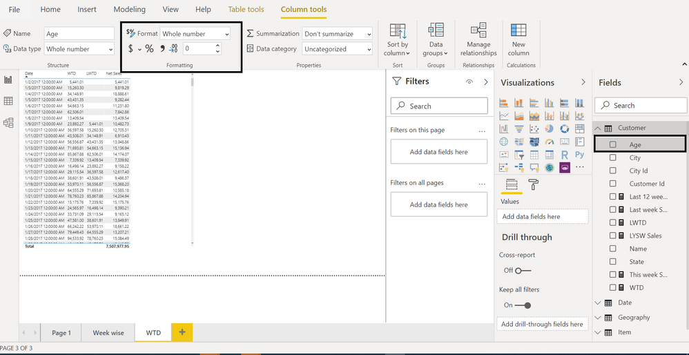
How is this possible? The formatting is definitely correctly set in the model itself, which also shows by the table and the formatting in Excel. The two visuals below are using the exact same measure:
I've also tried setting the formatting to a custom format string like #.##%, but that has the same effect. It shows in the table, but not in the graph. Please let me know if you have any ideas.
Solved! Go to Solution.
- Mark as New
- Bookmark
- Subscribe
- Mute
- Subscribe to RSS Feed
- Permalink
- Report Inappropriate Content
Apparently it's a known issue, see: https://community.powerbi.com/t5/Issues/Graph-formats-percentage-from-tabular-model-as-decimal-while...
We completed the work but have not turned the feature on yet. It should be enabled mid August at the latest, next Monday at the earliest, we are still testing it. This is a known issue / feature gap for a long time, not a regression.
- Mark as New
- Bookmark
- Subscribe
- Mute
- Subscribe to RSS Feed
- Permalink
- Report Inappropriate Content
Hi @Anonymous,
It seems like compatibility between azure SQL as and power bi desktop, what version of power bi desktop and azure SQL analysis are you test? can you please provide more detailed information to help us clarify this scenario?
How to Get Your Question Answered Quickly
Regards,
Xiaoxin Sheng
If this post helps, please consider accept as solution to help other members find it more quickly.
- Mark as New
- Bookmark
- Subscribe
- Mute
- Subscribe to RSS Feed
- Permalink
- Report Inappropriate Content
Apparently it's a known issue, see: https://community.powerbi.com/t5/Issues/Graph-formats-percentage-from-tabular-model-as-decimal-while...
We completed the work but have not turned the feature on yet. It should be enabled mid August at the latest, next Monday at the earliest, we are still testing it. This is a known issue / feature gap for a long time, not a regression.
- Mark as New
- Bookmark
- Subscribe
- Mute
- Subscribe to RSS Feed
- Permalink
- Report Inappropriate Content
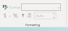
@Anonymous , have set is as % column in data format? % sign should have a grey background if selected
Microsoft Power BI Learning Resources, 2023 !!
Learn Power BI - Full Course with Dec-2022, with Window, Index, Offset, 100+ Topics !!
Did I answer your question? Mark my post as a solution! Appreciate your Kudos !! Proud to be a Super User! !!
- Mark as New
- Bookmark
- Subscribe
- Mute
- Subscribe to RSS Feed
- Permalink
- Report Inappropriate Content
Hi Amit,
I'm connecting live to Azure Analysis Services, so in Power BI there is no option to set this. Formatting is set directly in the tabular model, and there it is set to percentage.
- Mark as New
- Bookmark
- Subscribe
- Mute
- Subscribe to RSS Feed
- Permalink
- Report Inappropriate Content
@Anonymous , is it marked % column there?
If it marked % there and only showing on visual and not on the tooltip. Without additional formatting at the visual level. Log an issue -https://community.powerbi.com/t5/Issues/idb-p/Issues
Microsoft Power BI Learning Resources, 2023 !!
Learn Power BI - Full Course with Dec-2022, with Window, Index, Offset, 100+ Topics !!
Did I answer your question? Mark my post as a solution! Appreciate your Kudos !! Proud to be a Super User! !!
Helpful resources

Microsoft Fabric Learn Together
Covering the world! 9:00-10:30 AM Sydney, 4:00-5:30 PM CET (Paris/Berlin), 7:00-8:30 PM Mexico City

Power BI Monthly Update - April 2024
Check out the April 2024 Power BI update to learn about new features.

| User | Count |
|---|---|
| 111 | |
| 95 | |
| 80 | |
| 68 | |
| 59 |
| User | Count |
|---|---|
| 150 | |
| 119 | |
| 104 | |
| 87 | |
| 67 |


