- Power BI forums
- Updates
- News & Announcements
- Get Help with Power BI
- Desktop
- Service
- Report Server
- Power Query
- Mobile Apps
- Developer
- DAX Commands and Tips
- Custom Visuals Development Discussion
- Health and Life Sciences
- Power BI Spanish forums
- Translated Spanish Desktop
- Power Platform Integration - Better Together!
- Power Platform Integrations (Read-only)
- Power Platform and Dynamics 365 Integrations (Read-only)
- Training and Consulting
- Instructor Led Training
- Dashboard in a Day for Women, by Women
- Galleries
- Community Connections & How-To Videos
- COVID-19 Data Stories Gallery
- Themes Gallery
- Data Stories Gallery
- R Script Showcase
- Webinars and Video Gallery
- Quick Measures Gallery
- 2021 MSBizAppsSummit Gallery
- 2020 MSBizAppsSummit Gallery
- 2019 MSBizAppsSummit Gallery
- Events
- Ideas
- Custom Visuals Ideas
- Issues
- Issues
- Events
- Upcoming Events
- Community Blog
- Power BI Community Blog
- Custom Visuals Community Blog
- Community Support
- Community Accounts & Registration
- Using the Community
- Community Feedback
Register now to learn Fabric in free live sessions led by the best Microsoft experts. From Apr 16 to May 9, in English and Spanish.
- Power BI forums
- Forums
- Get Help with Power BI
- Desktop
- Granularity for M365 Usage Analytics data
- Subscribe to RSS Feed
- Mark Topic as New
- Mark Topic as Read
- Float this Topic for Current User
- Bookmark
- Subscribe
- Printer Friendly Page
- Mark as New
- Bookmark
- Subscribe
- Mute
- Subscribe to RSS Feed
- Permalink
- Report Inappropriate Content
Granularity for M365 Usage Analytics data
We connected Power BI desktop to the M365 Usage Analytics.
We'd like to display daily totals over the past 30 days for two items in particular: MBX_StorageUsed and MBX_TotalItems
The monthly totals show up fine in the bar graph. When I add the day field into Date Hierarchy, the visualization does not show daily totals. I was expecting to see a bar graph for every day of the month.
How can I determine if the dataset contains daily totals for these two counters?
How can I modify the visualization to show daily totals over the past 30 days instead of a monthly total?
I searched the forum and found this message (https://community.powerbi.com/t5/Desktop/how-to-build-M365-usage-reports-with-our-Office-365-data/m-...) however I did not see steps to modify the visualization.
The link provided in the message (https://docs.microsoft.com/en-us/microsoft-365/admin/usage-analytics/customize-reports?view=o365-wor...) shows basic steps to create a new visualization.
Thank you
Solved! Go to Solution.
- Mark as New
- Bookmark
- Subscribe
- Mute
- Subscribe to RSS Feed
- Permalink
- Report Inappropriate Content
Hi @sicalandmt1 ,
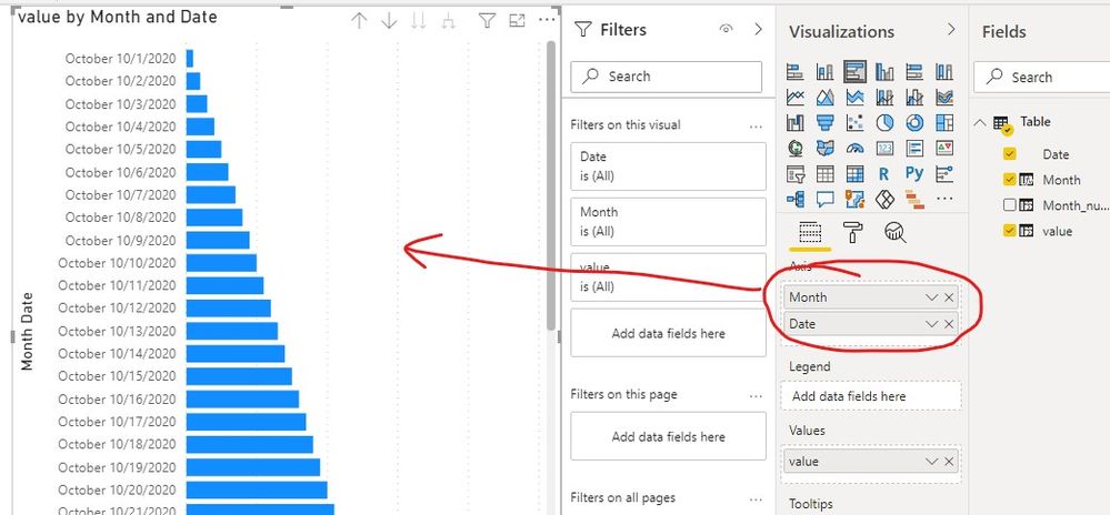
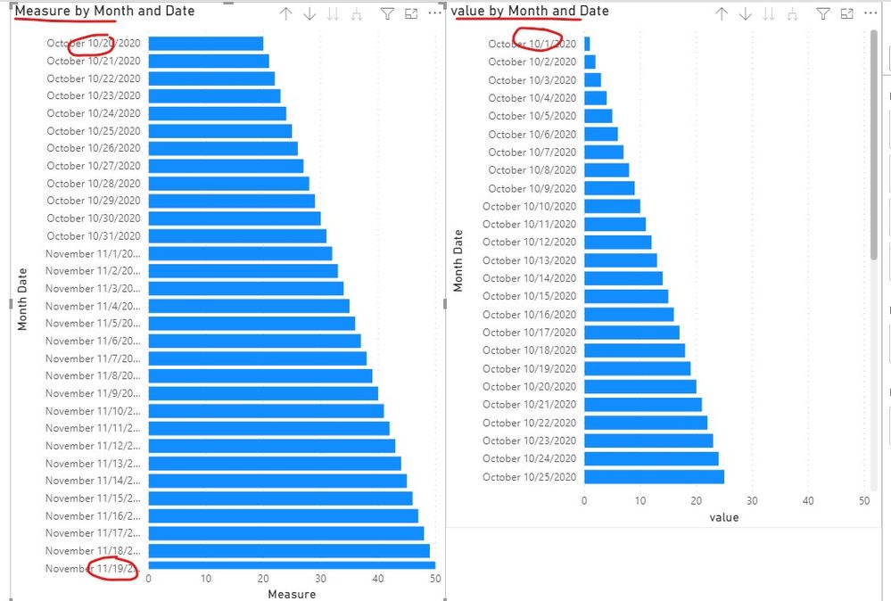
Do you want to show the daily total like the screenshot below?
If you want to show the past 30 days, you can refer the following steps.
1. Create a measure like this,
Measure =
var _past30 = CALCULATE(MAX('Table'[Date]),ALLSELECTED('Table'))-30
return
CALCULATE(SUM('Table'[value]),FILTER('Table','Table'[Date]>=_past30))
2. Then we can create a bar chart to get the result.
If it doesn’t meet your requirement, could you please provide a mockup sample based on fake data?
It will be helpful if you can show us the exact expected result based on the tables.
Please upload your files to OneDrive For Business and share the link here. Please don't contain any Confidential Information or Real data in your reply.
Best regards,
Community Support Team _ zhenbw
If this post helps, then please consider Accept it as the solution to help the other members find it more quickly.
BTW, pbix as attached.
Helpful resources

Microsoft Fabric Learn Together
Covering the world! 9:00-10:30 AM Sydney, 4:00-5:30 PM CET (Paris/Berlin), 7:00-8:30 PM Mexico City

Power BI Monthly Update - April 2024
Check out the April 2024 Power BI update to learn about new features.

| User | Count |
|---|---|
| 110 | |
| 95 | |
| 76 | |
| 65 | |
| 51 |
| User | Count |
|---|---|
| 146 | |
| 109 | |
| 106 | |
| 88 | |
| 61 |


