- Power BI forums
- Updates
- News & Announcements
- Get Help with Power BI
- Desktop
- Service
- Report Server
- Power Query
- Mobile Apps
- Developer
- DAX Commands and Tips
- Custom Visuals Development Discussion
- Health and Life Sciences
- Power BI Spanish forums
- Translated Spanish Desktop
- Power Platform Integration - Better Together!
- Power Platform Integrations (Read-only)
- Power Platform and Dynamics 365 Integrations (Read-only)
- Training and Consulting
- Instructor Led Training
- Dashboard in a Day for Women, by Women
- Galleries
- Community Connections & How-To Videos
- COVID-19 Data Stories Gallery
- Themes Gallery
- Data Stories Gallery
- R Script Showcase
- Webinars and Video Gallery
- Quick Measures Gallery
- 2021 MSBizAppsSummit Gallery
- 2020 MSBizAppsSummit Gallery
- 2019 MSBizAppsSummit Gallery
- Events
- Ideas
- Custom Visuals Ideas
- Issues
- Issues
- Events
- Upcoming Events
- Community Blog
- Power BI Community Blog
- Custom Visuals Community Blog
- Community Support
- Community Accounts & Registration
- Using the Community
- Community Feedback
Register now to learn Fabric in free live sessions led by the best Microsoft experts. From Apr 16 to May 9, in English and Spanish.
- Power BI forums
- Forums
- Get Help with Power BI
- Desktop
- Re: Google Form Visualization
- Subscribe to RSS Feed
- Mark Topic as New
- Mark Topic as Read
- Float this Topic for Current User
- Bookmark
- Subscribe
- Printer Friendly Page
- Mark as New
- Bookmark
- Subscribe
- Mute
- Subscribe to RSS Feed
- Permalink
- Report Inappropriate Content
Google Form Visualization
New to Power BI, please help
Hi Everyone,
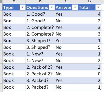
I made a google form with a dropdown list that connects to the answer's dedicated section. The responses came back with answers of only the intended section filled. The inputs are checkbox (Yes/No/Other) and I'm trying to create a stacked bar chart of the responses count.
I need a way to not hard code the tables since the google form is linked. The data sample, transformed table, and target chart are provided.


Along the way, I would also like to add slicers for the different types of items. If you have a simpler approach to get to the target chart please post it 🙂
I did use excel and used vlookup and countif, but I can't find a way to replicate them in Power BI.
Thank you for your help.
Solved! Go to Solution.
- Mark as New
- Bookmark
- Subscribe
- Mute
- Subscribe to RSS Feed
- Permalink
- Report Inappropriate Content
@Anonymous It might be nice to keep one table that has one row per respondent? See if this webinar on survey data gives you any inspiration: https://www.excelwithallison.com/MCT/news#h.p_NkgcNxVFFYaS
I didn't get too complex in this one, but I do often do what you have done by creating a column for 'question' and column for 'response'. I just think you're missing the Dim and Fact table concept to be able to create exactly the chart you want. https://excelwithallison.blogspot.com/2020/08/its-complicated-relationships-in-power.html
Please @mention me in your reply if you want a response.
Copying DAX from this post? Click here for a hack to quickly replace it with your own table names
Has this post solved your problem? Please Accept as Solution so that others can find it quickly and to let the community know your problem has been solved.
If you found this post helpful, please give Kudos C
I work as a Microsoft trainer and consultant, specialising in Power BI and Power Query.
www.excelwithallison.com
- Mark as New
- Bookmark
- Subscribe
- Mute
- Subscribe to RSS Feed
- Permalink
- Report Inappropriate Content
New to Power BI, please help
Hi Everyone,
I made a google form with a dropdown list that connects to the answer's dedicated section. The responses came back with answers of only the intended section filled. The inputs are checkbox (Yes/No/Other) and I'm trying to create a stacked bar chart of the responses count.
I need a way to not hard code the tables since the google form is linked. The data sample, transformed table, and target chart are provided.


Along the way, I would also like to add slicers for the different types of items. If you have a simpler approach to get to the target chart please post it 🙂
I did use excel and used vlookup and countif, but I can't find a way to replicate them in Power BI.
Thank you for your help.
- Mark as New
- Bookmark
- Subscribe
- Mute
- Subscribe to RSS Feed
- Permalink
- Report Inappropriate Content
The transfromation would be somthing like this (you can paste it to Advanced Editor in the Transform Data interface):
let
    Source = Excel.CurrentWorkbook(){[Name="Table"]}[Content],
    #"Unpivoted Other Columns" = Table.UnpivotOtherColumns(Source, {"Type"}, "Question", "Answer"),
    #"Grouped Rows" = Table.Group(#"Unpivoted Other Columns", {"Type", "Question", "Answer"}, {{"Total", each Table.RowCount(_), Int64.Type}})
in
    #"Grouped Rows"
you just need to replace the Source step with your table
Thank you for the kudos 🙂
- Mark as New
- Bookmark
- Subscribe
- Mute
- Subscribe to RSS Feed
- Permalink
- Report Inappropriate Content
@Anonymous It might be nice to keep one table that has one row per respondent? See if this webinar on survey data gives you any inspiration: https://www.excelwithallison.com/MCT/news#h.p_NkgcNxVFFYaS
I didn't get too complex in this one, but I do often do what you have done by creating a column for 'question' and column for 'response'. I just think you're missing the Dim and Fact table concept to be able to create exactly the chart you want. https://excelwithallison.blogspot.com/2020/08/its-complicated-relationships-in-power.html
Please @mention me in your reply if you want a response.
Copying DAX from this post? Click here for a hack to quickly replace it with your own table names
Has this post solved your problem? Please Accept as Solution so that others can find it quickly and to let the community know your problem has been solved.
If you found this post helpful, please give Kudos C
I work as a Microsoft trainer and consultant, specialising in Power BI and Power Query.
www.excelwithallison.com
- Mark as New
- Bookmark
- Subscribe
- Mute
- Subscribe to RSS Feed
- Permalink
- Report Inappropriate Content
Hi! Thank you for the webinar link! It really helps in creating the charts I want, but I have a question regarding the fact tables. Since the tables are unpivoted for each question, will the new entries be in the format of the fact tables when I refresh the data? Because the PBIX is directly linked to the survey's Google Spreadsheet.
- Mark as New
- Bookmark
- Subscribe
- Mute
- Subscribe to RSS Feed
- Permalink
- Report Inappropriate Content
@Anonymous You're very welcome, glad it helps! 🙂
Everything you do in Power Query is saved, so since the pbix is linked directly to the Google Spreadsheet, every time you refresh the data, Power BI will follow every step you created in Power Query. It starts by going to the Google Spreadsheet and grabbing all the rows, then transforms, unpivots, references, adds index column, etc. So the final result is yes, the new entries will be in the format of the fact tables when you refresh the data. Such a fun tool! Let me know if you have more questions around that.
Please @mention me in your reply if you want a response.
Copying DAX from this post? Click here for a hack to quickly replace it with your own table names
Has this post solved your problem? Please Accept as Solution so that others can find it quickly and to let the community know your problem has been solved.
If you found this post helpful, please give Kudos C
I work as a Microsoft trainer and consultant, specialising in Power BI and Power Query.
www.excelwithallison.com
- Mark as New
- Bookmark
- Subscribe
- Mute
- Subscribe to RSS Feed
- Permalink
- Report Inappropriate Content
Thank you so much for the explanation!! I've been reading a lot about Power Query so this really makes sense 🙂
- Mark as New
- Bookmark
- Subscribe
- Mute
- Subscribe to RSS Feed
- Permalink
- Report Inappropriate Content
Thank you for the response!!
Helpful resources

Microsoft Fabric Learn Together
Covering the world! 9:00-10:30 AM Sydney, 4:00-5:30 PM CET (Paris/Berlin), 7:00-8:30 PM Mexico City

Power BI Monthly Update - April 2024
Check out the April 2024 Power BI update to learn about new features.

| User | Count |
|---|---|
| 108 | |
| 100 | |
| 78 | |
| 64 | |
| 58 |
| User | Count |
|---|---|
| 148 | |
| 111 | |
| 94 | |
| 84 | |
| 67 |

