- Power BI forums
- Updates
- News & Announcements
- Get Help with Power BI
- Desktop
- Service
- Report Server
- Power Query
- Mobile Apps
- Developer
- DAX Commands and Tips
- Custom Visuals Development Discussion
- Health and Life Sciences
- Power BI Spanish forums
- Translated Spanish Desktop
- Power Platform Integration - Better Together!
- Power Platform Integrations (Read-only)
- Power Platform and Dynamics 365 Integrations (Read-only)
- Training and Consulting
- Instructor Led Training
- Dashboard in a Day for Women, by Women
- Galleries
- Community Connections & How-To Videos
- COVID-19 Data Stories Gallery
- Themes Gallery
- Data Stories Gallery
- R Script Showcase
- Webinars and Video Gallery
- Quick Measures Gallery
- 2021 MSBizAppsSummit Gallery
- 2020 MSBizAppsSummit Gallery
- 2019 MSBizAppsSummit Gallery
- Events
- Ideas
- Custom Visuals Ideas
- Issues
- Issues
- Events
- Upcoming Events
- Community Blog
- Power BI Community Blog
- Custom Visuals Community Blog
- Community Support
- Community Accounts & Registration
- Using the Community
- Community Feedback
Register now to learn Fabric in free live sessions led by the best Microsoft experts. From Apr 16 to May 9, in English and Spanish.
- Power BI forums
- Forums
- Get Help with Power BI
- Desktop
- Good visual for a work roaster/schedule - Gannt or...
- Subscribe to RSS Feed
- Mark Topic as New
- Mark Topic as Read
- Float this Topic for Current User
- Bookmark
- Subscribe
- Printer Friendly Page
- Mark as New
- Bookmark
- Subscribe
- Mute
- Subscribe to RSS Feed
- Permalink
- Report Inappropriate Content
Good visual for a work roaster/schedule - Gannt or table
Hello! I am trying to build a good-looking visual for a work roaster/schedule. The goal is for everyone to easily see who is on shift and who is off shift. I will aslo create additional functionality, such as simple compilation of a list of who starts their shift on a certain date.
So there will be a number of key dates involved for each worker, such as "arrived into quarantine hotel", "Start shift" and "Finish shift".
My thought is to represent this as a Gannt chart with one person per row with sections of bars in different colour.
Any advice on how I can organize the data in the Excel table for import into PowerBI? One name on each row, and then one date per column? This gets a bit complicated since one row on the Gannt chart will contain several bars (workers do one month on and one month off) and the bars will consist of several sections in different colours (quarantine time + work time).
Is there any good visual in PowerBI for this or do I have to program my own? I tried the different Gannt Chart visuals, but they all lack some of the functionality I need it seems. They are either unable to split the bars into different sections or show several bars on the same row.
Solved! Go to Solution.
- Mark as New
- Bookmark
- Subscribe
- Mute
- Subscribe to RSS Feed
- Permalink
- Report Inappropriate Content
Hi @Anonymous ,
Based on the current calculation what you can do is to highlight based on several options what I did was to change the format of the background and add one for the colour of the text:
Formatting = IF(MAX(DimDate[Date]) = TODAY(), "Light Grey", IF([Value_per_day] = "Q", "Yellow", "Blue"))

Formatting Font = IF([Value_per_day] = "Q", "Yellow", "Blue")
FInal result below and in attach PBIX.
Be aware that I have selected to do a ligth grey but you can do whateve colour you need. This depends on your needs and taste.
Regards
Miguel Félix
Did I answer your question? Mark my post as a solution!
Proud to be a Super User!
Check out my blog: Power BI em Português- Mark as New
- Bookmark
- Subscribe
- Mute
- Subscribe to RSS Feed
- Permalink
- Report Inappropriate Content
Hi @Anonymous ,
This depends on your information but have you tried the Timeline By Querion?
Depending on the way you have everything setup you can do several different options, can you share a sample of your data?
Using a custom visualization or a chart on the appsource.
Regards
Miguel Félix
Did I answer your question? Mark my post as a solution!
Proud to be a Super User!
Check out my blog: Power BI em Português- Mark as New
- Bookmark
- Subscribe
- Mute
- Subscribe to RSS Feed
- Permalink
- Report Inappropriate Content
Hey @MFelix, thanks for your advice! I checked the Timeline by Querion visual and it does not seem to offer the functionality I am looking for, unfortunately.
I need basically two following things - there has to be a table with names of workers on the Y-axis (a table or a Gannt chart would both work). And on the X-axis are the dates. And the quarantine + work periods for each worker should be visualized as sections of the same activity bar (in different colour).
Regarding the dataset, I have a lot of flexibility here. I can build it myself and I thought that one way of doing it would be to have the different milestones ("start quarantine", "mobilize to work site", "de-mobilize") as columns in my data table and worker names as rows. But then there will be multiple dates for each of these milestones (since it is a rotation). So I am not sure. Do you have any good suggestion?
p.s. I did not mean to press the "resolved" button 😞
- Mark as New
- Bookmark
- Subscribe
- Mute
- Subscribe to RSS Feed
- Permalink
- Report Inappropriate Content
Hi @Anonymous ,
First of all I have cancel the correct answer, you can do it by clicking on the ... on top of the post you marked has answer and then choose the option NOT THE SOLUTION
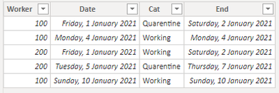
Regarding your question and since you refer that you have flexibity on the dataset I have made 2 models:
Model 1 - 1 row per day per worker
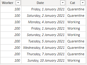
In this case I have created the following dataset:
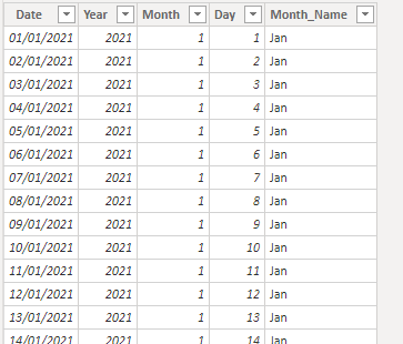
Has you can see for each day there is an entrance that have the type of work there is also a calendar table with the following data:
This table is also used for the second model.
Now create the following two measures:
Value_per_day =
LEFT (
    MAXX (
        FILTER (
            ALLSELECTED ( 'Simple_table' ),
            'Simple_table'[Date] = MAX ( DimDate[Date] )
                && 'Simple_table'[Worker] = MAX ( 'Simple_table'[Worker] )
        ),
        'Simple_table'[Cat]
    ),
    1
)

Formatting = IF([Value_per_day] = "Q", "Yellow", "Blue")
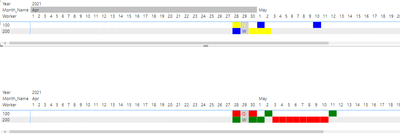
If you add a matrix visualization with the following setup you get the result below:
- Rows: Worker
- Columns: Date
- Values: Values_per_day
- Condittional formatting on values background and font colour: Formatting measure
Model 2 - 1 row per cat having start and end date:
has you can see the difference is the number of rows, so you only get one row for the quarentine periods or work periods that are in a row.
Add the following measures:
Value_per_day_end =
LEFT (
    MAXX (
        FILTER (
            ALLSELECTED ( With_start_End ),
            With_start_End[Date] <= MAX ( DimDate[Date] )
                && With_start_End[End] >= MAX ( DimDate[Date] )
                && 'With_start_End'[Worker] = MAX ( 'With_start_End'[Worker] )
        ),
        'With_start_End'[Cat]
    ),
    1
)

Formatting_End = IF([Value_per_day_end] = "Q", "Red", "Green")
The difference is on the Value_per_day has you can see final result is below:
The result is the same has you can see.
check PBIX file attach.
Regards
Miguel Félix
Did I answer your question? Mark my post as a solution!
Proud to be a Super User!
Check out my blog: Power BI em Português- Mark as New
- Bookmark
- Subscribe
- Mute
- Subscribe to RSS Feed
- Permalink
- Report Inappropriate Content
Wow man, this is pretty awesome - I just learned a number of new things. I am not used to creating custom visuals. As this is a bit above my level, I am gonna need some time to melt this and understand how it works 🙂 Thanks a lot! Hope I can follow up with some questions as I go. For example, do you know of any function that would allow the visual to always center on today`s date (so that today`s column in the visual is marked)? Where does the data come from in the attached pibx file - did you import it from Excel?
- Mark as New
- Bookmark
- Subscribe
- Mute
- Subscribe to RSS Feed
- Permalink
- Report Inappropriate Content
Hi @Anonymous ,
Regarding your questions:
- When referering to today what do you need exactly do you want to show the information for today has the first day? do you want to highlight? What is your needs/toughts about the best way to work
- I have made the input directly in PBI since it was just for an example, but you can setup this has an excel spreadsheet or some or input.
Regards
Miguel Félix
Did I answer your question? Mark my post as a solution!
Proud to be a Super User!
Check out my blog: Power BI em Português- Mark as New
- Bookmark
- Subscribe
- Mute
- Subscribe to RSS Feed
- Permalink
- Report Inappropriate Content
Hello!
I would just like to highlight the data date. So every time you log in to this dashboard the column for current date is highlighted somehow (with a frame around it?) and easy to spot.
Cheers
Dmitri
- Mark as New
- Bookmark
- Subscribe
- Mute
- Subscribe to RSS Feed
- Permalink
- Report Inappropriate Content
Does highlighting the date with a different colour works?
Regards
Miguel Félix
Did I answer your question? Mark my post as a solution!
Proud to be a Super User!
Check out my blog: Power BI em Português- Mark as New
- Bookmark
- Subscribe
- Mute
- Subscribe to RSS Feed
- Permalink
- Report Inappropriate Content
Yes, that`s a probably much more simple to implement - I did not think of that! Do you know a formula that would do this continiously every time the date changes?
- Mark as New
- Bookmark
- Subscribe
- Mute
- Subscribe to RSS Feed
- Permalink
- Report Inappropriate Content
Hi @Anonymous ,
Based on the current calculation what you can do is to highlight based on several options what I did was to change the format of the background and add one for the colour of the text:
Formatting = IF(MAX(DimDate[Date]) = TODAY(), "Light Grey", IF([Value_per_day] = "Q", "Yellow", "Blue"))

Formatting Font = IF([Value_per_day] = "Q", "Yellow", "Blue")
FInal result below and in attach PBIX.
Be aware that I have selected to do a ligth grey but you can do whateve colour you need. This depends on your needs and taste.
Regards
Miguel Félix
Did I answer your question? Mark my post as a solution!
Proud to be a Super User!
Check out my blog: Power BI em Português- Mark as New
- Bookmark
- Subscribe
- Mute
- Subscribe to RSS Feed
- Permalink
- Report Inappropriate Content
Hey @MFelix,
I have been looking at your code and implement it in my PowerBI this last week. I think I understand how it works now and I can get the data formatted and imported from Excel or Sharepoint as I want it. What programming langugage is this? Would be nice to learn more.
I also have two last questions:
1. Is it possible to have more than one column showing to the left in the matrix? For example, not only names (100, 200 in your example) but also positions, for instance.
2. Is there any code to implement a count for how many workers are on shift and in quarentine at the same time for every specific date?
- Mark as New
- Bookmark
- Subscribe
- Mute
- Subscribe to RSS Feed
- Permalink
- Report Inappropriate Content
Hi @Anonymous ,
Whay do you mean by what language is this? Are you refering to the measures or to the query editor?
You can add all the columns you need on the rows no issue you may need to turn off the totals and substotals.
This can be calculated but do you want it to appear in a card or in the same matrix?
Regards
Miguel Félix
Did I answer your question? Mark my post as a solution!
Proud to be a Super User!
Check out my blog: Power BI em Português- Mark as New
- Bookmark
- Subscribe
- Mute
- Subscribe to RSS Feed
- Permalink
- Report Inappropriate Content
The measures.
Both in the matrix, but also in a different visual (a card, for example).
- Mark as New
- Bookmark
- Subscribe
- Mute
- Subscribe to RSS Feed
- Permalink
- Report Inappropriate Content
Do you want to present it in the last line of the matrix or in the a specific line?
Regards
Miguel Félix
Did I answer your question? Mark my post as a solution!
Proud to be a Super User!
Check out my blog: Power BI em Português- Mark as New
- Bookmark
- Subscribe
- Mute
- Subscribe to RSS Feed
- Permalink
- Report Inappropriate Content
Grand total on the last line but also several specific lines inside the matrix (summaries by specific worker categories).
Helpful resources

Microsoft Fabric Learn Together
Covering the world! 9:00-10:30 AM Sydney, 4:00-5:30 PM CET (Paris/Berlin), 7:00-8:30 PM Mexico City

Power BI Monthly Update - April 2024
Check out the April 2024 Power BI update to learn about new features.

| User | Count |
|---|---|
| 106 | |
| 93 | |
| 75 | |
| 62 | |
| 50 |
| User | Count |
|---|---|
| 147 | |
| 107 | |
| 105 | |
| 87 | |
| 61 |

