- Power BI forums
- Updates
- News & Announcements
- Get Help with Power BI
- Desktop
- Service
- Report Server
- Power Query
- Mobile Apps
- Developer
- DAX Commands and Tips
- Custom Visuals Development Discussion
- Health and Life Sciences
- Power BI Spanish forums
- Translated Spanish Desktop
- Power Platform Integration - Better Together!
- Power Platform Integrations (Read-only)
- Power Platform and Dynamics 365 Integrations (Read-only)
- Training and Consulting
- Instructor Led Training
- Dashboard in a Day for Women, by Women
- Galleries
- Community Connections & How-To Videos
- COVID-19 Data Stories Gallery
- Themes Gallery
- Data Stories Gallery
- R Script Showcase
- Webinars and Video Gallery
- Quick Measures Gallery
- 2021 MSBizAppsSummit Gallery
- 2020 MSBizAppsSummit Gallery
- 2019 MSBizAppsSummit Gallery
- Events
- Ideas
- Custom Visuals Ideas
- Issues
- Issues
- Events
- Upcoming Events
- Community Blog
- Power BI Community Blog
- Custom Visuals Community Blog
- Community Support
- Community Accounts & Registration
- Using the Community
- Community Feedback
Register now to learn Fabric in free live sessions led by the best Microsoft experts. From Apr 16 to May 9, in English and Spanish.
- Power BI forums
- Forums
- Get Help with Power BI
- Desktop
- Give hierarchy to the values of a column when disp...
- Subscribe to RSS Feed
- Mark Topic as New
- Mark Topic as Read
- Float this Topic for Current User
- Bookmark
- Subscribe
- Printer Friendly Page
- Mark as New
- Bookmark
- Subscribe
- Mute
- Subscribe to RSS Feed
- Permalink
- Report Inappropriate Content
Give hierarchy to the values of a column when displayed on map
Hello everyone,
I'm doing a covid risk map that overlays with a list of locations. The problem I wasn't able to solve is to show the color on a map with the given hierarchy to the values in a column. Specifically, we have 3 levels in the location hierarchy (state, county, city) and another column contains one of low, medium and high risk level of a location. When the data shows a city is medium level risk, we would like the map to show medium as well when we drill up to county and state, but it actually shows low. This might be because the map shows the color by the majority of lower hierarchy values or by alphabetical order of the risk level string.
Is there a way to customize this?
Solved! Go to Solution.
- Mark as New
- Bookmark
- Subscribe
- Mute
- Subscribe to RSS Feed
- Permalink
- Report Inappropriate Content
Hi @larrychang1118,
Welcome to this amazing community.
I've created a very small mockup file with a dimension Geography and a facts table that has the Risks (you could also have the registries of Risk "High, average, low, etc" on another dimension, but for the purpose of demonstration I'll let it be like this 🙂
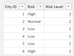
Geography:
Risks:
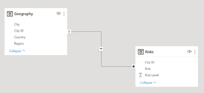
The model and how tables relate:
That being said, I've placed the geo fields on "Location" and the Risk on "Legend". I've also given the Low, average, and high risk a value from 1 to 3.
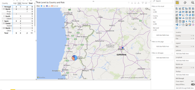
When we choose a Country it shows the number of risks and their classification:
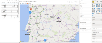
And so does when I choose a different granularity (City):
Is this what you needed? I can send you the file if you need, for inspiration.
Hope I was of assistance!
Cheers
Joao Marcelino
Ps- Did I answer your question? Mark my post as a solution! Kudos are also appreciated 🙂
- Mark as New
- Bookmark
- Subscribe
- Mute
- Subscribe to RSS Feed
- Permalink
- Report Inappropriate Content
This is awesome. I didn't think of using another type of map. Thanks!
Helpful resources

Microsoft Fabric Learn Together
Covering the world! 9:00-10:30 AM Sydney, 4:00-5:30 PM CET (Paris/Berlin), 7:00-8:30 PM Mexico City

Power BI Monthly Update - April 2024
Check out the April 2024 Power BI update to learn about new features.

| User | Count |
|---|---|
| 111 | |
| 97 | |
| 80 | |
| 69 | |
| 59 |
| User | Count |
|---|---|
| 150 | |
| 119 | |
| 104 | |
| 87 | |
| 67 |


