cancel
Showing results for 
Search instead for 
Did you mean: 

Register now to learn Fabric in free live sessions led by the best Microsoft experts. From Apr 16 to May 9, in English and Spanish.

Reply
mnhthegreat
New Member

Getting whole trend for Worst Performing Cells based on performance during a specific time

Hi,


At my telecom firm, I use Power BI to find the worst performing cells. These cells are ranked as worst performing if they have the most failures (in this case Abnormal Release) in the filtered time range. I have used a Top N filter in a table to get the list of top 5 cells which is accurate: 

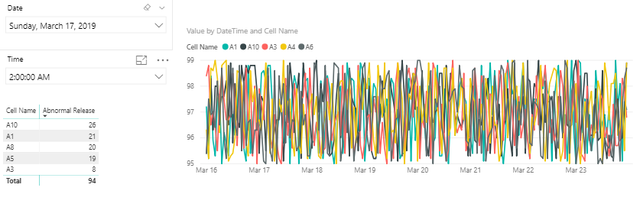
Now what I want to do is to create 5 independent graphs for the top cells showing their call drop rates by datetime. These graphs should look something like this, which is obtained when A10 is selected from the table:

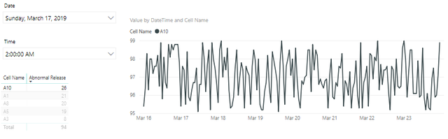
Please note that the graph should show the trend for the whole time period, not just the filtered date/time. I am stuck at this because in the first image you can see that the top cells from the table and the graph are mismatching because I had to close the interactions with date/time to show the whole trend. The Top N filter is not helping me here as I want to show a graph of 2nd worst cell independently without filtered time. Is there any measure which I can use to get the names of the top 5 cell names which I can store in a variable that I can pass as a text filter to a graph to get the desired trend?


My Power BI file is attached here.

1 ACCEPTED SOLUTION
OwenAuger
Super User
Super User

Hi @mnhthegreat 

I've had a look at your PBIX file and uploaded a possible approach here:

PBIX link


The changes I made:

  1. Added Date & Time dimension tables with inactive relationships to your fact table (Sheet1) to be used in your slicers.image.png


  2. Created a measure Abnormal Release Sum (with Date Time filters) that returns the Abnormal Release Sum with these Date & Time relationships activated and any Date/Time filters on the fact table cleared:
    Abnormal Release Sum (with Date Time filters) = 
    CALCULATE ( 
        SUM ( Sheet1[Abnormal Release] ),
        USERELATIONSHIP( Sheet1[Date], 'Date'[Date] ),
        USERELATIONSHIP( Sheet1[Time], 'Time'[Time] ),
        ALL ( Sheet1[DateTime], Sheet1[Date], Sheet1[Time] )
    )
  3. Changed your Date & Time slicers to use the dimension tables created in step 1, rather than the fact table columns.
  4. Use Abnormal Release Sum (with Date Time filters) within the TopN filter on the table, to filter on Top 5 Cell Name by 
    Abnormal Release Sum (with Date Time filters)
  5. Create a small multiple chart using the same TopN filter.
    Annoyingly, I can't get this to sort by the same measure used for the TopN filter.
  6. End result looks like this:image.png


Well this is my initial approach, and I'm sure there are formatting issues to be looked at. You could split the line chart into 5 separate charts if you wanted.


Let me know if that's of any use.


Regards,

Owen


Owen Auger
Did I answer your question? Mark my post as a solution!
Blog
Twitter
LinkedIn

View solution in original post

1 REPLY 1
OwenAuger
Super User
Super User

Hi @mnhthegreat 

I've had a look at your PBIX file and uploaded a possible approach here:

PBIX link


The changes I made:

  1. Added Date & Time dimension tables with inactive relationships to your fact table (Sheet1) to be used in your slicers.image.png


  2. Created a measure Abnormal Release Sum (with Date Time filters) that returns the Abnormal Release Sum with these Date & Time relationships activated and any Date/Time filters on the fact table cleared:
    Abnormal Release Sum (with Date Time filters) = 
    CALCULATE ( 
        SUM ( Sheet1[Abnormal Release] ),
        USERELATIONSHIP( Sheet1[Date], 'Date'[Date] ),
        USERELATIONSHIP( Sheet1[Time], 'Time'[Time] ),
        ALL ( Sheet1[DateTime], Sheet1[Date], Sheet1[Time] )
    )
  3. Changed your Date & Time slicers to use the dimension tables created in step 1, rather than the fact table columns.
  4. Use Abnormal Release Sum (with Date Time filters) within the TopN filter on the table, to filter on Top 5 Cell Name by 
    Abnormal Release Sum (with Date Time filters)
  5. Create a small multiple chart using the same TopN filter.
    Annoyingly, I can't get this to sort by the same measure used for the TopN filter.
  6. End result looks like this:image.png


Well this is my initial approach, and I'm sure there are formatting issues to be looked at. You could split the line chart into 5 separate charts if you wanted.


Let me know if that's of any use.


Regards,

Owen


Owen Auger
Did I answer your question? Mark my post as a solution!
Blog
Twitter
LinkedIn

Helpful resources

Announcements
Microsoft Fabric Learn Together

Microsoft Fabric Learn Together

Covering the world! 9:00-10:30 AM Sydney, 4:00-5:30 PM CET (Paris/Berlin), 7:00-8:30 PM Mexico City

PBI_APRIL_CAROUSEL1

Power BI Monthly Update - April 2024

Check out the April 2024 Power BI update to learn about new features.

April Fabric Community Update

Fabric Community Update - April 2024

Find out what's new and trending in the Fabric Community.