- Power BI forums
- Updates
- News & Announcements
- Get Help with Power BI
- Desktop
- Service
- Report Server
- Power Query
- Mobile Apps
- Developer
- DAX Commands and Tips
- Custom Visuals Development Discussion
- Health and Life Sciences
- Power BI Spanish forums
- Translated Spanish Desktop
- Power Platform Integration - Better Together!
- Power Platform Integrations (Read-only)
- Power Platform and Dynamics 365 Integrations (Read-only)
- Training and Consulting
- Instructor Led Training
- Dashboard in a Day for Women, by Women
- Galleries
- Community Connections & How-To Videos
- COVID-19 Data Stories Gallery
- Themes Gallery
- Data Stories Gallery
- R Script Showcase
- Webinars and Video Gallery
- Quick Measures Gallery
- 2021 MSBizAppsSummit Gallery
- 2020 MSBizAppsSummit Gallery
- 2019 MSBizAppsSummit Gallery
- Events
- Ideas
- Custom Visuals Ideas
- Issues
- Issues
- Events
- Upcoming Events
- Community Blog
- Power BI Community Blog
- Custom Visuals Community Blog
- Community Support
- Community Accounts & Registration
- Using the Community
- Community Feedback
Register now to learn Fabric in free live sessions led by the best Microsoft experts. From Apr 16 to May 9, in English and Spanish.
- Power BI forums
- Forums
- Get Help with Power BI
- Desktop
- Getting average of a measure and plotting as a tre...
- Subscribe to RSS Feed
- Mark Topic as New
- Mark Topic as Read
- Float this Topic for Current User
- Bookmark
- Subscribe
- Printer Friendly Page
- Mark as New
- Bookmark
- Subscribe
- Mute
- Subscribe to RSS Feed
- Permalink
- Report Inappropriate Content
Getting average of a measure and plotting as a trend line
I have a measure as following:
Normalized Events = (IF ((COUNTROWS(FILTER('Events',[Type]="TypeA")) = 0), 0,COUNTROWS(FILTER('Events',[Type]="TypeA"))))/ COUNTROWS(FILTER('Population',[Type]="TypeA"))
This is plotted on a line chart with dates as x-axis. I also want to show a mean value as another line on the chart. How can i get the average of this measure as a single value that can be plotted as a horizontal line?
- Mark as New
- Bookmark
- Subscribe
- Mute
- Subscribe to RSS Feed
- Permalink
- Report Inappropriate Content
1. I created a scenario where in I have the sales data by date and there are more than 1 sales record for a day. This is called BaseSales
| Date | Sales |
| 20160301 | 20 |
| 20160301 | 30 |
| 20160301 | 50 |
| 20160304 | 25 |
| 20160304 | 45 |
| 20160304 | 40 |
| 20160309 | 35 |
| 20160309 | 55 |
| 20160404 | 15 |
| 20160404 | 34 |
| 20160404 | 90 |
| 20160404 | 45 |
| 20160404 | 75 |
| 20160404 | 40 |
| 20160420 | 120 |
| 20160420 | 130 |
2. The first step is to get the averages by day and store it as a table created dynamically.
3. To do this selecte new table from modelling and enter the code as follows
AverageByDay(TableName) = Summarize( BaseSales, BaseSales[Date], "ByDayAverage",Average(BaseSales[Sales]))
4. What this actually does is creates an average by day from the base sales data and stores in the column ByDayAverage and stores the entire rows as table AverageByDay.
5. Create a mesaure AvgofAvg =Calculate(Average([ByDayAverage]),AllSelected(AverageByDay[Date]))
6. From this new table AverageByDay create the combo chart with Date as Shared Axis, ByDayAverage as ColumnValues and AvgofAvg as LineValues.
7. The chart will be the way you wanted.
Try it out and if you have any problems do reply to the post. Send me your mail id so that I can send you the pbix file.
If you find the solution working , please accept it as a solution and also give Kudos.
Cheers
Proud to be a Datanaut!
- Mark as New
- Bookmark
- Subscribe
- Mute
- Subscribe to RSS Feed
- Permalink
- Report Inappropriate Content
@Abhaykumar, You can add a calculated column using the same DAX expression , and then add this new column to Values.
Regards,
Charlie Liao
- Mark as New
- Bookmark
- Subscribe
- Mute
- Subscribe to RSS Feed
- Permalink
- Report Inappropriate Content
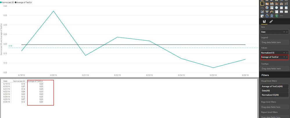
@v-caliao-msft, I did the same thing but the average does not seem to be correct. As from the following screenshot, the average is 0.18 but when the column is plotted it shows average to be 0.20. I also added a second column with following DAX :
AvgCol = AVERAGE(Event41[TestCol]). But this gives the same result of 0.20. Interestingly median also gives the same results.
- Mark as New
- Bookmark
- Subscribe
- Mute
- Subscribe to RSS Feed
- Permalink
- Report Inappropriate Content
A bit of a guess here, but this sounds reasonable to me:
Median Event := MEDIANX(Calendar, [Normalized Events])
just drop this measure on your on your chart... maybe? 🙂
Helpful resources

Microsoft Fabric Learn Together
Covering the world! 9:00-10:30 AM Sydney, 4:00-5:30 PM CET (Paris/Berlin), 7:00-8:30 PM Mexico City

Power BI Monthly Update - April 2024
Check out the April 2024 Power BI update to learn about new features.

| User | Count |
|---|---|
| 107 | |
| 99 | |
| 76 | |
| 64 | |
| 58 |
| User | Count |
|---|---|
| 148 | |
| 113 | |
| 97 | |
| 84 | |
| 67 |


