- Power BI forums
- Updates
- News & Announcements
- Get Help with Power BI
- Desktop
- Service
- Report Server
- Power Query
- Mobile Apps
- Developer
- DAX Commands and Tips
- Custom Visuals Development Discussion
- Health and Life Sciences
- Power BI Spanish forums
- Translated Spanish Desktop
- Power Platform Integration - Better Together!
- Power Platform Integrations (Read-only)
- Power Platform and Dynamics 365 Integrations (Read-only)
- Training and Consulting
- Instructor Led Training
- Dashboard in a Day for Women, by Women
- Galleries
- Community Connections & How-To Videos
- COVID-19 Data Stories Gallery
- Themes Gallery
- Data Stories Gallery
- R Script Showcase
- Webinars and Video Gallery
- Quick Measures Gallery
- 2021 MSBizAppsSummit Gallery
- 2020 MSBizAppsSummit Gallery
- 2019 MSBizAppsSummit Gallery
- Events
- Ideas
- Custom Visuals Ideas
- Issues
- Issues
- Events
- Upcoming Events
- Community Blog
- Power BI Community Blog
- Custom Visuals Community Blog
- Community Support
- Community Accounts & Registration
- Using the Community
- Community Feedback
Register now to learn Fabric in free live sessions led by the best Microsoft experts. From Apr 16 to May 9, in English and Spanish.
- Power BI forums
- Forums
- Get Help with Power BI
- Desktop
- Re: Get selectable measures on line chart to show ...
- Subscribe to RSS Feed
- Mark Topic as New
- Mark Topic as Read
- Float this Topic for Current User
- Bookmark
- Subscribe
- Printer Friendly Page
- Mark as New
- Bookmark
- Subscribe
- Mute
- Subscribe to RSS Feed
- Permalink
- Report Inappropriate Content
Get selectable measures on line chart to show as percentages
Hello, I am having some trouble with some selectable measures being displayed in a line graph and a matrix.
I inherited this report and am thinking about reworking it in future. But for the time being I just need to get it to work.
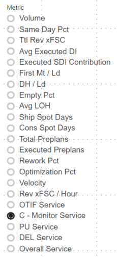
The user is to select from a list of measures that which they want displayed on a line chart. The actual data on that chart is displayed below in a matrix which is not necessarily to be responsive to the list slicer.
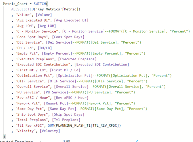
The slicer pulls from a list of names of measures which are themselves in their own table. A switch measure then determines which measure is selected by the user, and then displays the selected measure.
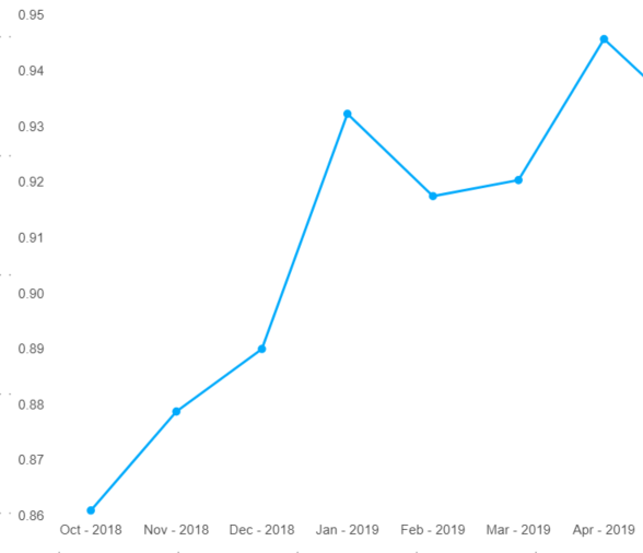
This system works. However, percentage numbers are not displayed as percentages, despite those measures being listed as percentages. In order to make them display as percentages in the matrix, I have to use the FORMAT() function. I have not been able to get them to successfully display as actual percentages in the graph. Using the FORMAT() function in conjunction with the graph actually breaks the graph; it goes blank.
So, what I need to know is:
1) How do I get those numbers to actually display as percentages on the graph.
2) Why does this work for the matrix, but not the graph? What am I doing wrong? Where is the disconnect?
3) Any ideas on other ways I could concisely-ish display over a dozen measures?
Thank you for your help!
- Mark as New
- Bookmark
- Subscribe
- Mute
- Subscribe to RSS Feed
- Permalink
- Report Inappropriate Content
Hi @jengwt ,
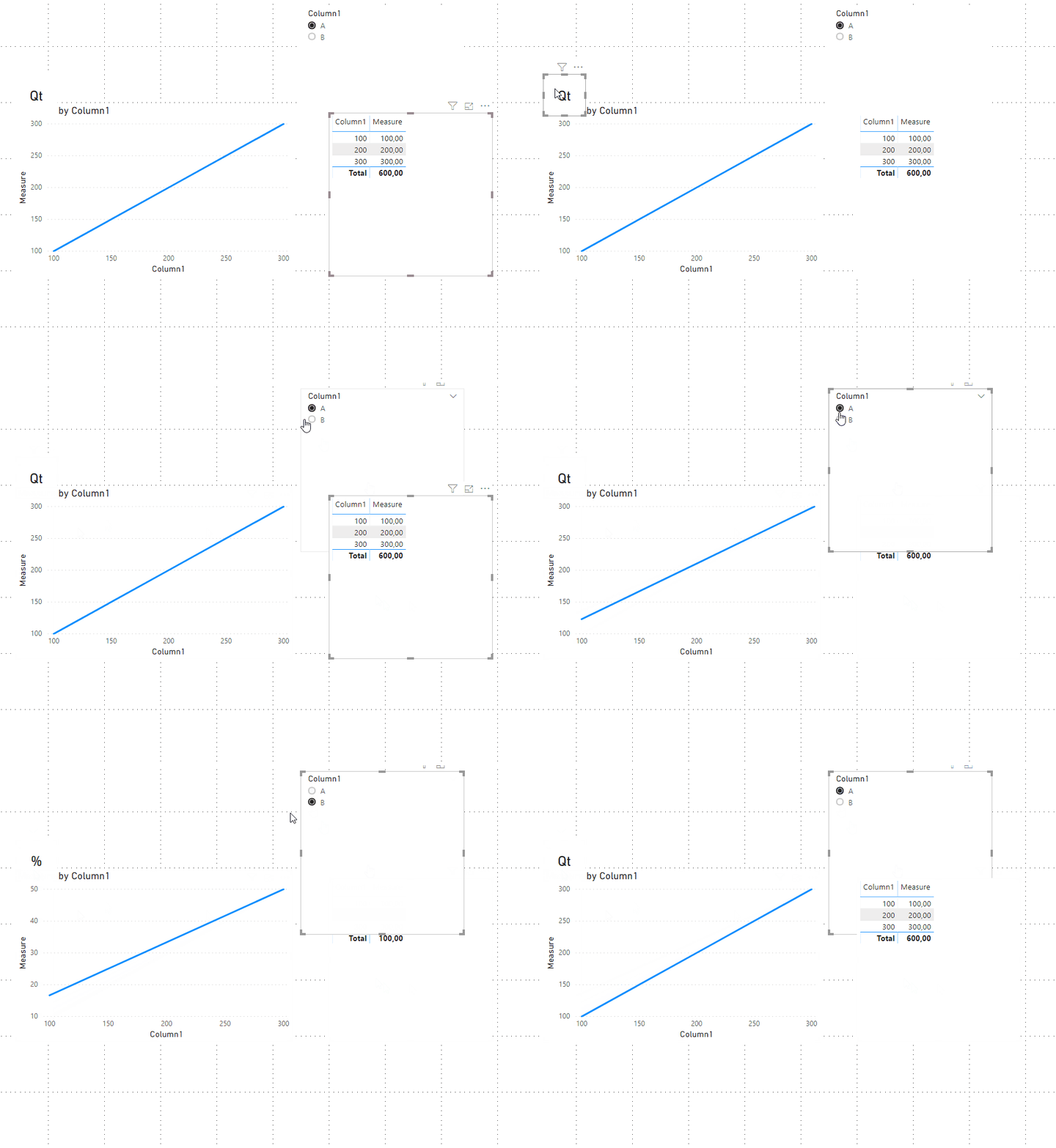
When using the FORMAT syntax you are transforming you value in text so it cannot be used in a chart although in a table, matrix or card work perfectly. One workaround can be to multiply the value of those percentages by 100 and then make a card to place above the chart Y-axis telling the units something similar to this:
Regards,
MFelix
Regards
Miguel Félix
Did I answer your question? Mark my post as a solution!
Proud to be a Super User!
Check out my blog: Power BI em Português- Mark as New
- Bookmark
- Subscribe
- Mute
- Subscribe to RSS Feed
- Permalink
- Report Inappropriate Content
@MFelix I see. And have the Y-axis label change depending on the selected measure. That's pretty ghetto, but until it could work for the time being. Thanks for your response.
Helpful resources

Microsoft Fabric Learn Together
Covering the world! 9:00-10:30 AM Sydney, 4:00-5:30 PM CET (Paris/Berlin), 7:00-8:30 PM Mexico City

Power BI Monthly Update - April 2024
Check out the April 2024 Power BI update to learn about new features.

| User | Count |
|---|---|
| 112 | |
| 100 | |
| 80 | |
| 64 | |
| 57 |
| User | Count |
|---|---|
| 145 | |
| 111 | |
| 92 | |
| 84 | |
| 66 |


