- Power BI forums
- Updates
- News & Announcements
- Get Help with Power BI
- Desktop
- Service
- Report Server
- Power Query
- Mobile Apps
- Developer
- DAX Commands and Tips
- Custom Visuals Development Discussion
- Health and Life Sciences
- Power BI Spanish forums
- Translated Spanish Desktop
- Power Platform Integration - Better Together!
- Power Platform Integrations (Read-only)
- Power Platform and Dynamics 365 Integrations (Read-only)
- Training and Consulting
- Instructor Led Training
- Dashboard in a Day for Women, by Women
- Galleries
- Community Connections & How-To Videos
- COVID-19 Data Stories Gallery
- Themes Gallery
- Data Stories Gallery
- R Script Showcase
- Webinars and Video Gallery
- Quick Measures Gallery
- 2021 MSBizAppsSummit Gallery
- 2020 MSBizAppsSummit Gallery
- 2019 MSBizAppsSummit Gallery
- Events
- Ideas
- Custom Visuals Ideas
- Issues
- Issues
- Events
- Upcoming Events
- Community Blog
- Power BI Community Blog
- Custom Visuals Community Blog
- Community Support
- Community Accounts & Registration
- Using the Community
- Community Feedback
Register now to learn Fabric in free live sessions led by the best Microsoft experts. From Apr 16 to May 9, in English and Spanish.
- Power BI forums
- Forums
- Get Help with Power BI
- Desktop
- Gantt Chart with different task colors
- Subscribe to RSS Feed
- Mark Topic as New
- Mark Topic as Read
- Float this Topic for Current User
- Bookmark
- Subscribe
- Printer Friendly Page
- Mark as New
- Bookmark
- Subscribe
- Mute
- Subscribe to RSS Feed
- Permalink
- Report Inappropriate Content
Gantt Chart with different task colors
Hello
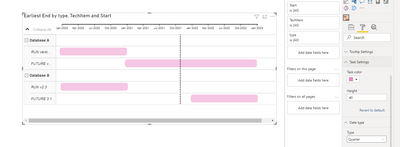
I want to create a Tech refresh roadmap using power BI and so far come up with the following using Gantt chart 2.2.3:
here is the data source (which I can tweak around with if required):
| type | Parent | TechItem | Start | End |
| RUN version 1 | Database | Database A | 01/01/2020 | 01/01/2021 |
| FUTURE version 2 | Database | Database A | 01/02/2021 | 01/01/2023 |
| RUN v2.3 | Database | Database B | 01/06/2020 | 01/06/2021 |
| FUTURE 3.1 | Database | Database B | 01/06/2022 | 01/06/2023 |
What would be cool is if I could make the 'RUN' types Green and the 'FUTURE' ones Orange programmatically somehow - I was thinking I could store the colours in excel too but I can't see a way to set 'task colour =' typecolour etc.
1 - is this feasible using Gantt
2 - is there a better chart I could use which would work better
I've googled and can't see anything like this for this chart type.
please help..
Solved! Go to Solution.
- Mark as New
- Bookmark
- Subscribe
- Mute
- Subscribe to RSS Feed
- Permalink
- Report Inappropriate Content
Hi @rcbmulder ,
In the version of Gantt Chart you provided, there is no option for a function corresponding to the color.
Best Regards,
Henry
If this post helps, then please consider Accept it as the solution to help the other members find it more quickly.
- Mark as New
- Bookmark
- Subscribe
- Mute
- Subscribe to RSS Feed
- Permalink
- Report Inappropriate Content
- I believe this can be achieved by adding another column to your dataset essentially categorizing the data by current, future, etc and then you can assign that to the legend which will assign colors for each category.
- Mark as New
- Bookmark
- Subscribe
- Mute
- Subscribe to RSS Feed
- Permalink
- Report Inappropriate Content
Hello,
How are you able to show text i.e. in your example "Type" on Gantt Chart bar? I'm looking for solution, please let me know. Thanks
- Mark as New
- Bookmark
- Subscribe
- Mute
- Subscribe to RSS Feed
- Permalink
- Report Inappropriate Content
Hi @rcbmulder ,
In the version of Gantt Chart you provided, there is no option for a function corresponding to the color.
Best Regards,
Henry
If this post helps, then please consider Accept it as the solution to help the other members find it more quickly.
- Mark as New
- Bookmark
- Subscribe
- Mute
- Subscribe to RSS Feed
- Permalink
- Report Inappropriate Content
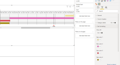
Hi @rcbmulder ,
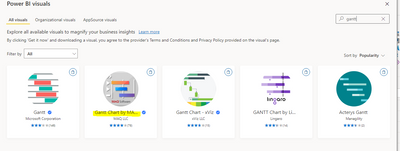
According to your description, you can use another version of Gantt Chart visual. in Format->Bar formatting you can set the colors for different tasks.
I did the test with the following reference:
If the problem is still not resolved, please provide detailed error information and let me know immediately. Looking forward to your reply.
Best Regards,
Henry
If this post helps, then please consider Accept it as the solution to help the other members find it more quickly.
- Mark as New
- Bookmark
- Subscribe
- Mute
- Subscribe to RSS Feed
- Permalink
- Report Inappropriate Content
Hi - this doesn't allow me to group tasks on the SAME line as per my requirements and example.
- Mark as New
- Bookmark
- Subscribe
- Mute
- Subscribe to RSS Feed
- Permalink
- Report Inappropriate Content
@rcbmulder , I tried matrix as project plan, see if that can help
Matrix as Project plan Visual: https://youtu.be/R25QoiyoSVs
Microsoft Power BI Learning Resources, 2023 !!
Learn Power BI - Full Course with Dec-2022, with Window, Index, Offset, 100+ Topics !!
Did I answer your question? Mark my post as a solution! Appreciate your Kudos !! Proud to be a Super User! !!
- Mark as New
- Bookmark
- Subscribe
- Mute
- Subscribe to RSS Feed
- Permalink
- Report Inappropriate Content
thanks - I watched the video - this would help but only if I can have 4 dates on the same line..
e.g. start1 end1 start2 end2 (there maybe a gap between end1 and start2) - I need to spend some more time on Matrix to undertstand how to program this..
If the Gant Chart 2.3.3 just had a task bar colour that could pull a colour from the data that would be perfect..
Helpful resources

Microsoft Fabric Learn Together
Covering the world! 9:00-10:30 AM Sydney, 4:00-5:30 PM CET (Paris/Berlin), 7:00-8:30 PM Mexico City

Power BI Monthly Update - April 2024
Check out the April 2024 Power BI update to learn about new features.

| User | Count |
|---|---|
| 110 | |
| 97 | |
| 78 | |
| 64 | |
| 55 |
| User | Count |
|---|---|
| 143 | |
| 109 | |
| 89 | |
| 84 | |
| 66 |


