- Power BI forums
- Updates
- News & Announcements
- Get Help with Power BI
- Desktop
- Service
- Report Server
- Power Query
- Mobile Apps
- Developer
- DAX Commands and Tips
- Custom Visuals Development Discussion
- Health and Life Sciences
- Power BI Spanish forums
- Translated Spanish Desktop
- Power Platform Integration - Better Together!
- Power Platform Integrations (Read-only)
- Power Platform and Dynamics 365 Integrations (Read-only)
- Training and Consulting
- Instructor Led Training
- Dashboard in a Day for Women, by Women
- Galleries
- Community Connections & How-To Videos
- COVID-19 Data Stories Gallery
- Themes Gallery
- Data Stories Gallery
- R Script Showcase
- Webinars and Video Gallery
- Quick Measures Gallery
- 2021 MSBizAppsSummit Gallery
- 2020 MSBizAppsSummit Gallery
- 2019 MSBizAppsSummit Gallery
- Events
- Ideas
- Custom Visuals Ideas
- Issues
- Issues
- Events
- Upcoming Events
- Community Blog
- Power BI Community Blog
- Custom Visuals Community Blog
- Community Support
- Community Accounts & Registration
- Using the Community
- Community Feedback
Register now to learn Fabric in free live sessions led by the best Microsoft experts. From Apr 16 to May 9, in English and Spanish.
- Power BI forums
- Forums
- Get Help with Power BI
- Desktop
- Re: Funnel chart upside down
- Subscribe to RSS Feed
- Mark Topic as New
- Mark Topic as Read
- Float this Topic for Current User
- Bookmark
- Subscribe
- Printer Friendly Page
- Mark as New
- Bookmark
- Subscribe
- Mute
- Subscribe to RSS Feed
- Permalink
- Report Inappropriate Content
Funnel chart upside down
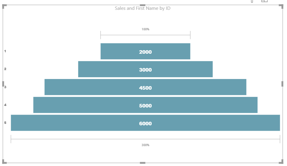
Hello, is there a way to plot funnel chart upside down? Meaning lowest number on top, and highest on the bottom? Or is there anything similar to the pyramid? Couldn't find pyramid in the custom visualizations. Thank you.
Solved! Go to Solution.
- Mark as New
- Bookmark
- Subscribe
- Mute
- Subscribe to RSS Feed
- Permalink
- Report Inappropriate Content
- Mark as New
- Bookmark
- Subscribe
- Mute
- Subscribe to RSS Feed
- Permalink
- Report Inappropriate Content
Hi @Anonymous ,
You just need to click on the 3 dots on the up right corner of the visual and sort ascending by the values.
Regards,
MFelix
Regards
Miguel Félix
Did I answer your question? Mark my post as a solution!
Proud to be a Super User!
Check out my blog: Power BI em Português- Mark as New
- Bookmark
- Subscribe
- Mute
- Subscribe to RSS Feed
- Permalink
- Report Inappropriate Content
Hi @Anonymous ,
You can refer this https://community.powerbi.com/t5/Desktop/Funnel-Chart-Sorting/td-p/511773.
I hope this helps you:-)
If yes please accept this as solution so that it can help others too
- Mark as New
- Bookmark
- Subscribe
- Mute
- Subscribe to RSS Feed
- Permalink
- Report Inappropriate Content
Hi @Anonymous
This is how funnel chart may look after sorting it 🙂
- Mark as New
- Bookmark
- Subscribe
- Mute
- Subscribe to RSS Feed
- Permalink
- Report Inappropriate Content
I would love a solution to this that actually still shows the correct conversion....as in 100% would be at the bottom and would go incrementally smaller as you go up the pyramid. Seems like its not a solution otherwise. The link to the other "solution" doesn't help either. Does anyone know of a solution that just simply allows you to stack it in pyramid with the correct conversion percentages? I don't want them to simply be off of the chart.
- Mark as New
- Bookmark
- Subscribe
- Mute
- Subscribe to RSS Feed
- Permalink
- Report Inappropriate Content
Hi @KateSPhoenix ,
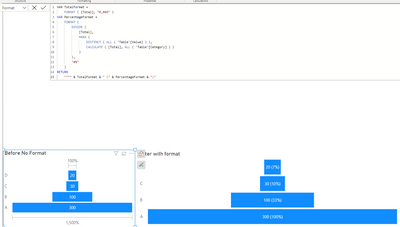
This visualization is the Funnel show it's calculates from top to bottom considering always the 100% at the top.
I see two option for this to check for custom visualizaitons on the store, the other is using dynamic format for measures:
https://learn.microsoft.com/en-us/power-bi/create-reports/desktop-dynamic-format-strings
Using this you can create a measure that is the SUM of your value and the add the followig format string:
VAR TotalFormat =
    FORMAT ( [Total], "#,##0" )
VAR PercentageFormat =
    FORMAT (
        DIVIDE (
            [Total],
            MAXX (
                DISTINCT ( ALL ( 'Table'[Value] ) ),
                CALCULATE ( [Total], ALL ( 'Table'[Category] ) )
            )
        ),
        "#%"
    )
RETURN
    """" & TotalFormat & " (" & PercentageFormat & ")"
Now turn off the converison rate on the funnel and final result is below:
Regards
Miguel Félix
Did I answer your question? Mark my post as a solution!
Proud to be a Super User!
Check out my blog: Power BI em PortuguêsHelpful resources

Microsoft Fabric Learn Together
Covering the world! 9:00-10:30 AM Sydney, 4:00-5:30 PM CET (Paris/Berlin), 7:00-8:30 PM Mexico City

Power BI Monthly Update - April 2024
Check out the April 2024 Power BI update to learn about new features.

| User | Count |
|---|---|
| 113 | |
| 100 | |
| 78 | |
| 76 | |
| 52 |
| User | Count |
|---|---|
| 146 | |
| 109 | |
| 106 | |
| 88 | |
| 61 |


