- Power BI forums
- Updates
- News & Announcements
- Get Help with Power BI
- Desktop
- Service
- Report Server
- Power Query
- Mobile Apps
- Developer
- DAX Commands and Tips
- Custom Visuals Development Discussion
- Health and Life Sciences
- Power BI Spanish forums
- Translated Spanish Desktop
- Power Platform Integration - Better Together!
- Power Platform Integrations (Read-only)
- Power Platform and Dynamics 365 Integrations (Read-only)
- Training and Consulting
- Instructor Led Training
- Dashboard in a Day for Women, by Women
- Galleries
- Community Connections & How-To Videos
- COVID-19 Data Stories Gallery
- Themes Gallery
- Data Stories Gallery
- R Script Showcase
- Webinars and Video Gallery
- Quick Measures Gallery
- 2021 MSBizAppsSummit Gallery
- 2020 MSBizAppsSummit Gallery
- 2019 MSBizAppsSummit Gallery
- Events
- Ideas
- Custom Visuals Ideas
- Issues
- Issues
- Events
- Upcoming Events
- Community Blog
- Power BI Community Blog
- Custom Visuals Community Blog
- Community Support
- Community Accounts & Registration
- Using the Community
- Community Feedback
Register now to learn Fabric in free live sessions led by the best Microsoft experts. From Apr 16 to May 9, in English and Spanish.
- Power BI forums
- Forums
- Get Help with Power BI
- Desktop
- Frontlog Visual (Link to Dynamics 365 CRM)
- Subscribe to RSS Feed
- Mark Topic as New
- Mark Topic as Read
- Float this Topic for Current User
- Bookmark
- Subscribe
- Printer Friendly Page
- Mark as New
- Bookmark
- Subscribe
- Mute
- Subscribe to RSS Feed
- Permalink
- Report Inappropriate Content
Frontlog Visual (Link to Dynamics 365 CRM)
Dear all,
I am struggling to visualize the evolution of the Frontlog (= Contract Value in EUR with Status “Open”) during time.
NOTE: I linked Power BI to Dynamics 365 (CRM).
We are currently using this measure:
We linked the “Date” to the Creation date, which causes the problem that we can’t see declines in our Frontlog (When an open opportunity gets closed, the initial increase and the decline take place at the exact same date, because it is only linked with the Creation Date).
Is there a possibility to add the Closure Date to the above measure, so the evolution of the Frontlog is shown correctly?
Many thanks in advance,
Thomas
- Mark as New
- Bookmark
- Subscribe
- Mute
- Subscribe to RSS Feed
- Permalink
- Report Inappropriate Content
HI @ThomasSTS ,
I'd like some sample data and expected result to help us clarify your data structure and test to coding formula.
How to Get Your Question Answered Quickly
Regards,
Xiaoxin Sheng
If this post helps, please consider accept as solution to help other members find it more quickly.
- Mark as New
- Bookmark
- Subscribe
- Mute
- Subscribe to RSS Feed
- Permalink
- Report Inappropriate Content
Hi,
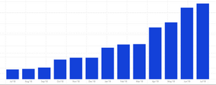
Please find below a screenshot of our current visual:
The dates we used here are linked with the creation date. So if we add an open opportunity to CRM in July '19, the July '19 bar will increase with the contract value of that specific opportunity.
If we would close the opportunity in August '19, there wouldn't be a visibe decline in the Aug '19 bar.
What will happen is a decline in the Jul '19 bar, because our dates are linked to the creation date.
We need to find a way to include the actual close date in the measures, so declines will be visible in the rigt month.
Hope this helps,
Kind regards,
Thomas
- Mark as New
- Bookmark
- Subscribe
- Mute
- Subscribe to RSS Feed
- Permalink
- Report Inappropriate Content
Hi @ThomasSTS ,
Actually, visual graph not helps. I'd like some sample data with table structure and expected result to show your requirement more clearly.
Regards,
Xiaoxin Sheng
If this post helps, please consider accept as solution to help other members find it more quickly.
Helpful resources

Microsoft Fabric Learn Together
Covering the world! 9:00-10:30 AM Sydney, 4:00-5:30 PM CET (Paris/Berlin), 7:00-8:30 PM Mexico City

Power BI Monthly Update - April 2024
Check out the April 2024 Power BI update to learn about new features.

| User | Count |
|---|---|
| 109 | |
| 96 | |
| 77 | |
| 66 | |
| 53 |
| User | Count |
|---|---|
| 144 | |
| 105 | |
| 102 | |
| 89 | |
| 63 |


