- Power BI forums
- Updates
- News & Announcements
- Get Help with Power BI
- Desktop
- Service
- Report Server
- Power Query
- Mobile Apps
- Developer
- DAX Commands and Tips
- Custom Visuals Development Discussion
- Health and Life Sciences
- Power BI Spanish forums
- Translated Spanish Desktop
- Power Platform Integration - Better Together!
- Power Platform Integrations (Read-only)
- Power Platform and Dynamics 365 Integrations (Read-only)
- Training and Consulting
- Instructor Led Training
- Dashboard in a Day for Women, by Women
- Galleries
- Community Connections & How-To Videos
- COVID-19 Data Stories Gallery
- Themes Gallery
- Data Stories Gallery
- R Script Showcase
- Webinars and Video Gallery
- Quick Measures Gallery
- 2021 MSBizAppsSummit Gallery
- 2020 MSBizAppsSummit Gallery
- 2019 MSBizAppsSummit Gallery
- Events
- Ideas
- Custom Visuals Ideas
- Issues
- Issues
- Events
- Upcoming Events
- Community Blog
- Power BI Community Blog
- Custom Visuals Community Blog
- Community Support
- Community Accounts & Registration
- Using the Community
- Community Feedback
Register now to learn Fabric in free live sessions led by the best Microsoft experts. From Apr 16 to May 9, in English and Spanish.
- Power BI forums
- Forums
- Get Help with Power BI
- Desktop
- Re: Formula to sort by accuracy (absolute error)
- Subscribe to RSS Feed
- Mark Topic as New
- Mark Topic as Read
- Float this Topic for Current User
- Bookmark
- Subscribe
- Printer Friendly Page
- Mark as New
- Bookmark
- Subscribe
- Mute
- Subscribe to RSS Feed
- Permalink
- Report Inappropriate Content
Formula to sort by accuracy (absolute error)
Hello everyone,
I need some help. Any advice will be appreciated, especially if someone can explain.
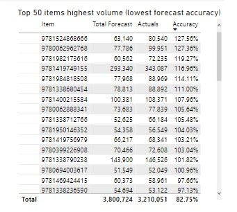
I have such a visualization.
I need to sort by lowest forecast accuracy. By saying this, I need to somehow take the forecast accuracy of 100% as the best one and to rank the ratio of Accuracy considering that items can be over and under forecasted. So 100.20 and 99.80 basically show that there is an error of 0.20% and it should be considered similar level issue.
Measure of Accuracy is 1-(FCST-ACTUALS)/FCST
Does someone know how i can sort it taking into consideration this absolute error...
Solved! Go to Solution.
- Mark as New
- Bookmark
- Subscribe
- Mute
- Subscribe to RSS Feed
- Permalink
- Report Inappropriate Content
- Mark as New
- Bookmark
- Subscribe
- Mute
- Subscribe to RSS Feed
- Permalink
- Report Inappropriate Content
- Mark as New
- Bookmark
- Subscribe
- Mute
- Subscribe to RSS Feed
- Permalink
- Report Inappropriate Content
@ebeery Thank you very much for your reply.
I am not sure but something is totally wrong, it doesn't calculate correctly. That's what I have now.
Calculation for Accuracy
And calculation for Error
- Mark as New
- Bookmark
- Subscribe
- Mute
- Subscribe to RSS Feed
- Permalink
- Report Inappropriate Content
@DIFF1 What do you mean by "it doesn't calculate correctly"? What is the actual result you are expecting? It seems to me like it is operating as intended - the are sorted by worst to best accuracy. To see the most accurate values just sort in ascending order.
- Mark as New
- Bookmark
- Subscribe
- Mute
- Subscribe to RSS Feed
- Permalink
- Report Inappropriate Content
@ebeery Thank you very much. But the first step is how to basically let PowerBI know that 100.01 accuracy and 99.99 accuracy is basically a mistake of 0.01 so that it is treated as the same mistake? That is the biggest issue for me. I don't understand how it can be done.
- Mark as New
- Bookmark
- Subscribe
- Mute
- Subscribe to RSS Feed
- Permalink
- Report Inappropriate Content
- Mark as New
- Bookmark
- Subscribe
- Mute
- Subscribe to RSS Feed
- Permalink
- Report Inappropriate Content
@DIFF1 assuming that you don't want the absolute error to be shown in the visual, the only way I'm aware of with a table/matrix visual is described in the 2nd part of the article below. Basically involves creating a measure for sorting, adding to the visual, and adjusting the column width such that the column is no longer visible.
https://pbivisuals.com/2021/03/03/power-bi-sorting-data-by-a-column-not-shown-in-visual/
Helpful resources

Microsoft Fabric Learn Together
Covering the world! 9:00-10:30 AM Sydney, 4:00-5:30 PM CET (Paris/Berlin), 7:00-8:30 PM Mexico City

Power BI Monthly Update - April 2024
Check out the April 2024 Power BI update to learn about new features.

| User | Count |
|---|---|
| 107 | |
| 100 | |
| 80 | |
| 63 | |
| 58 |
| User | Count |
|---|---|
| 148 | |
| 111 | |
| 94 | |
| 84 | |
| 67 |


