- Power BI forums
- Updates
- News & Announcements
- Get Help with Power BI
- Desktop
- Service
- Report Server
- Power Query
- Mobile Apps
- Developer
- DAX Commands and Tips
- Custom Visuals Development Discussion
- Health and Life Sciences
- Power BI Spanish forums
- Translated Spanish Desktop
- Power Platform Integration - Better Together!
- Power Platform Integrations (Read-only)
- Power Platform and Dynamics 365 Integrations (Read-only)
- Training and Consulting
- Instructor Led Training
- Dashboard in a Day for Women, by Women
- Galleries
- Community Connections & How-To Videos
- COVID-19 Data Stories Gallery
- Themes Gallery
- Data Stories Gallery
- R Script Showcase
- Webinars and Video Gallery
- Quick Measures Gallery
- 2021 MSBizAppsSummit Gallery
- 2020 MSBizAppsSummit Gallery
- 2019 MSBizAppsSummit Gallery
- Events
- Ideas
- Custom Visuals Ideas
- Issues
- Issues
- Events
- Upcoming Events
- Community Blog
- Power BI Community Blog
- Custom Visuals Community Blog
- Community Support
- Community Accounts & Registration
- Using the Community
- Community Feedback
Register now to learn Fabric in free live sessions led by the best Microsoft experts. From Apr 16 to May 9, in English and Spanish.
- Power BI forums
- Forums
- Get Help with Power BI
- Desktop
- Formatting data for Radar Charts
- Subscribe to RSS Feed
- Mark Topic as New
- Mark Topic as Read
- Float this Topic for Current User
- Bookmark
- Subscribe
- Printer Friendly Page
- Mark as New
- Bookmark
- Subscribe
- Mute
- Subscribe to RSS Feed
- Permalink
- Report Inappropriate Content
Formatting data for Radar Charts
Hi there,
I’m trying to build a radar chart, and recreate what I’ve created in Excel within a Power BI dashboard – showing two quarters worth of scores for various different skills, with having the option to drill down to individual locations
I summarised the data in a table:
But when I created a radar chart, the radar ‘columns’ were Q1 and Q4, whereas I wanted these as radar ‘points’, with the ‘column headings’ being the skills
So I re-formatted the data with the skills as rows and then the date (Q1/Q4 together with the location) as columns.
This produces the right graph, however I want to be able to easily flick between locations (so you can just see the Q1 and Q4 figure for one location at a time).
I’ve attempted to add a ‘slicer’ box (as I did for the data with the original formatting) but I can’t see a way to filter between locations, as the locations are now part of the column headers? it now just produces a table of figures:
Any help in producing this slicer box together (to flick between different locations data) with the graph showing two quarters data as above would be much appreciated!
Thanks
Solved! Go to Solution.
- Mark as New
- Bookmark
- Subscribe
- Mute
- Subscribe to RSS Feed
- Permalink
- Report Inappropriate Content
Hi @davidburch,
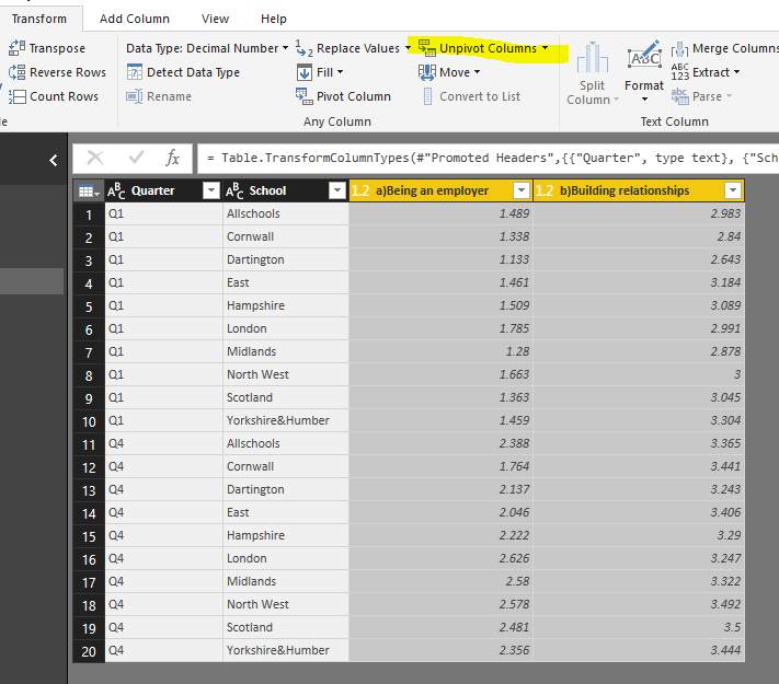
Open Query Editor mode, select all 'skills' fileds, then click "unpivote columns" button. Remember to rename new columns.
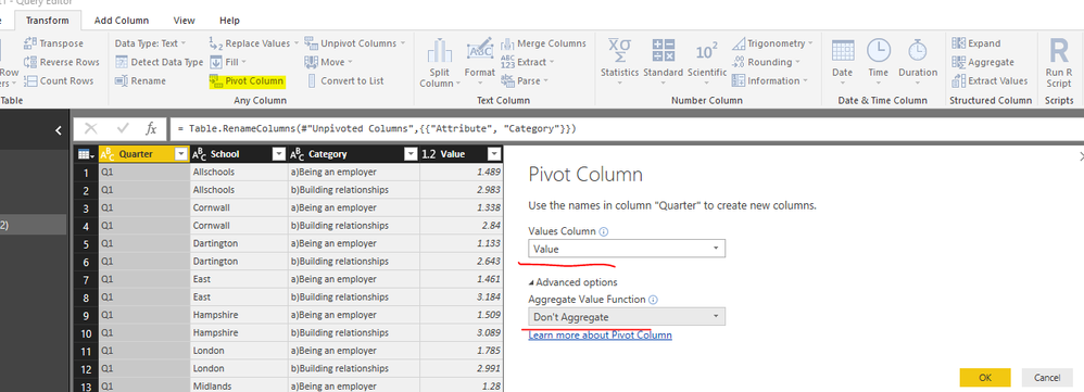
Then, choose [Quarter] field, click 'Pivot Column' button.
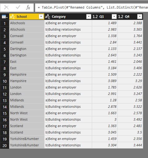
With above changes, you will get a new table structure as shown in below image.
Create radar chart like below.
Best regards,
Yuliana Gu
If this post helps, then please consider Accept it as the solution to help the other members find it more quickly.
- Mark as New
- Bookmark
- Subscribe
- Mute
- Subscribe to RSS Feed
- Permalink
- Report Inappropriate Content
Thanks so much!!!! 😃
Helpful resources

Microsoft Fabric Learn Together
Covering the world! 9:00-10:30 AM Sydney, 4:00-5:30 PM CET (Paris/Berlin), 7:00-8:30 PM Mexico City

Power BI Monthly Update - April 2024
Check out the April 2024 Power BI update to learn about new features.

| User | Count |
|---|---|
| 107 | |
| 100 | |
| 80 | |
| 63 | |
| 58 |
| User | Count |
|---|---|
| 148 | |
| 111 | |
| 94 | |
| 84 | |
| 67 |


