- Power BI forums
- Updates
- News & Announcements
- Get Help with Power BI
- Desktop
- Service
- Report Server
- Power Query
- Mobile Apps
- Developer
- DAX Commands and Tips
- Custom Visuals Development Discussion
- Health and Life Sciences
- Power BI Spanish forums
- Translated Spanish Desktop
- Power Platform Integration - Better Together!
- Power Platform Integrations (Read-only)
- Power Platform and Dynamics 365 Integrations (Read-only)
- Training and Consulting
- Instructor Led Training
- Dashboard in a Day for Women, by Women
- Galleries
- Community Connections & How-To Videos
- COVID-19 Data Stories Gallery
- Themes Gallery
- Data Stories Gallery
- R Script Showcase
- Webinars and Video Gallery
- Quick Measures Gallery
- 2021 MSBizAppsSummit Gallery
- 2020 MSBizAppsSummit Gallery
- 2019 MSBizAppsSummit Gallery
- Events
- Ideas
- Custom Visuals Ideas
- Issues
- Issues
- Events
- Upcoming Events
- Community Blog
- Power BI Community Blog
- Custom Visuals Community Blog
- Community Support
- Community Accounts & Registration
- Using the Community
- Community Feedback
Register now to learn Fabric in free live sessions led by the best Microsoft experts. From Apr 16 to May 9, in English and Spanish.
- Power BI forums
- Forums
- Get Help with Power BI
- Desktop
- Formatting Of Values
- Subscribe to RSS Feed
- Mark Topic as New
- Mark Topic as Read
- Float this Topic for Current User
- Bookmark
- Subscribe
- Printer Friendly Page
- Mark as New
- Bookmark
- Subscribe
- Mute
- Subscribe to RSS Feed
- Permalink
- Report Inappropriate Content
Formatting Of Values
Hi
I am looking for a tip regarding the below visual.
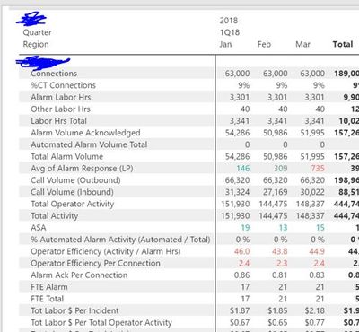
1. Does anyone know which visual it is (screen "Goal")? It doesn't seem to be a standard matrix.
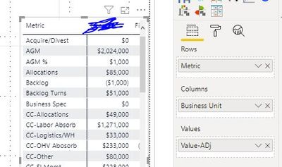
2. How can I format various metrics in a different way (dollars, whole number, percentage) based on my dataset? Please note that I can pivot/unpivot columns - that is not a problem.
My ultimate goal is that I have various metrics in column "Metric" and some of them should be shown as a percentage, some other ones as value or as a dollar.
thank you
Goal:
My Matrix:
My dataset:
| Business Unit | Account Desc. | Metric | Period | Scenario | Value |
| YHZ | AGMAcqDiv | Acquire/Divest | Saturday, February 1, 2020 | Actual | 14 |
| YYY | AGMAcqDiv | Acquire/Divest | Saturday, February 1, 2020 | Actual | 14 |
| ZZZ | AGMAcqDiv | Acquire/Divest | Saturday, February 1, 2020 | Actual | 14 |
| YHZ | AGMAcqDiv | Acquire/Divest | Wednesday, January 1, 2020 | Actual | 13 |
| YYY | AGMAcqDiv | Acquire/Divest | Wednesday, January 1, 2020 | Actual | 13 |
| ZZZ | AGMAcqDiv | Acquire/Divest | Wednesday, January 1, 2020 | Actual | 13 |
| YHZ | AGMAcqDiv | Acquire/Divest | Sunday, March 1, 2020 | Actual | 13 |
| YYY | AGMAcqDiv | Acquire/Divest | Sunday, March 1, 2020 | Actual | 13 |
| ZZZ | AGMAcqDiv | Acquire/Divest | Sunday, March 1, 2020 | Actual | 13 |
| YHZ | AGMAcqDiv | Acquire/Divest | Wednesday, April 1, 2020 | Actual | 13 |
| YYY | AGMAcqDiv | Acquire/Divest | Wednesday, April 1, 2020 | Actual | 13 |
| ZZZ | AGMAcqDiv | Acquire/Divest | Wednesday, April 1, 2020 | Actual | 13 |
| YHZ | AGMAcqDiv | Acquire/Divest | Friday, May 1, 2020 | Actual | 13 |
| YYY | AGMAcqDiv | Acquire/Divest | Friday, May 1, 2020 | Actual | 13 |
| ZZZ | AGMAcqDiv | Acquire/Divest | Friday, May 1, 2020 | Actual | 13 |
| ABCD | TradeAGM | AGM | Wednesday, January 1, 2020 | Actual | 4345 |
| ABCD | TradeAGM | AGM | Saturday, February 1, 2020 | Actual | 4840 |
| ABCD | TradeAGM | AGM | Sunday, March 1, 2020 | Actual | 4565 |
| ABCD | TradeAGM | AGM | Wednesday, April 1, 2020 | Actual | 5418 |
| ABCD | TradeAGM | AGM | Friday, May 1, 2020 | Actual | 4340 |
| EFG | TradeAGM | AGM | Wednesday, January 1, 2020 | Actual | 1643 |
| EFG | TradeAGM | AGM | Saturday, February 1, 2020 | Actual | 1892 |
| EFG | TradeAGM | AGM | Sunday, March 1, 2020 | Actual | 1787 |
Solved! Go to Solution.
- Mark as New
- Bookmark
- Subscribe
- Mute
- Subscribe to RSS Feed
- Permalink
- Report Inappropriate Content
Hi @Anonymous ,
The visual in your "Goal" image looks like the standard matrix.
A single measure can only have a single data format. What you're seeing in that image is text formatting using the FORMAT() dax formula.
Take a quick look at this link:
https://docs.microsoft.com/sv-se/dax/pre-defined-numeric-formats-for-the-format-function
Essentially this relies on the fact that you have numeric values of different types calculated and then you use a SWITCH() together with several different FORMAT()s to define how you want your numbers to be displayed.
Hope this helps,
J
Connect on LinkedIn
- Mark as New
- Bookmark
- Subscribe
- Mute
- Subscribe to RSS Feed
- Permalink
- Report Inappropriate Content
Hi @Anonymous ,
In addition, we can create a measure to replace your value to meet your requirement.
Measure Value =
FORMAT(
    SUM('Table'[Value]),
    SWITCH (
        TRUE (),
        MAX('Table'[Metric])="AGM%", "Percent",
        MAX('Table'[Metric])="AGM","Currency",
        MAX('Table'[Metric])="Acquire/Divest","General Number"
    )
)
You can also refer to the post I answered earlier.
https://community.powerbi.com/t5/Desktop/How-to-create-a-visual-like-this/td-p/1084043
If it doesn’t meet your requirement, could you please show the exact expected result based on the table that you have shared?
BTW, pbix as attached.
Best regards,
Community Support Team _ zhenbw
If this post helps, then please consider Accept it as the solution to help the other members find it more quickly.
- Mark as New
- Bookmark
- Subscribe
- Mute
- Subscribe to RSS Feed
- Permalink
- Report Inappropriate Content
Hi @Anonymous ,
The visual in your "Goal" image looks like the standard matrix.
A single measure can only have a single data format. What you're seeing in that image is text formatting using the FORMAT() dax formula.
Take a quick look at this link:
https://docs.microsoft.com/sv-se/dax/pre-defined-numeric-formats-for-the-format-function
Essentially this relies on the fact that you have numeric values of different types calculated and then you use a SWITCH() together with several different FORMAT()s to define how you want your numbers to be displayed.
Hope this helps,
J
Connect on LinkedIn
Helpful resources

Microsoft Fabric Learn Together
Covering the world! 9:00-10:30 AM Sydney, 4:00-5:30 PM CET (Paris/Berlin), 7:00-8:30 PM Mexico City

Power BI Monthly Update - April 2024
Check out the April 2024 Power BI update to learn about new features.

| User | Count |
|---|---|
| 114 | |
| 99 | |
| 83 | |
| 70 | |
| 60 |
| User | Count |
|---|---|
| 150 | |
| 115 | |
| 104 | |
| 89 | |
| 65 |


